Dashboard vs Report: What's the Difference?
The difference is not the tool or the charts, it is whether the reader is checking for change or asking for an explanation
5 Minutes Read
Data Analytics Program — Data Analytics — Next cohort Starts Oct 24 · 35% Discount
Enroll NowThe difference is not the tool or the charts, it is whether the reader is checking for change or asking for an explanation
Most people learn these two words in the wrong order. They learn that a dashboard is "the pretty one with the KPI cards" and a report is "the boring one with the table," and then they spend the next two years building dashboards that are really reports and reports that nobody reads because the useful part was one number buried on page four.
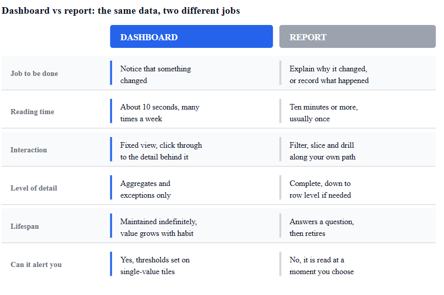
The visual style is not the difference. You can build an ugly dashboard and a beautiful report. The difference is what job the artifact does for the person opening it. A dashboard exists so someone can notice that something changed. A report exists so someone can understand why it changed, or so a record of what happened exists in a fixed form. Everything else, the page count, the interactivity, the tool it was built in, follows from that.
This guide uses one scenario throughout. Northpoint Logistics is a last-mile parcel delivery company running six regional hubs. Their operations team cares about on-time delivery rate, failed first-attempt deliveries, parcels in transit, and cost per parcel. Every example below is built on that same data, because the point is that identical numbers become a dashboard or a report depending only on the question being asked of them.
Ask this: is the reader checking, or asking?
A Northpoint hub manager opening a screen at 8:15 every morning is checking. She already knows what normal looks like. On-time delivery sits around 94 percent, failed first attempts around 4 percent, and if either number moves outside that band she wants to see it in under ten seconds without reading anything. She is not looking for insight. She is looking for a deviation. That is a dashboard.
The regional director who gets told on Thursday that the North hub's on-time rate dropped to 88 percent for two weeks running is asking. He wants the breakdown by route, by day of week, by driver shift, by parcel size, and by weather, and he wants to see the analyst's reasoning laid out in an order that makes an argument. That is a report.
The same on-time delivery measure appears in both. In the dashboard it is a single card with a target line. In the report it is decomposed across four pages. Neither version is a worse chart. They answer different questions.
Dashboards are built for repeated viewing over an indefinite period. The value of a dashboard is almost entirely in the reader's memory of what it looked like yesterday. If Northpoint's operations dashboard shows 12,400 parcels in transit, that number means nothing on its own. It means something because the manager remembers it read 9,800 on the same weekday last week. A dashboard is a baseline machine.
Reports are built for a specific moment and a specific question, and most of them should have an end date. The North hub investigation report is useful in September and largely irrelevant in March, because by then the cause has been found and fixed, or it hasn't and a new report exists. Some reports do repeat, and a monthly cost-per-parcel report is a real thing, but even a recurring report is a series of self-contained documents rather than a living surface.
This has a practical consequence that catches out a lot of new analysts. Dashboards need maintenance forever. Every dashboard you build is a permanent commitment to keep a data pipeline alive, and a dashboard that silently stops refreshing is worse than no dashboard because people keep trusting it. Reports mostly do not carry that cost. If you build ten dashboards in a year, you now have ten things to keep breathing.
Reports are interactive in the exploratory sense. The reader filters, slices, drills down, changes the date range, and follows their own path. Dashboards are, deliberately, much less interactive. They present a fixed view because a fixed view is what makes day-to-day comparison possible. If the numbers move around depending on what filter someone left applied last Tuesday, the baseline is gone.
The Power BI product line makes this distinction unusually literal, which is useful for understanding the concept even if you never touch the tool. Microsoft's documentation describes a Power BI dashboard as a single-page canvas built from tiles pinned out of one or more reports, and it notes plainly that dashboards do not support filtering or slicing the way reports do, while reports are multi-page collections of visuals built on one semantic model. Microsoft's own list of dashboard limitations is blunter still: one page only, and you cannot drop a slicer across tiles and expect them all to respond.
That is a product decision, not a law of the universe, and other tools draw the line differently. But it reflects the underlying logic well. The thing you check every morning should look the same every morning.
There is one interaction dashboards do own, and it is the one reports cannot do at all: alerting. A dashboard can watch a number for you. In Power BI, data alerts can be set on gauge, KPI, and card tiles so that a threshold crossing sends a notification, and those alerts fire only when the underlying data actually refreshes. For Northpoint, that means the ops lead does not even have to open the dashboard to learn that on-time delivery fell below 92 percent. The dashboard becomes a sensor. No report does this, because a report has no concept of a value it is continuously watching.
A report can be exhaustive. A dashboard cannot.
If Northpoint's finance team needs a monthly file listing every parcel that incurred a redelivery charge, with hub, route, driver, date, and fee, that is thousands of rows and it needs to print the same way every time for the audit trail. That is not a dashboard problem and it is not really an interactive report problem either. It is what paginated reports in Power BI are built for, designed for printing and sharing, laid out to an exact page specification, and able to run a table across as many pages as the data requires rather than hiding the rest behind a scrollbar.
Dashboards deal in aggregates and exceptions. Six hub-level on-time percentages, a trend sparkline, a count of routes currently behind schedule. The moment a dashboard tries to be complete, it stops working, because completeness and ten-second scanning are directly opposed goals.
Layout follows from this. Because a dashboard is scanned rather than read, position carries meaning. Tableau's own guidance on dashboard design points out that most viewers start scanning at the top left, so the view carrying the main message should occupy or span that corner. In a report, position carries a different meaning: it establishes an argument order, the way paragraphs do.
Dashboards are usually read by many people, briefly, on their own schedule. Reports are usually read by fewer people, at length, at a moment someone chose.
Northpoint's operations dashboard is opened by six hub managers, two ops leads, and the COO, for maybe forty seconds each. The North hub investigation report is read carefully by three people, once, and then referenced in a decision. Those are different products with different quality bars. A dashboard with one confusing tile wastes forty seconds times ten people every day forever. A report with one confusing chart gets a question in a meeting and is fixed.
Delivery follows audience. Dashboards live at a URL and are pulled. Reports are pushed: emailed, attached, presented, filed. When a "dashboard" ends up being emailed as a PDF every Monday, that is a strong hint that it was always a report and the format was chosen before the purpose was.
Where the words get slippery
Two things make this harder than it needs to be.
First, "report" means at least three different things depending on who is talking. In everyday business use, a report is a document with findings. In Power BI, a report is the interactive multi-page canvas that dashboard tiles get pinned from, which is closer to what most people would call a dashboard. In older enterprise systems, a report is a pixel-perfect printable file. When someone asks you for a report, find out which one they mean before you build anything.
Second, "dashboard" has become a status word. Stakeholders ask for dashboards because dashboards sound modern and reports sound like 2004. A large share of requests that arrive as "can you build a dashboard for this" are actually one-off analytical questions that will be asked once, and building a permanent monitoring surface for them is expensive and pointless. The right response to a dashboard request is not to open Power BI. It is to ask what decision the thing will drive and how often someone will look at it.
If you are still getting comfortable with the mechanics of pinning visuals, building report pages, and publishing to a workspace, Power BI for Beginners walks through the tool's building blocks in order, and it is worth having that vocabulary straight before making architectural calls about what should be a dashboard.
Four questions, in order, settle almost every case.
Will someone look at this on a repeating schedule? If no, build a report. A question asked once gets answered once.
Is the goal to notice a change, or to explain one? Noticing points to a dashboard. Explaining points to a report, every time.
Does the answer need row-level detail or completeness? If yes, report, and possibly a paginated one.
Can the whole thing fit on one screen with roughly eight numbers or fewer? If not, it is a report wearing a dashboard's clothes, or it is two dashboards.
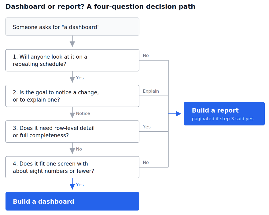
Note what question 2 does to Northpoint's actual situation. The morning ops screen passes: repeated, noticing, aggregate, fits a screen. The North hub investigation fails at question 2 immediately. The monthly redelivery charge file fails at question 3. Three requests, three formats, one dataset.
To make the distinction concrete, take one measure, failed first-attempt deliveries, currently 6.8 percent against a 4 percent target.
On the dashboard: a single card reading 6.8%, coloured against target, with a twelve-week sparkline underneath and nothing else. The job of this tile is to be wrong-looking at a glance. No breakdown, no filter, no explanation. If someone wants to know more, they click through to the report.
In the report: four pages. Page one states the finding and the size of the impact in redelivery cost. Page two breaks the rate by hub and shows that North and North-East account for nearly all of the increase. Page three splits by time-of-day window and shows the increase is concentrated in the 6pm to 9pm slot. Page four looks at driver shift patterns in those windows. The chart types differ page to page because each page asks a different question, and picking the right one for each is its own skill; why the right chart depends on the question covers that decision properly, and it matters more in reports than dashboards precisely because reports carry an argument rather than a status.
In the paginated report: every affected parcel, one row each, grouped by hub, with repeating headers and a total per page, ready to be filed or handed to the operations audit.
Same measure. Three completely different artifacts, because three different people need three different things from it.
Building a dashboard for a question that will be asked once. The request sounds like "can I have a dashboard for the Q3 promotion," but the promotion ends in November and so does the usefulness of the surface. Write the report, save the maintenance.
Putting thirty visuals on one page and calling it a dashboard. If it takes more than about ten seconds to determine whether anything is wrong, it is not doing a dashboard's job, however good the individual charts are.
Designing the dashboard before agreeing what the thresholds are. A tile showing 94.2 percent is meaningless without a shared answer to "what is bad?" Agree the target first, then design the tile around showing distance from it.
Treating a report as a dumping ground for everything you found. A report makes an argument. If page four exists because you happened to run that query, cut it. Analysts confuse thoroughness with usefulness constantly here.
Emailing a dashboard as a static image and expecting it to work. A dashboard stripped of its live refresh and its click-through is just a low-detail report, and usually a bad one.
Letting a dashboard rot. A stale dashboard is more dangerous than a missing one because people keep making decisions from it. If nobody has opened it in three months, retire it deliberately rather than leaving it to drift.
The natural next step is design rather than definition. Once you have decided that something genuinely should be a dashboard, how to design a KPI dashboard executives will actually use covers the layout and metric-selection decisions that turn that judgment into a page people open twice a day rather than once. If a dashboard project is already going wrong and the charts are not the problem, why most executive dashboards fail deals with the upstream failures, unclear owners, undefined metrics, no agreed decision, that no amount of design work fixes afterwards.
On the build side, the reason many dashboards feel slow or produce numbers that disagree with the finance team's is almost always the data model underneath rather than the visuals on top. Power BI data modeling explained through a real sales dataset works through fact and dimension tables on a dataset close to what an operations or sales team actually holds, which is the layer that makes the difference between a dashboard that refreshes in four seconds and one that times out. https://www.gradientlearnings.org/resources
Quiz
Question 1 of 15
FAQ
FREE COURSES
A hands-on path to real DAX fluency in Power BI, from data modeling fundamentals through CALCULATE, time intelligence, iterators, and advanced analytical patterns, all built on one retail model you construct yourself. Closes with two full portfolio projects: a retail sales dashboard and a SaaS analytics build.
This course takes you from Power BI fundamentals to job-ready data analytics skills through seven structured modules. Learn data connections, Power Query, relational modeling, DAX, time intelligence, and interactive dashboard design with hands-on examples. Build six portfolio projects across sales, retail, marketing, finance, and enterprise analytics. Finish with interview preparation, career guidance, project ideas, and current compensation insights.
Build practical, analyst-level Excel skills from foundations to advanced analysis. Learn how to clean and structure data, write powerful formulas, use lookups and dynamic arrays, build PivotTables and interactive dashboards, transform data with Power Query, create data models with Power Pivot and DAX, automate workflows with VBA, and perform statistical and financial analysis. The course uses realistic business scenarios and hands-on projects to help you turn Excel into a powerful tool for analysis, reporting, forecasting, and decision-making.