Data Visualization: Why the Right Chart Depends on the Question
A decision guide built around the question being asked, not the chart that looks most impressive
5 Minutes Read
Data Analytics Program — Data Analytics — Next cohort Starts Oct 24 · 35% Discount
Enroll NowA decision guide built around the question being asked, not the chart that looks most impressive
Most chart-choice mistakes aren't aesthetic mistakes. Nobody fails because a bar chart used the wrong shade of blue. They fail because the chart type answers a different question than the one actually being asked, a pie chart standing in for a trend, a line chart standing in for a comparison, and the reader has to do the translation work the chart should have done for them.
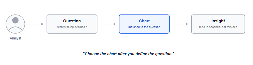
The fix isn't a longer list of chart types to memorise. It's one habit: name the question first, then let the question pick the chart. This guide works through the six question types that cover most business charts, with the chart each one actually calls for, and a handful of wrong-versus-right examples using the same underlying data.
The running example is a SaaS company's subscription data: monthly recurring revenue (MRR) by plan tier, signups over time, and customer usage patterns, the same handful of tables asked six different kinds of questions below.
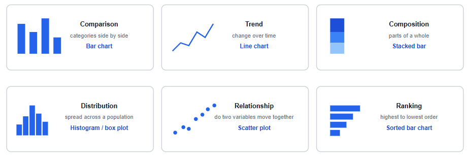
Question type | What you're asking | Chart that answers it |
|---|---|---|
Comparison | How do these categories compare to each other? | Bar chart |
Trend | How has this changed over time? | Line chart |
Composition | What are the parts of this whole? | Stacked bar (or 100% stacked bar) |
Distribution | How is this value spread across the population? | Histogram or box plot |
Relationship | Do these two variables move together? | Scatter plot |
Ranking | What's the order, from highest to lowest? | Sorted bar chart |
Most chart-choice mistakes are a mismatch somewhere in this table, a trend question answered with a chart built for comparison, a composition question answered with a chart built for ranking. The rest of this guide works through what that mismatch actually looks like.
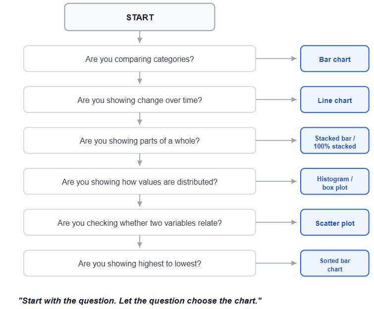
Before opening any charting tool, run through these six questions:
Am I comparing categories?
Am I showing change over time?
Am I showing parts of a whole?
Am I showing how values are distributed?
Am I showing whether two variables relate?
Am I ranking things from highest to lowest?
The one that best matches your question gives you the starting chart type, before aesthetics, the charting tool at hand, or a stakeholder's stated preference enter the conversation. This isn't a creative decision to make in the moment while building; it's closer to a lookup, and the lookup takes less time than picking a colour scheme usually does.
The question: "How does MRR compare across our four plan tiers this month?"
A bar chart puts each tier's value at a directly comparable height, side by side. This is the most literal match between question and chart on this whole list: comparison is fundamentally about comparing lengths, and a bar's length is the one visual property humans judge most accurately.
What the reader should notice first: the relative size of each category. A well-built comparison chart makes the tallest and shortest bars obvious within a second, without needing to read a single axis label first.
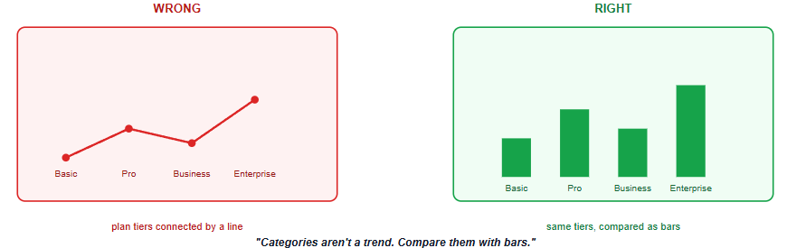
The wrong-versus-right version of this mistake: connecting the four plan tiers with a line, implying a trend or sequence between categories that don't actually have one. Basic, Pro, Business, and Enterprise aren't points along a continuum; there's no meaningful "between Basic and Pro." A line drawn across them implies a relationship that doesn't exist in the data.
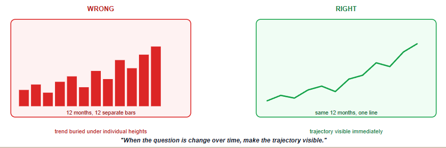
The question: "How has total MRR moved over the last 12 months?"
A line chart is built for exactly this: showing change across a continuous axis, almost always time, where the connecting line itself carries real information, the direction and rate of change between points.
What the reader should notice first: the direction and rate of change. A good trend chart makes it obvious within a glance whether things are going up, down, flattening, or reversing, not just where the line currently sits.
The wrong-versus-right version of this mistake: using 12 separate bars for 12 months. It's not wrong exactly, but it buries the trend, the thing actually being asked about, underneath 12 individually-compared heights. A line makes the trajectory the first thing the eye catches; a bar chart makes each month's individual value the first thing the eye catches. Different question, different answer.
The question: "What share of this month's MRR comes from each plan tier?"
A stacked bar, or a 100% stacked bar when the total itself doesn't matter and only the proportions do, shows parts of a whole side by side, in a shape that's genuinely easy to compare across multiple time periods if the question extends to "and how has that mix changed."
What the reader should notice first: the relative share of each component. The largest and smallest contributors should be identifiable without needing to read every individual value.
The wrong-versus-right version of this mistake: a pie chart with many slices. Pie charts can work when there are only a few categories and the differences in share are easy to see; as the number of slices grows, comparing wedge sizes becomes harder. This is one of the most overused chart types in business reporting specifically because it looks finished and professional, not because it's usually the right answer to the underlying question.
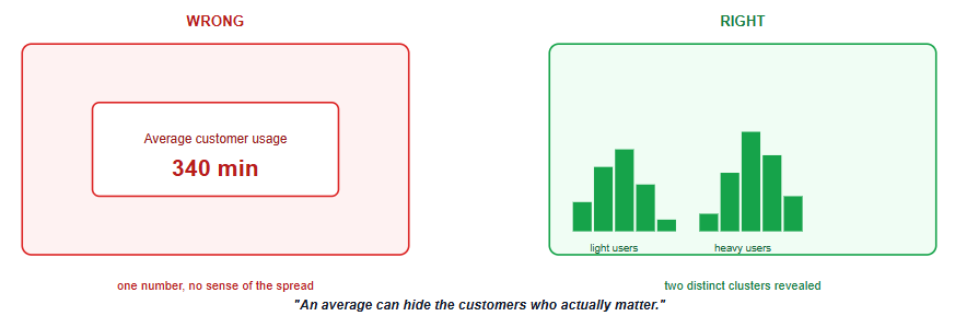
The question: "How is monthly usage spread across our customer base?"
A single average customer usage number hides everything interesting: whether usage is tightly clustered around that average, or whether it's actually bimodal, a cluster of light users and a separate cluster of heavy users, with the average sitting in a gap where almost no real customer actually lives. A histogram shows the full shape of that spread, which the average alone cannot.
What the reader should notice first: the shape, spread, clusters, and unusual values. A histogram's job is to reveal whether a population is tightly packed, widely spread, or split into distinct groups the average would otherwise hide.
The wrong-versus-right version of this mistake: reporting "average customer usage is 340 minutes per month" as if that single number tells the full story, when the underlying distribution might be two distinct customer segments with very different needs, a pattern only a histogram reveals.
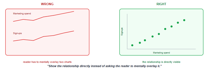
The question: "Does higher marketing spend actually correlate with more signups?"
A scatter plot puts spend on one axis and signups on the other, one dot per week or month, and the pattern of dots (or lack of one) directly shows whether the two variables move together. This is the one chart type built specifically to answer a "do these two things relate" question, and there isn't a good substitute for it.
What the reader should notice first: the pattern, direction, strength, or absence of association. A tight upward cluster of dots reads very differently from a scattered cloud with no visible pattern, and that difference is the actual answer to the question.
The wrong-versus-right version of this mistake: two separate line charts, one for spend and one for signups, plotted over time and left for the reader to mentally overlay and judge whether the peaks line up. A scatter plot does that comparison directly; two side-by-side line charts ask the reader to do it in their head, less accurately and more slowly.
The question: "Which are our top 10 customers by revenue this quarter?"
A bar chart sorted from highest to lowest value makes the ranking the first thing visible, no reading required. This sounds close to the comparison case above, and it is related, but the sort order itself is doing real analytical work here that a plain comparison chart wouldn't need.
What the reader should notice first: the order, from highest to lowest. If the reader has to scan more than a couple of rows to find the top result, the chart isn't doing the ranking work it should be doing.
The wrong-versus-right version of this mistake: a table sorted alphabetically by customer name, forcing the reader to scan every row and mentally rank them by revenue themselves. The data is all there; the chart just isn't doing any of the work it should be doing.
The first chart that comes to mind isn't necessarily the best one, and a few habits of thought are worth catching before they turn into a finished, wrong chart.
"I have 12 months of data" does not automatically mean the only useful visual is a bar chart; it depends on whether the question is about each month individually or about the trajectory across all twelve. "I have percentages" does not automatically mean a pie chart; a percentage is still a composition question, and a stacked bar usually handles more than a couple of categories better. "I have two variables" does not automatically mean two line charts; if the question is whether they relate to each other, a scatter plot answers it more directly than two charts plotted side by side.
The presence of a particular data shape, months, percentages, two variables, does not determine the chart by itself. The business question does, and the data shape is only ever a clue toward it, not the final answer.
Choosing a chart type because it looks more sophisticated, not because it answers the question. A 3D pie chart or a dual-axis combo chart often signals effort rather than clarity, and frequently makes the actual comparison harder to read, not easier.
Defaulting to whatever chart type is fastest to build in the tool at hand. The easiest chart to insert isn't always the one that matches the question, and it's worth the extra minute to check.
Using colour as the only way to distinguish categories. Colour alone isn't accessible to every reader, and it fails entirely once a chart is printed in black and white or viewed by someone with colour vision deficiency; pair colour with position, labels, or pattern where it matters.
Cramming a distribution question into a bar chart of averages. Averages by category can look like a fair comparison while hiding wildly different spreads underneath each bar.
Treating pie charts as a safe default. They work in a narrow case, few categories, one clearly dominant share, and get reached for far more often than that narrow case actually applies.
Ignoring the audience's reading task. A technically correct chart can still be poor if the reader has to work too hard to extract the answer.
Showing more precision than the decision requires. If the decision is about broad movement or ranking, excessive decimal precision can add noise rather than useful information.
Making every chart visually different just to make the dashboard look interesting. Consistency helps readers learn the visual language of a report faster.
Before finalising a chart, ask:
What exact question does this chart answer?
What should the reader notice first?
Is the chart type matched to that question?
Could the same answer be read faster with a simpler chart?
Am I forcing the reader to compare things mentally?
Is colour doing too much of the explanatory work?
Would the chart still work in grayscale?
Is the level of detail appropriate for the decision?
The best chart is not the one that contains the most information. It is the one that makes the intended answer easiest to see.
Chart choice is one layer of a larger design problem; once the right chart type is picked for each question, the KPI dashboard design guide covers how to arrange several of them into a page that actually gets used, including the stakeholder questions that determine which charts belong on the page at all. If a dashboard project is going wrong for reasons that have nothing to do with chart choice, why most executive dashboards fail covers the upstream process failures that chart selection alone can't fix.
For the tool-specific side of building these charts, the Power BI for Beginners tutorial and Power BI vs Tableau vs Excel cover where to actually build them.
Quiz
Question 1 of 15
FAQ
FREE COURSES
Learn to create clear, professional data visualizations in Python using Pandas, Matplotlib, Seaborn, Plotly, Streamlit, and Dash with practical projects and real-world business scenarios.
A hands-on course that takes you from BI foundations to KPI design, SQL calculation, dashboards, data quality, experiments, and clear communication of insights. Every lesson uses worked examples, exercises, and interview questions. The description is two sentences. If you want it shorter, use: "Learn to design, calculate, analyze, and present KPIs, from BI foundations to dashboards, data quality, and experiments."
An 11-module SQL course for data analysts preparing for interviews, built around one consistent company (Kestrel Outfitters) and one repeated method: the Five Questions What is the grain? What rows do I need? How should I combine them? How should I calculate the answer? How do I validate it? Starts with how to approach an unfamiliar SQL problem, then builds through core retrieval, aggregation, joins, subqueries and CTEs, window functions, NULL and conditional logic, reshaping and combining data, working with time, and data quality and validation finishing with a dedicated module on performance for analysts. Every lesson includes a custom diagram and a set of interview questions tagged by difficulty (Screener, Analyst, Advanced, Case) and type (Conceptual, Query Writing, Debugging, Optimization, Business Case), each with a fully worked solution. PostgreSQL-first, with dialect callouts for MySQL, SQL Server, BigQuery, and Snowflake throughout.