Power BI Data Modeling Explained Through a Real Sales Dataset
The deeper modelling concepts a beginner tutorial skips, worked through a five-table sales dataset
5 Minutes Read
Data Analytics Program — Data Analytics — Next cohort Starts Oct 24 · 35% Discount
Enroll NowThe deeper modelling concepts a beginner tutorial skips, worked through a five-table sales dataset
Most Power BI confusion that looks like a chart problem is actually a modelling problem wearing a chart's costume. A visual that shows the same total for every category, a time-intelligence function that silently returns blank, a filter that seems to affect the wrong table entirely, these are model symptoms, not visual bugs, and no amount of fiddling with the chart itself fixes them.
This guide goes one level deeper than the Power BI for Beginners tutorial, linked at the end, which covers the basics of fact tables, dimension tables, and a first relationship. Here, the dataset is closer to what a real sales team actually works with, five tables instead of three, including a dedicated date table, and the concepts, cardinality, cross-filter direction, and the mistakes that come from getting either wrong, get the fuller treatment a beginner tutorial doesn't have room for.
Table | Grain | Role |
|---|---|---|
| one row per order line | fact table |
| one row per customer | dimension table |
| one row per product | dimension table |
| one row per sales region | dimension table |
| one row per calendar day | dimension table |
Orders holds the transactional numbers: quantity, unit price, order date, and the foreign keys pointing to a customer, a product, and a region. Everything else describes something about one of those keys. This is a straightforward star schema: one fact table in the centre, several dimension tables around it, with the dimensions relating directly to the fact table.
Orders already has an order date column. It's tempting to skip building a separate Date table and just use that column directly for anything time-related. This works for basic filtering, but it breaks down in two specific, common situations.
A dedicated, continuous Date table is the recommended foundation for reliable time-intelligence calculations. Functions like year-over-year growth or a running total rely on a continuous, gapless calendar, every single day represented, not just the days that happen to have an order. Orders, on its own, only contains dates when something was actually sold, which has gaps, weekends with no orders, days with no activity in a particular region. A dedicated Date table, built to include every day in the relevant range regardless of whether anything happened that day, is what these functions are actually built to sit on top of.
A shared calendar keeps multiple fact tables consistent. A sales dataset that later grows to include a Returns table or a Marketing Spend table can join all of them to the same single Date table, giving every part of the model one consistent definition of a week, a quarter, and a fiscal year, rather than each fact table computing its own version of "this month" independently.
Every relationship in this model should be one-to-many: one row in a dimension table can relate to many rows in the fact table. One customer, many orders. One product, many order lines. One calendar day, many orders placed that day.
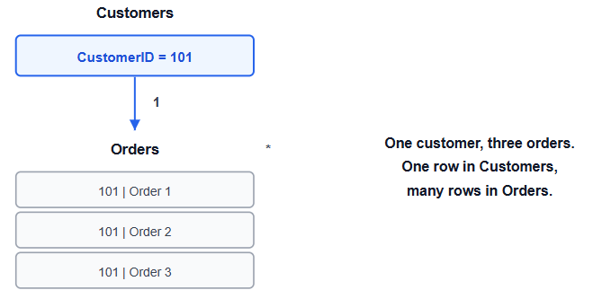
One customer can appear once in the Customers table but many times in Orders. That is the practical meaning of one-to-many cardinality.
Getting the direction of that "one" and "many" backwards, or leaving it on Power BI's automatic guess without checking, is one of the most common sources of a model that looks fine until a total comes out wrong. If Customers were accidentally set as the "many" side of its relationship to Orders, a customer's total spend could be calculated incorrectly, since the model would be structured as if a single order could relate to many customer records rather than the other way round.
Where this bites people: trusting Power BI's auto-detected cardinality without opening the relationship and checking it. The automatic guess is usually right, but "usually" isn't "always," and a wrong guess doesn't throw an error, it just quietly produces wrong numbers.
Cross-filter direction controls whether a filter applied to a dimension table flows through to the fact table. In a standard star schema like this one, single-direction filtering, from the dimension into the fact table, is the correct default for every relationship. Filtering Region to "West" should filter Orders down to West region orders; that's single-direction filtering doing its job.
Single direction means the dimension filters the fact table. The fact table does not automatically filter the dimension back.
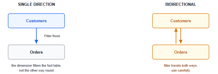
Bidirectional filtering allows the filter to flow the other way too, letting a filter on the fact table affect a dimension table. It's occasionally necessary for specific, more advanced model shapes, but turning it on by default across every relationship, because a specific visual isn't filtering the way someone expected, is a common way to create ambiguous filter paths: if Region and Products are both set to bidirectional, and both connect back to Orders, Power BI can end up with more than one possible way to apply a filter, and the result is a number that's technically calculated but doesn't mean what anyone expects. Leave relationships single-direction unless there's a specific, understood reason to change one.
Bidirectional filtering allows the filter to travel both ways, which can be useful in specific model designs but can also create ambiguous filter paths.
Total Sales = SUMX(Orders, Orders[Quantity] * Orders[UnitPrice])An illustrative result might look like this:
Region | Electronics | Furniture | Total |
|---|---|---|---|
West | ₹… | ₹… | ₹… |
South | ₹… | ₹… | ₹… |
North | ₹… | ₹… | ₹… |
The exact values depend on the underlying Orders table; the important point is that each region-category intersection is being filtered through the correct dimension relationships.
This measure, placed on a matrix visual with Region[RegionName] on rows and Products[Category] on columns, only produces a genuinely correct cross-tabulation if both relationships, Region to Orders and Products to Orders, are properly one-to-many with single-direction filtering. If either relationship is misconfigured, the matrix will still render, it just won't show the number the model is supposed to be capable of showing, and nothing about the visual itself indicates that anything is wrong. This is the practical reason modelling gets checked first, before troubleshooting a visual that "looks wrong": the visual is frequently innocent.
When a Power BI visual shows a suspicious number, check the model in this order:
Check the dimension key. Is the key unique in the dimension table?
Check the relationship columns. Are the correct key columns connected?
Check cardinality. Is the dimension on the "one" side and the fact table on the "many" side?
Check cross-filter direction. Is the filter flowing in the direction the model requires?
Check relationship status. Is the required relationship active?
Check the Date table. Is it continuous and correctly related to the fact table?
Test with a simple matrix. Use one or two dimension fields and a basic measure before debugging a complicated visual.
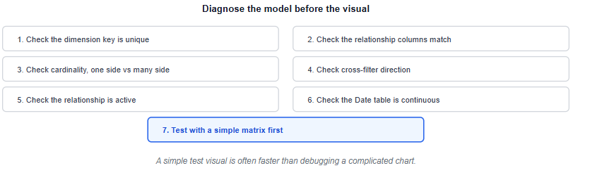
A simple test visual is often faster than debugging a complicated chart. If the simple matrix is wrong, the problem is probably in the model rather than the visual.
Skipping the dedicated Date table and using the order date column directly. Time intelligence functions and multi-fact-table consistency both depend on a proper, gapless calendar table that the raw fact table alone doesn't provide.
Trusting auto-detected cardinality without verifying it. A wrong cardinality guess doesn't error out, it just quietly produces wrong totals.
Turning on bidirectional filtering as a default troubleshooting step. It's a targeted tool for specific model shapes, not a general fix for a filter that isn't behaving as expected, and applying it broadly creates ambiguous filter paths.
Unnecessarily snowflaking a dimension table. Splitting Products into a separate Products and Category table, each with its own relationship back toward the fact table, adds complexity without a real benefit unless the category data genuinely needs to be shared and maintained separately.
Creating two active relationships between the same pair of tables. Power BI only allows one active relationship at a time between two tables; a second one has to stay inactive and be invoked explicitly in a measure, which is easy to forget once the model has grown past a handful of tables.
If the fact table and dimension table basics covered here felt unfamiliar, Power BI for Beginners covers that foundation on a simpler three-table model before returning here. Once the model itself is solid, the KPI dashboard design guide covers what to actually build on top of it, and choosing the right chart for the question covers picking the right visual once the model can support it.
For the tool-choice question this guide doesn't cover, whether Power BI is the right platform to invest in over Tableau for your specific goals, Power BI vs Tableau vs Excel covers that decision separately.
Quiz
Question 1 of 15
FAQ
FREE COURSES
A hands-on path to real DAX fluency in Power BI, from data modeling fundamentals through CALCULATE, time intelligence, iterators, and advanced analytical patterns, all built on one retail model you construct yourself. Closes with two full portfolio projects: a retail sales dashboard and a SaaS analytics build.
This course takes you from Power BI fundamentals to job-ready data analytics skills through seven structured modules. Learn data connections, Power Query, relational modeling, DAX, time intelligence, and interactive dashboard design with hands-on examples. Build six portfolio projects across sales, retail, marketing, finance, and enterprise analytics. Finish with interview preparation, career guidance, project ideas, and current compensation insights.
Learn to design data models that power accurate, fast, and trusted analytics. Starting from grain, keys, and relationships, you will build star schemas, track history with slowly changing dimensions, and implement tested dbt projects on cloud warehouses. The course ends with two hands-on portfolio projects. Basic SQL is all you need to start.