Why Most Executive Dashboards Fail Before Anyone Opens Them
The failure is usually decided weeks before anyone opens Power BI or Tableau, not in a chart choice
5 Minutes Read
Data Analytics Program — Data Analytics — Next cohort Starts Oct 24 · 35% Discount
Enroll NowThe failure is usually decided weeks before anyone opens Power BI or Tableau, not in a chart choice
When a dashboard goes unused, the retrospective almost always focuses on the wrong layer. Someone suggests the colours were confusing, or there were too many charts, or the layout needed work. Sometimes that's true. But by the time anyone is critiquing chart choices, the dashboard has usually already failed, and it failed for reasons that had nothing to do with Power BI or Tableau at all.
This is the piece that sits upstream of designing a dashboard executives will actually use: before you get to layout, headline metrics, or comparison logic, there's a set of process failures that determine the outcome before a single visual exists. If these are already broken, better design alone usually won't fix them.
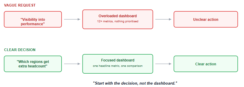
One of the most common root failures is that the dashboard was commissioned to answer a question nobody can actually name. "We need visibility into performance" is not a decision. "The VP needs to decide which regions get additional headcount next quarter" is a decision. A dashboard built against the first kind of request has no way to know what it's actually for, so it defaults to showing everything the data can produce, which is a different thing entirely from showing what one specific person needs to decide one specific thing.
This failure is invisible at build time. The dashboard gets built, it looks complete, and it ships. It only becomes visible weeks later, when nobody's opening it, and by then the retrospective conversation has moved on to blaming the visuals.
Left without strong direction, an analyst building a dashboard defaults to their own mental model: the metrics that were interesting to compute, arranged in the order the data happened to load, with everything included because leaving something out felt like an incomplete answer. That's a reasonable instinct and the wrong output. An executive doesn't want a complete picture of everything the data contains. They want the smallest number of facts that changes what they do next.
The tell that this has happened is a dashboard where every metric feels equally important, because nothing was actually prioritised against a real decision. If you can't point to which single number on the page matters most, that's usually a sign this failure occurred somewhere upstream.
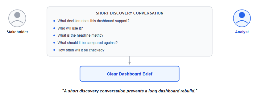
This is the most fixable failure on this list, and the fact that it's fixable is exactly why it's frustrating how often it gets skipped anyway. A short conversation, what decision this supports, how often it'll actually be checked, what the headline number should be, what it should be compared against, resolves most of the ambiguity that later shows up as a design problem. Skipping it doesn't remove the ambiguity. It just defers the ambiguity to the analyst, who resolves it by guessing, and the guess is usually wrong in a way that isn't discovered until the dashboard has already shipped and gone unused.
Teams that skip this step aren't being lazy, usually. They're often under real time pressure, and a stakeholder conversation feels like the step that can be cut to move faster. It's the opposite: skipping it is what makes the eventual rebuild, after the first version fails silently, take longer than the conversation would have.
Ask most teams how they'll know if a new dashboard worked, and the honest answer is often "we'll see if people use it," discovered passively, weeks later, usually by noticing nobody's opened it in a while. That's not a success metric, it's an autopsy. A dashboard commissioned without any definition of what a good outcome looks like has no way to course-correct early, because nobody's watching for a signal until the absence of one becomes impossible to ignore.
A better version of this question gets asked before the build starts: what would tell us in the first two weeks that this is actually working? Sometimes that's usage frequency. Often it's more specific, whether a particular recurring meeting starts referencing the dashboard's numbers directly, for instance. Defining that answer before building gives you an early warning system instead of a retrospective.
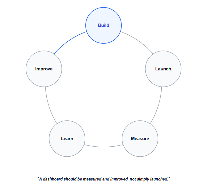
A dashboard that was exactly right on launch day degrades anyway, quietly, if nobody is responsible for it afterward. A metric definition changes upstream and nobody updates the dashboard to match. A new region gets added to the business and the filter list doesn't. The person who understood the original stakeholder conversation moves to a different team, and the institutional knowledge of why the dashboard was built this specific way leaves with them.
This is the failure that looks like a maintenance problem but is actually a launch-time planning gap: ownership needs to be assigned when the dashboard ships, not discovered as a gap months later when something's visibly wrong and nobody knows whose job it is to fix it.
A finance team requests "a dashboard for leadership on company performance." No specific decision is named. The analyst, working from that alone, builds a comprehensive 12-chart dashboard covering revenue, costs, headcount, churn, and pipeline, each with its own comparison logic, because all of it seemed relevant to "performance." It ships on schedule and looks professional.
Three weeks later, it's opened twice. The retrospective conversation focuses on whether the charts were the right type. The actual problem was upstream: nobody ever asked which specific decision leadership needed this dashboard to support, so the analyst reasonably built a comprehensive answer to an unasked question, rather than a precise answer to a real one. No redesign fixes that. The fix was a short stakeholder conversation that needed to happen three weeks earlier.
Treating a dashboard request as a data-pull ticket rather than a design conversation. "Can you build me a dashboard for X" deserves a short round of clarifying questions before any work starts, not an immediate build.
Mistaking silence for success. No complaints about a dashboard is not the same as the dashboard being used or useful. Actively check usage rather than assuming it either way.
Assuming more metrics means more value. A dashboard that tries to be comprehensive usually ends up serving no single decision well, since comprehensiveness and decision-relevance pull in different directions.
Skipping the ownership conversation at launch. Assigning who maintains a dashboard after it ships is a launch-time task, not something to figure out later once something's already broken.
Fixing the wrong layer when a dashboard goes unused. Before touching colours or chart types, check whether the actual root cause is upstream: an unclear decision, a skipped stakeholder conversation, or no defined owner.
Once the process failures above are addressed, actually designing the dashboard well is its own skill; the KPI dashboard design guide covers the stakeholder-interview framework and layout principles that follow directly from getting this upstream layer right. If the technical build itself — relationships, data modelling, and the mechanics of Power BI — is the part that still feels shaky, the Power BI for Beginners tutorial covers that ground.
Dashboard failure and diagnosis questions increasingly come up in analyst interviews framed as scenario questions, "a dashboard isn't being used, how would you investigate why"; the interview questions guide covers that style of question in more depth.
Quiz
Question 1 of 15
FAQ
FREE COURSES
A hands-on course that takes you from BI foundations to KPI design, SQL calculation, dashboards, data quality, experiments, and clear communication of insights. Every lesson uses worked examples, exercises, and interview questions. The description is two sentences. If you want it shorter, use: "Learn to design, calculate, analyze, and present KPIs, from BI foundations to dashboards, data quality, and experiments."
Learn to create clear, professional data visualizations in Python using Pandas, Matplotlib, Seaborn, Plotly, Streamlit, and Dash with practical projects and real-world business scenarios.
A statistics course built for working Data Analysts, not a general statistics degree. Every lesson passes one test: would a working analyst actually use this on the job. Four modules take you from descriptive statistics and probability through hypothesis testing to regression, all taught on one continuous fictional retailer's data so techniques build on data you already recognize. Closes with two full end-to-end portfolio projects, each ending in a written business recommendation. No unnecessary mathematical depth, no career filler, every number in every lesson verified against real data before it's written down.