How to Design a KPI Dashboard Executives Will Actually Use
The stakeholder questions to ask before opening Power BI or Tableau, since that's the step almost everyone skips
5 Minutes Read
Data Analytics Program — Data Analytics — Next cohort Starts Oct 24 · 35% Discount
Enroll NowThe stakeholder questions to ask before opening Power BI or Tableau, since that's the step almost everyone skips
Many dashboards go unused for reasons that have little to do with whether the charts look good. They're unused because nobody asked the executive what decision the dashboard was actually supposed to support before building it. The analyst picked the metrics that were easiest to pull, arranged them in the order the data happened to load, and shipped something technically correct that nobody opens after the first week.
The fix isn't a better chart type. It's a five-minute conversation that happens before you open Power BI or Tableau at all, and it's the step this guide spends the most time on, because it's the one almost every tutorial skips in favour of jumping straight to the visuals.
Treat this as a genuine short interview, not a formality. Four questions do most of the work. They also line up closely with the way Microsoft and Tableau recommend thinking about dashboard purpose and audience before getting into visual design.
"What decision does this dashboard need to support?" Not "what do you want to see," which tends to produce a wish list, but what specific decision or action this dashboard should make faster or clearer. A dashboard meant to help a VP decide where to reallocate ad spend needs completely different metrics from one meant to reassure a board that the business is healthy.
"How often will you actually look at this?" A dashboard checked daily needs to surface change and anomalies quickly. A dashboard checked monthly needs more context and trend, since the viewer has less continuous memory of what "normal" looks like. Building a daily-cadence layout for a monthly-cadence viewer, or the reverse, is a common, quiet source of a dashboard nobody opens.
"If one number changed significantly, would you want to know immediately?" The answer identifies your headline metric, the number that earns the most prominent spot on the page. If the honest answer is "not really, I'd rather see the trend over the quarter," that tells you the layout should lead with trend, not a single large number.
"What should this number be compared against?" A number alone rarely means anything to an executive. Compared to last month, compared to target, compared to the same period last year, each comparison implies a different layout decision and, often, a different data pull entirely.
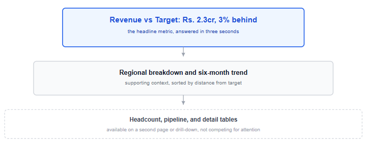
Lead with the headline number, not a wall of charts. Whatever answered the "if this changed, would you want to know" question belongs at the top, large, with its comparison right next to it. An executive should be able to identify the single most important fact almost immediately, before scrolling or clicking anything. Microsoft's guidance makes a version of the same point, noting that most people read top to bottom, so the highest-level information belongs at the top left, with more detail as the reader's eye moves further into the page.
One dashboard answers one core question well, rather than ten questions poorly. A dashboard trying to serve sales, marketing, and finance simultaneously usually serves none of them, since each function's headline metric and comparison logic differ. If you catch yourself building for three audiences at once, that's usually a sign you need three dashboards, or three clearly separated pages within one.
Every number needs a comparison, not just a value. "Revenue: ₹2.3 crore" tells an executive almost nothing on its own. "Revenue: ₹2.3 crore, up 8% versus last month, 3% behind target" tells them whether to feel good, bad, or neutral, and that judgment is the actual product a dashboard is meant to deliver.
Keep the first page to only the visuals needed for the decision. If the page starts feeling crowded, move detail to a second page or drill-down rather than extending the first page indefinitely. Tableau's own guidance is specific on this point, generally recommending limiting a single dashboard to two or three views, and the Tableau Blueprint visual best-practices guide frames white space itself as functional, since it helps define hierarchy and keeps a dense page from becoming harder to read, not as empty space to be filled with more charts. If there's genuinely more the audience needs, that's what a second page or a drill-down click is for.
Match the time period consistently across every visual on the page. A dashboard showing this month's revenue next to last quarter's churn rate next to year-to-date signups is quietly asking the viewer to do date-normalisation math in their head before any comparison makes sense. Academic research on dashboard design describes this kind of choice as a genuine tradeoff, not a purely aesthetic one: fitting more onto one screen, one page, and one interaction model always costs something elsewhere, whether that's consistency, clarity, or the viewer's own effort to reconcile what they're looking at.
The interview. The VP says the dashboard needs to support a monthly decision about which regions get extra sales headcount. She checks it weekly during the review cycle, mostly monthly otherwise. If regional revenue growth stalls significantly, she wants to know immediately. She compares everything against the quarterly target, not last year, since the business has changed too much year over year for that comparison to mean much anymore.
What that interview determines. The headline metric is revenue versus quarterly target, broken out by region, since that's the number tied directly to the headcount decision. The comparison logic is target-based, not year-over-year, which rules out several chart types that assume a historical trend line is the point. The cadence is weekly-glanceable with monthly depth available, which argues for a top-line summary card plus a trend chart underneath, rather than a dense weekly-grain table.
The resulting layout. A headline card at the top: total revenue versus quarterly target, with the gap called out explicitly. A regional breakdown directly underneath, sorted by how far each region is from its own target, not alphabetically, since the sort order itself is doing analytical work. A trend line beneath that, showing the same metric over the past six months, so a stall is visible before it becomes a crisis. Headcount and pipeline data sit on a second page, available but not competing for attention with the number that actually drives the decision.
Notice that none of this required a novel chart type. The differentiation is entirely in what got included, what got left off, and what order it appears in, all of which trace directly back to the four-question interview.
Skipping the stakeholder conversation and guessing at what matters. This is the root cause behind most of the mistakes below; a short conversation can prevent many dashboard problems before they're built.
Building for yourself instead of the audience. An analyst's instinct is to include everything interesting; an executive needs everything decision-relevant. Those are frequently different, shorter lists.
Including a metric because the data was easy to pull, not because it matters. Data availability is not the same thing as relevance, and a dashboard padded with easy-but-irrelevant metrics dilutes the ones that actually matter.
Reporting a number without its comparison. A raw value with no target, no prior period, and no benchmark forces the viewer to supply their own judgment, which is exactly the work the dashboard was supposed to do for them.
Inconsistent time periods across visuals on the same page. Even technically correct numbers become hard to compare mentally when each chart quietly uses a different date range.
Decorative colour with no analytical purpose. Colour should mean something, above or below target, this region versus that one, not just make the page look finished. Random colour variety is one of the fastest ways to make a dashboard feel busy without adding information.
This guide covers the thinking behind a dashboard, not the button-by-button build. If the modelling and relationship side of building one in Power BI still feels shaky, the Power BI for beginners tutorial covers that ground, including the data model decisions that any well-designed dashboard depends on underneath the layout.
Dashboard design can come up in analyst interviews too, sometimes framed directly as "how would you design a dashboard for a stakeholder," which is close to the exact scenario worked through above; the interview questions guide covers that question alongside the technical rounds. And if you want to practise the stakeholder-interview habit on a real build rather than reading about it, the sales dashboard entry among the beginner project ideas is a close match for the worked example in this guide.
Quiz
Question 1 of 15
FAQ
FREE COURSES
A hands-on course that takes you from BI foundations to KPI design, SQL calculation, dashboards, data quality, experiments, and clear communication of insights. Every lesson uses worked examples, exercises, and interview questions. The description is two sentences. If you want it shorter, use: "Learn to design, calculate, analyze, and present KPIs, from BI foundations to dashboards, data quality, and experiments."
Learn to create clear, professional data visualizations in Python using Pandas, Matplotlib, Seaborn, Plotly, Streamlit, and Dash with practical projects and real-world business scenarios.
Learn to design data models that power accurate, fast, and trusted analytics. Starting from grain, keys, and relationships, you will build star schemas, track history with slowly changing dimensions, and implement tested dbt projects on cloud warehouses. The course ends with two hands-on portfolio projects. Basic SQL is all you need to start.