Power BI for Beginners: Data Model, Relationships and Your First Report
Starting from three messy CSVs instead of one clean table, because that's closer to how the work actually looks
6 Minutes Read

Starting from three messy CSVs instead of one clean table, because that's closer to how the work actually looks
Most Power BI tutorials start with one clean table and end with one bar chart. That teaches you which buttons do what, but it skips the part of the job that actually takes the time: real business data doesn't arrive as one table. It arrives as several, exported from different systems, none of them clean, and the actual first skill in Power BI is getting those tables talking to each other before you build anything a stakeholder will look at.
This tutorial starts there instead. You'll import three genuinely messy, related CSV files the way a small D2C retailer's systems might actually export them, clean them in Power Query, build a real data model with relationships between them, and publish a first report that pulls fields from more than one table at once. That last part is the actual test: if your relationships are wrong, the report will either error out or quietly show the wrong numbers, and you won't know which until you check.
You've been handed three exports from a small online retailer's systems: Orders.csv, Customers.csv, and Products.csv. Nobody cleaned them before sending them over, which is the normal case, not the exception.
File | What it contains | What's wrong with it |
|---|---|---|
| One row per order-product combination, an order line: order ID, customer ID, product ID, quantity, order date, order value | Dates are a mix of |
| One row per customer: customer ID, name, city, signup date | Names have inconsistent capitalisation and trailing spaces. A handful of rows are exact duplicates from a repeated export. |
| One row per product: product ID, product name, category, price | Category values are inconsistent, "Electronics", "electronics", and "Electronic" all appear for the same category. |
This is a deliberately realistic setup: three related tables, each with its own kind of mess, none of it severe enough to be obviously broken, which is exactly the kind of thing that produces a confidently wrong report if you skip the cleanup step.
In Power BI Desktop, use Get Data → Text/CSV for each of the three files. Don't load them directly; click Transform Data instead, which opens Power Query and lets you fix problems before anything lands in your report.
This is the single most important habit to build early. Loading data directly and fixing it later means re-doing the fix by hand every time the file refreshes. Transforming it in Power Query means the fix is a repeatable step that reapplies itself automatically the next time this month's export comes in.
Each table needs a slightly different fix, which is the point of walking through all three rather than one.
Orders: the order value column arrived as text because of the ₹ symbol. Use Replace Values to strip the symbol, then change the column's data type to Decimal Number. For the mixed date formats, check whether Power Query's automatic date detection guessed correctly for every row, it often won't on a genuinely mixed column, and if it didn't, split the column by the date pattern first or fix the source export rather than trusting an automatic parse on ambiguous data.
Customers: use Trim and Clean from the Transform tab to remove stray whitespace, then Remove Duplicates on the full row to drop the repeated export rows. Capitalisation inconsistencies in names are cosmetic rather than functional here, since you won't be joining on the name column, so they're worth a lower priority than the join keys.
Products: standardise the category column with Replace Values, mapping "electronics" and "Electronic" to a single consistent "Electronics". This one matters more than it looks: an inconsistent category column will split what should be one bar in a chart into three smaller ones later, and that kind of error doesn't throw a warning.
Where this bites people: fixing the data column by column without first checking each column's data type. A number stored as text can lead to unexpected aggregation or visual behaviour rather than an obvious error, so check the data type before building visuals. Check every column's type icon in the column header before moving on from Power Query.
Once each table is cleaned, click Close & Apply to load them into the data model. This is where most beginner tutorials stop describing the thinking and just say "now build a chart," which skips the actual decision that determines whether the rest of the report works.
You have three tables, and they need to relate to each other correctly. Orders is what's called a fact table: in this example, Orders.csv holds one row per order-product combination, an order line, rather than one row per whole order. It's the transactional table at that order-line grain, holding the numbers you'll actually aggregate, quantity and order value. Customers and Products are dimension tables: they hold descriptive attributes you'll filter and group by, but you won't sum a customer's city or average a product's category.
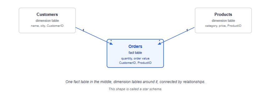
This shape, one fact table in the middle, dimension tables around it, each connected by a relationship, is called a star schema, and it's the default structure worth building toward rather than an advanced technique to learn later. It's also the same underlying idea as a well-designed set of SQL tables joined on foreign keys; if you've worked through SQL for Data Analysts already, a Power BI relationship and a SQL JOIN are solving the same problem from two different interfaces.
Switch to the Model view. Power BI will often auto-detect relationships based on matching column names, but don't trust that blindly, verify each one rather than assuming it guessed correctly.
Drag CustomerID from Orders to CustomerID in Customers to create the relationship, and do the same for ProductID between Orders and Products. For each relationship, check two things in the properties panel: the cardinality and the cross-filter direction.
Cardinality describes how many rows on each side can match. Here, it should be "many to one": many rows in Orders can share the same customer, but each row in Customers represents exactly one customer. Getting this backwards, or leaving it on Power BI's guess without checking, is one of the most common sources of a data model that looks fine until a total comes out wrong.
Cross-filter direction determines whether a filter on the dimension table (say, filtering to one city in Customers) flows through to filter the fact table (Orders), and in a standard star schema, it should. The default single-direction setting handles this correctly for a straightforward model like this one; bidirectional filtering is a tool for more advanced, ambiguous model shapes, not something to reach for by default here.
Where this bites people: building one enormous flattened table instead of a proper model, by joining everything together in Power Query before it ever reaches the data model. It feels simpler at first, since there's only one table to think about, but it multiplies the file size, duplicates data unnecessarily, and makes the model harder to extend later. Keep the tables separate and let relationships do the connecting work; that's what they're for.
With the model in place, switch to Report view. Start with three simple visuals to prove the relationships actually work, not to build a finished dashboard yet.
A card visual showing total order value: drag Orders[OrderValue] onto a Card visual. This confirms the basic aggregation works.
A bar chart showing revenue by product category: drag Category from Products onto the axis and Orders[OrderValue] onto the values. This is the visual that actually tests your relationships, since it's pulling a dimension from one table and a measure from another. If the chart populates correctly with sensible numbers, your Products relationship is working. If every category shows the same total, or the chart is blank, the relationship or its cardinality is wrong, and it's worth going back to Step 4 before building anything further.
A slicer for city, from Customers: drag City onto a Slicer visual, then click through a few cities and watch whether the bar chart and card update correctly. This tests the Customers relationship the same way the bar chart tested Products.
This sequence, card, then a cross-table chart, then a cross-table filter, is a deliberate order. Each visual tests something the previous one didn't, so if something breaks, you know roughly where to look rather than debugging the whole model at once.
Once the three visuals behave correctly, Publish from the Home ribbon to send the report to the Power BI Service, if your organisation has a workspace set up. For a first learning project without a workspace, saving the .pbix file and being able to walk someone through the model and the relationships you built is just as valuable a deliverable; the underlying skill being tested is the modelling, not the publishing click.
Cleaning the data after building visuals instead of before. A visual built on an uncleaned column will need to be rebuilt once the column's data type or values change, which wastes more time than fixing it first.
Not checking cardinality and cross-filter direction on every relationship. Power BI's auto-detected guess is often right, but "often" isn't "always," and a wrong guess produces a report that looks plausible right up until someone checks the numbers.
Flattening tables together instead of using relationships. This is the single most common habit carried over from spreadsheet thinking, and it's worth deliberately unlearning early.
Skipping the test visuals. Jumping straight to a polished dashboard without first confirming each relationship works individually makes it much harder to find the actual problem when something looks wrong.
Trusting a mixed date column's automatic type conversion without checking a sample. A handful of rows silently parsed as the wrong date is one of the quietest possible errors in a report, since nothing throws a warning.
This tutorial covers Power BI specifically; if you're still deciding whether Power BI or Tableau is the better tool to prioritise for your target roles, Power BI vs Tableau vs Excel walks through that decision based on company stack rather than personal preference. The Power Query cleanup covered here draws on the same underlying engine that sits inside Excel too, so if that part felt unfamiliar, the Excel for Data Analysis guide covers Power Query's fundamentals in more depth.
For practising this end to end on a project of your own, several of the beginner project ideas are built around exactly this kind of multi-table, messy-data scenario, and Power BI and Tableau questions increasingly show up in the same technical rounds as the SQL and case-study questions covered in the interview questions guide. If you're mapping this against the broader sequence of what to learn and when, the Data Analyst roadmap shows where Power BI fits alongside SQL, Excel and statistics.
Quiz
Question 1 of 15
FAQ