How Data Analysts Decide Which Metrics Actually Matter
A repeatable process for separating the metric worth a board slide from the one that just happens to be going up
5 Minutes Read
Data Analytics Program — Data Analytics — Next cohort Starts Oct 24 · 35% Discount
Enroll NowA repeatable process for separating the metric worth a board slide from the one that just happens to be going up
Northline Media's analytics dashboard tracks 40-something numbers: pageviews, unique visitors, average time on page, articles published per week, social shares, ad impressions, newsletter opens, and a dozen more. When a new editorial director asks which one the team should actually watch this quarter, the honest answer isn't on the dashboard at all. It's a process for figuring that out, one most teams never write down because they've never had to. It's also a process that matters more, not less, now that a BI tool's AI layer can generate a new chart or suggested metric in seconds; dashboards get bloated fastest when adding a metric is easier than deciding whether it deserves a spot.
This article covers that process: how to decide which metrics actually matter, using Northline Media's reader data, reader_id, article_id, page_views, time_on_page, subscription_status, referral_source, and ad_revenue, as the running example throughout. The goal isn't a universal list of good metrics, since the right ones depend entirely on what a specific team is trying to decide. It's a repeatable way to tell the difference between a metric that deserves a spot on the dashboard and one that just happens to be trending up.
The most common mistake in metric selection is working in the wrong direction: starting from what's easy to measure and asking what story it tells, instead of starting from a real decision someone needs to make and asking what would need to be true to make it well. Pageviews are easy to measure, which is exactly why they end up on so many dashboards regardless of whether anyone's decisions actually depend on them.
Google's own research on this problem, developed for teams drowning in exactly this kind of large-scale usage data, proposes working through three questions in order: what is the goal, what user behavior or attitude would signal progress toward that goal, and only then, what specific metric captures that signal. As the researchers put it, no matter how well-designed a metric is, it's unlikely to be useful in practice unless it explicitly relates to a goal and can be used to track progress toward it. Skipping straight to "what can we measure" produces a dashboard full of numbers that are all technically accurate and mostly disconnected from any decision anyone is actually making.
For Northline Media, the difference plays out concretely. "Increase pageviews" isn't really a goal, it's already halfway to a metric, and a vague one at that. "Grow the base of readers who come back on their own, not just through a social link" is an actual goal, and it points toward a specific, different metric: something like the percentage of readers who return within seven days without arriving through a referral or social share.
Does it trace back to a goal someone will act differently based on? If a number could move sharply in either direction and nobody on the team would change what they're doing, it's not a metric that matters yet, however interesting it looks on a chart. This is the single most useful filter for cutting down a 40-metric dashboard, since most of the cuts come from numbers nobody was ever going to act on. It's also a judgment call an AI tool can't make for you: deciding which question is actually worth asking stays firmly on the human side of the line, however good the tooling gets at answering whatever question it's handed.
Is it normalized, not a raw count that grows just because the audience grows? A raw pageview total climbing 20% could reflect a genuinely more engaged readership, or it could simply reflect more total visitors, each behaving exactly as before. The same Google research makes the point directly: raw counts need to be normalized into ratios, percentages, or averages per user, since a raw total will rise as the user base grows regardless of whether individual behavior actually changed. For Northline Media, total pageviews is far less informative than pageviews per returning reader, which strips out the effect of simply having more readers.
Could someone improve this number without the underlying goal actually improving? A metric that can be gamed without the real thing getting better isn't a stable measure of progress, it's a target waiting to be optimized against. This is worth checking for deliberately, not assumed away, and it's covered in more depth in the next section.
Does everyone measuring it agree on exactly what it means? "Engaged reader" needs one definition, not a different threshold in every team's spreadsheet. A metric that sounds precise but is calculated three different ways across three teams isn't actually one metric, it's three metrics wearing the same name, and disagreements about the number often turn out to be disagreements about the definition instead.
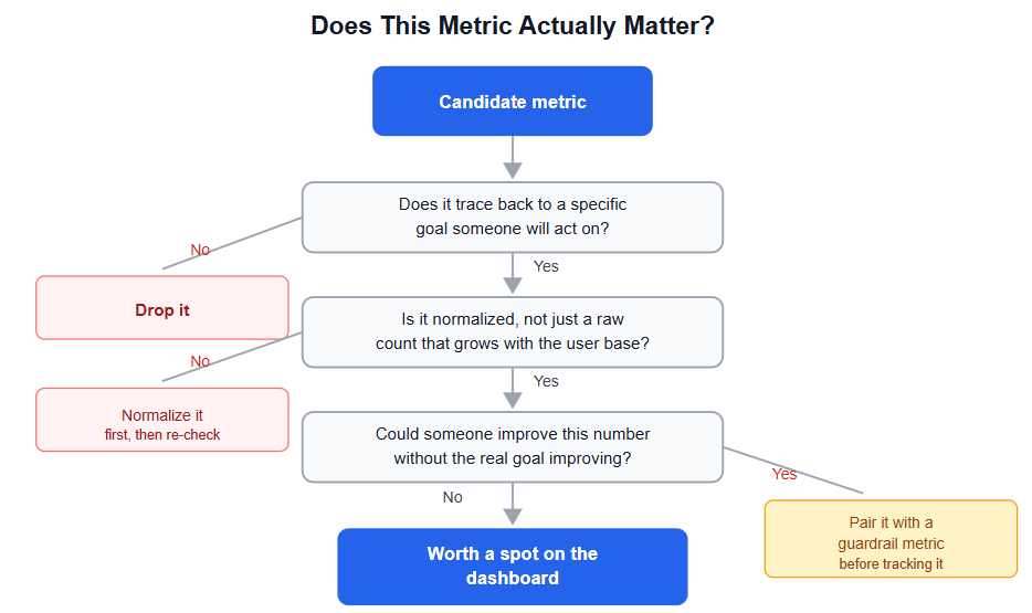
The third question above deserves its own explanation, because it's the one teams most often skip, and skipping it can make a dashboard actively misleading rather than just incomplete. If Northline Media's editors are evaluated partly on pageviews per article, the incentive to write a more accurate, useful headline competes directly with the incentive to write a more clickable one, and pageviews alone can't distinguish between the two. Once a measure becomes something people are explicitly optimizing against, it tends to stop reflecting what it was originally meant to track. Economists and researchers studying this pattern formally describe it as Goodhart's law: the optimization of a measure can have a counter-productive effect on the actual goal once that measure becomes the target being optimized, particularly when the gap between the measure and the true goal has room to be exploited.
This doesn't mean pageviews are useless, it means pageviews alone are an incomplete and gameable signal for the goal of "readers trust and value this publication." The practical fix isn't to abandon the metric, it's to pair it with a guardrail metric that would catch the gaming if it happened. If Northline Media tracks pageviews per article alongside average time on page and 7-day return rate, a spike in pageviews driven by misleading headlines would show up as a drop in the guardrail metrics even while the primary number looked great. The pair is much harder to game successfully than either metric alone.
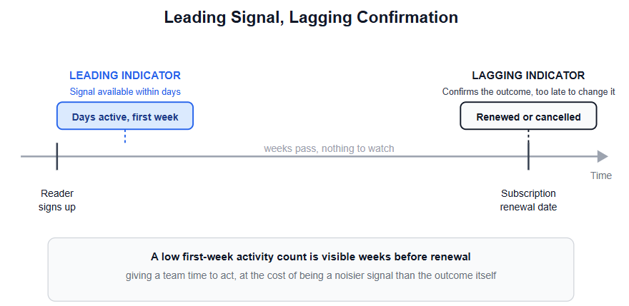
Metrics that matter aren't all the same type, and mixing them up leads to a dashboard that either reacts too slowly or panics over noise. A lagging indicator, like monthly subscription revenue, tells you what already happened, reliably, but too late to change the outcome that produced it. A leading indicator, like the 7-day return rate for readers who signed up for a free account last week, moves earlier and gives a team time to react, at the cost of being a noisier, less certain signal of the thing you actually care about.
sql
SELECT
  reader_id,
  first_visit,
  COUNT(DISTINCT page_view_date) AS days_active_first_week
FROM (
  SELECT
    reader_id,
    page_view_date,
    MIN(page_view_date) OVER (PARTITION BY reader_id) AS first_visit
  FROM page_views
) reader_first_visit
WHERE page_view_date BETWEEN first_visit AND first_visit + INTERVAL '7 days'
GROUP BY reader_id, first_visit;
The window function does its work in the inner subquery, tagging every row with that reader's first visit date without collapsing anything yet. The outer query then filters to just the first seven days and aggregates. Writing it this way, rather than trying to call a window function directly inside an aggregate like COUNT(DISTINCT CASE WHEN ...), avoids a genuine SQL error: a window function can't be nested inside an aggregate that's also driving a GROUP BY in the same SELECT, since the two operate at different stages of query execution. The same logic in pandas looks similar in spirit: group by reader_id, find each reader's minimum page_view_date, then filter and count within that seven-day window, an approach covered in more depth in the pandas basics guide for data analysts if SQL isn't the tool of choice for this particular pipeline.
A query like this, tracking how many distinct days a new reader was active in their first week, is a leading indicator worth watching alongside the lagging subscription number, since it tends to move weeks before a subscription renewal or cancellation decision actually happens. Neither type replaces the other. A dashboard built entirely on lagging indicators can't warn anyone early enough to act, and one built entirely on leading indicators risks reacting to noise that never actually turns into the outcome it was supposed to predict.
The four-question filter above works just as well in reverse, applied to a dashboard that already has too many metrics on it, as it does when building a new one from scratch. Walking Northline Media's 40-metric dashboard through the filter, total pageviews fails the normalization question and gets replaced by pageviews per returning reader. Social shares fails the goal-connection question outright, since nobody on the team could point to a decision they'd make differently based on that number moving, and gets cut entirely rather than replaced. Average time on page passes as a guardrail metric specifically paired with pageviews, but wouldn't earn a spot on its own. The 7-day return rate, which didn't exist on the original dashboard at all, gets added because it's the metric that actually traces back to the goal the editorial director cared about in the first place.
This is usually how the exercise goes: fewer total metrics on the dashboard, a couple of new ones that didn't exist before, and a much clearer answer the next time someone asks which number to watch this quarter.
Starting from available data instead of a specific decision. Working backward from "what can we measure" produces a dashboard full of numbers that are all correct and mostly disconnected from any decision anyone is actually making.
Reporting raw counts without checking whether they're just tracking audience growth. A rising total can hide flat or declining per-user behavior, and the two require completely different responses.
Treating a gameable metric as safe just because nobody's gaming it yet. The risk isn't hypothetical once a number becomes something a team is evaluated on; pairing it with a guardrail metric before that happens is far easier than diagnosing the damage after.
Mixing leading and lagging indicators without labeling which is which. A team that doesn't know whether a metric is meant to warn early or confirm an outcome tends to either panic over noisy leading indicators or discover problems too late from lagging ones.
Letting every team define a shared metric differently. A metric that sounds precise but is calculated three different ways across three teams creates arguments about the number that are actually arguments about the definition.
Never revisiting the metric list once it's set. A metric that mattered for last quarter's goal doesn't automatically matter for this quarter's, and a dashboard that's never pruned accumulates numbers nobody's looked at in months.
Applying this process well leans on being comfortable enough with SQL to actually build the normalized, per-user metrics this article keeps pointing toward, rather than settling for whatever raw count is easiest to pull. The SQL skills guide for data analysts covers the aggregation and window function fundamentals behind queries like the one in this article. It's also worth revisiting an existing dashboard with the four-question filter above at least once a quarter, since the metrics that mattered when a dashboard was first built rarely stay the right ones forever.
Quiz
Question 1 of 15
FAQ
FREE COURSES
A hands-on course that takes you from BI foundations to KPI design, SQL calculation, dashboards, data quality, experiments, and clear communication of insights. Every lesson uses worked examples, exercises, and interview questions. The description is two sentences. If you want it shorter, use: "Learn to design, calculate, analyze, and present KPIs, from BI foundations to dashboards, data quality, and experiments."
A complete, practitioner-taught path from foundational concepts to advanced technique: how to mine data for a real story, structure a narrative that lands, choose and design the right chart, write with clarity, present and defend your findings live, and apply this honestly and ethically. The course closes with two full end-to-end portfolio projects, each with a real business problem, a dataset, specific questions to answer, and a complete worked solution, so you finish with concrete work you can show, not just concepts you've read about.
An 11-module, project-based course for data analysts who need to work fluently with finance data. Covers financial statements, unit economics, forecasting, valuation, market risk, and fraud analytics, all built around one running case company with real code, data, and a full answer key in every module.