Data Storytelling for Analysts

A complete, practitioner-taught path from foundational concepts to advanced technique: how to mine data for a real story, structure a narrative that lands, choose and design the right chart, write with clarity, present and defend your findings live, and apply this honestly and ethically. The course closes with two full end-to-end portfolio projects, each with a real business problem, a dataset, specific questions to answer, and a complete worked solution, so you finish with concrete work you can show, not just concepts you've read about.

author

Rutvik Acharya

Principal Data Scientist

Atlassian

Loading modules...

What You'll Learn

Mine any dataset for the story worth telling, and validate that it's signal, not noise, before you present it

Structure a finding using the Pyramid Principle and BLUF so stakeholders get the answer in the first sentence

Choose, design, and declutter the right chart for your message, and avoid the visual tricks that mislead an audience

Build and defend a complete, presentable deliverable, from a raw data extract to a live stakeholder recommendation

Who Should Attend

Data, business, and financial analysts who can run the analysis but want their findings to actually get acted on

BI developers and dashboard builders who want their reports read as a story, not just filtered and scanned

Aspiring or early-career analysts building a portfolio of real, presentable work for job applications

Anyone in a data-adjacent role (product, marketing, ops) who regularly has to turn numbers into a recommendation

CERTIFICATION

Certificate of Completion
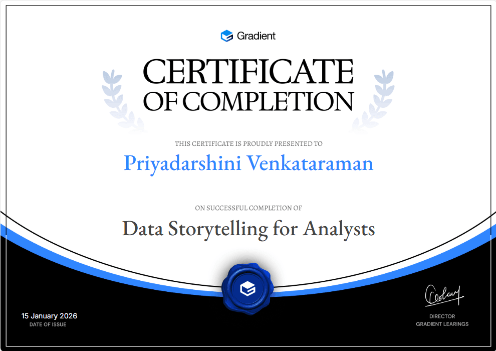
Certificate of Participation
Course
10 Modules
15 Hours 45 Minutes
47 Lessons
47 Challenges
Language: English

FAQ

FREQUENTLY ASKED QUESTIONS

You should already be comfortable working with data in some form, such as building basic charts or running simple analysis, since this course focuses on communication and storytelling rather than teaching data analysis from scratch. It does not require any specific tool, statistics background, or programming language.
No. The course teaches storytelling and communication principles, such as chart selection, narrative structure, and design, that apply regardless of which tool you use to build your charts and dashboards. The skills transfer directly to whatever software you already work in.
The course has 10 modules that move from foundational concepts through narrative structure, chart selection and design, writing, live presentation, and ethics, ending with two full portfolio projects. Each module contains several focused lessons, and each lesson includes examples, common mistakes, best practices, and a practice exercise.
The final module contains two complete end-to-end projects, each with a real business problem, a dataset, specific questions to answer, and a fully worked solution. They are designed to give you concrete, presentable work you can walk through in a job interview or performance review, not just theoretical knowledge.
It is built for data, business, and financial analysts, BI developers and dashboard builders, aspiring analysts building a portfolio, and anyone in a data-adjacent role who regularly needs to turn numbers into a recommendation. It assumes you can already produce analysis and focuses on making that analysis land with an audience.
The full course runs approximately 15 hours and 45 minutes across 10 modules and 47 lessons. Most people move through it over a few weeks, working through one or two modules at a time alongside their regular work.
Yes. Most analysts can already build a chart or a dashboard; this course addresses the separate skill of making that chart or dashboard actually change a decision. It covers narrative structure, audience-specific framing, decluttering, and live presentation, which are rarely taught alongside technical charting skills.
Yes. A dedicated module covers presenting live, handling tough questions and pushback without becoming defensive, and managing situations where a finding contradicts what a stakeholder already believes. It also covers building long-term credibility as a data communicator.
Yes. One module is dedicated to the line between honest persuasion and manipulation, covering common ways charts mislead, confirmation bias and cherry-picking, and how to represent genuine uncertainty honestly instead of with false precision.
You will be able to take a raw dataset, find the story worth telling in it, validate that the pattern is real, structure it into a clear narrative, choose and design the right visuals, write a credible executive summary, and present and defend the finding live or asynchronously. You will also have two complete portfolio projects to show as evidence of these skills.
Scroll Up
GET FREE CAREER COUNSELING