Data Analytics in Product Management: How Analysts Influence Product Decisions
How analysts influence product decisions before, during, and after launch
5 Minutes Read
Data Analytics Program — Data Analytics — Next cohort Starts Oct 24 · 35% Discount
Enroll NowHow analysts influence product decisions before, during, and after launch
Most people picture product analytics as a dashboard that appears after a feature ships, showing whether the launch worked. That picture is not wrong, but it describes the least influential part of the job. The U.S. Department of Labor's O*NET database lists synthesising business intelligence data to support recommendations for action as a core task for this occupation, alongside report generation, which is a broader mandate than producing a chart after the fact. By the time a feature has shipped, the decision that actually mattered, whether to build it at all, and what problem it was supposed to solve, has already been made. A dashboard at that point can confirm a decision or complicate it, but it rarely changes what already happened.
Real influence comes from where in the process an analyst shows up, not from how polished the eventual report looks. An analyst pulled in during discovery, before anyone has committed engineering time, can change a roadmap decision entirely. An analyst pulled in only after launch is, at best, grading a decision someone else already made alone.
Consider Vikram, an illustrative product analyst at PulseFit, a fitness app company in Surat. Two moments from his work anchor this article: a discovery-stage query that reshaped a roadmap decision before a single line of code was written, and a launch that looked like a clear win in week one and did not survive a second look in week four.
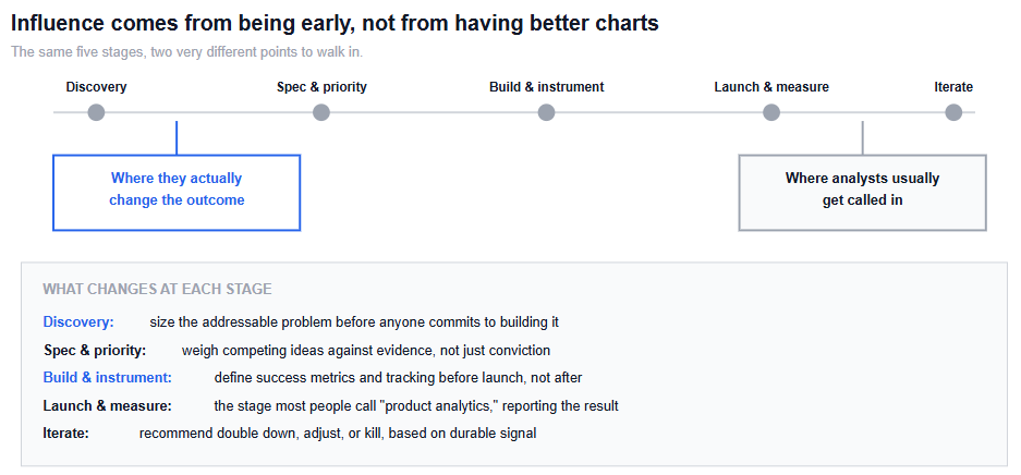
A typical product decision moves through five stages, and the gap between where analysts are usually invited in and where they would do the most good is the central problem this article is about.
Discovery. Before anyone commits to building something, this is where an analyst can size the actual problem: how many users does this affect, how often, and how does that compare to other things the team could build instead. This is also, not coincidentally, the stage analysts are least often invited into.
Spec and prioritisation. Once a few ideas are on the table, this is where evidence should be weighing competing options against each other, not settling for whichever idea the most senior person in the room prefers.
Build and instrumentation. This is the stage most likely to be skipped entirely, and it is the one with the longest consequences. Deciding what to actually measure, and building the tracking for it, has to happen before launch. Once a feature is live, questions the team forgot to instrument for are gone, not delayed.
Launch and measurement. This is the stage most people mean when they say "product analytics": did the metric move, and by how much. It is necessary, but it is also the stage with the least remaining leverage, since the build decision is already behind you.
Iterate. Based on what the data actually shows, weeks after launch rather than days, the team decides to double down, adjust, or kill the feature.
One of the most common ways analytics work gets sidelined in a product organisation is simple: nobody decided what to measure before the feature shipped. This is not a hypothetical gap. Firebase's own event-tracking documentation is explicit that, beyond a small set of automatically logged events, an app must explicitly log up to 500 additional custom event types to collect anything else; nothing outside that instrumented set gets captured after the fact. Once a PM asks "did this work" after launch, an analyst is often stuck reconstructing an answer from whatever data happened to get logged, rather than the data the actual question needed.
This is avoidable, and it is avoidable specifically at the build stage, not after. Defining the success metric, the guardrail metrics that should not get worse, and the exact events that need to be tracked, before a single line of the feature ships, is the highest-leverage moment in the entire cycle for an analyst to be involved. It is also, frequently, the easiest moment to get skipped, since it does not feel urgent until the feature is already live and someone is waiting for an answer that was never instrumented for.
Once a feature does ship, the first metric read is rarely the whole story, and treating it as final is one of the more consequential mistakes an analyst can make on a product team's behalf.
Research on long-running online experiments describes this directly: a novelty effect, where users respond more strongly to a new or unfamiliar feature before that response fades as the feature becomes familiar, is a well-documented pattern in controlled experimentation, distinct from a durable change in behaviour. A feature that produces a strong week-one lift and a feature that produces a durable one can look identical after seven days. A later measurement is one of the clearest ways to distinguish a durable effect from a short-lived novelty response.
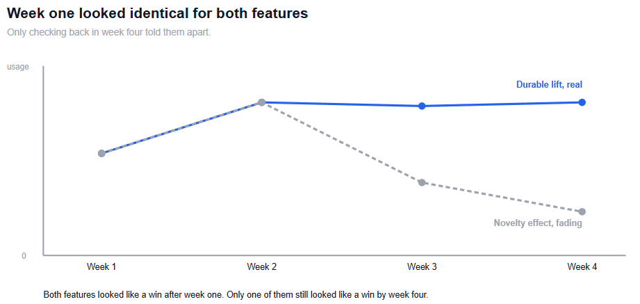
This has a direct practical implication: a product analyst's job does not end when the launch dashboard goes green. Building in a second look, weeks later, is what separates a genuinely informative measurement practice from one that just confirms whatever the team already wanted to believe in week one.
Product teams are not immune to a well-known dynamic in data-informed organisations, sometimes called the HiPPO problem, shorthand for decisions driven by the highest-paid person's opinion rather than evidence. The term appears in the title of the original 2007 paper that introduced it to the experimentation literature, "Practical Guide to Controlled Experiments on the Web: Listen to Your Customers not to the HiPPO," by Ronny Kohavi and colleagues at Microsoft, aimed at exactly this pattern: confident, senior judgment substituting for a look at the actual data. An analyst's job in this dynamic is not to win an argument with authority. It is to make the actual cost of a gut call visible: what does the data say the addressable opportunity actually is, and what would have to be true for the intuition to be right.
This works far better when it happens before a decision is made than after. Evidence presented after a launch, once someone has already committed publicly to an idea, tends to get explained away. The same evidence presented during discovery, before anyone has taken a public position, is simply information.
Only getting involved after launch. By that point, the highest-leverage decisions, what to build and what to track, have already been made without analytical input.
Not defining a success metric before the feature ships. This turns "did it work" into a reconstruction exercise instead of a straightforward measurement one.
Treating a week-one result as final. A lift driven by novelty and a lift driven by real value can be indistinguishable at first glance, and only a second measurement later separates them.
Reporting only the metrics a PM already expects to see. Surfacing an uncomfortable but relevant number is frequently more valuable than confirming an assumption that was already going to be acted on regardless.
Assuming a metric change was caused by the feature that shipped alongside it. Other changes happening at the same time can produce a similar pattern without the feature being the actual cause.
Presenting evidence only after a decision is public. The same data lands very differently before someone has committed to a position than after.
A product manager at PulseFit proposed building a detailed nutrition-tracking feature, confident it would drive meaningful engagement based on user interview feedback. Before any design work began, Vikram ran a query estimating how many active users actually logged meals with enough regularity for the feature to matter, and the number was a small fraction of what the interviews had implied, since the users who agreed to be interviewed were disproportionately the app's most engaged minority. That single query did not kill the idea, but it changed its scope from a headline feature to a smaller, targeted one, before any engineering time was spent building the larger version.
Separately, a redesigned onboarding flow launched a few months later showed a clear jump in day-one activation within the first week, and the initial reaction on the product team was to call it an unambiguous win. Vikram had already flagged, before launch, that he would re-check the same cohort's behaviour four weeks out rather than close the loop at day seven. By week four, the activation lift had mostly faded back toward the previous baseline, consistent with a novelty effect rather than a durable improvement. The team adjusted the flow rather than declaring victory and moving on, which is a smaller, less exciting outcome than a headline win, and also the accurate one.
If the metric you are reporting on needs to survive a stakeholder actually using it, not just displaying it, how to design a KPI dashboard executives will actually use covers that specific problem, and why most executive dashboards fail before anyone opens them covers the more common failure mode.
If your organisation is deciding whether a launch result is a real signal or noise, A/B testing for data analysts covers the rigor a genuine before-and-after comparison actually requires.
And for the underlying judgment behind telling a real move from ordinary variation, which sits behind almost everything in this article, statistics for data analysts is the place to build that skill directly.
Quiz
Question 1 of 10
FAQ
FREE COURSES
A 12-module, hands-on course that teaches product analytics using one real, consistent dataset from start to finish, SQL, funnels, retention, A/B testing, segmentation, churn modeling, and stakeholder communication. Every number is computed and verified, not invented. Ends with two full portfolio projects you can show off.
An 11-module, project-based course for data analysts who need to work fluently with finance data. Covers financial statements, unit economics, forecasting, valuation, market risk, and fraud analytics, all built around one running case company with real code, data, and a full answer key in every module.
A hands-on path from Python fundamentals to production-grade automation, built for data analysts. Learn to clean messy files, pull data from databases and APIs, generate automated Excel/PDF/PowerPoint reports, and schedule it all to run unattended - then go further with logging, secrets management, and workflow orchestration. Built around one consistent scenario: automating a retail company's weekly sales reporting. Closes with two full portfolio projects using real data and complete worked solutions. No prior programming experience required.