AI Hallucinations in Data Analysis: 7 Mistakes to Watch For
What AI hallucinations actually look like inside analytics work, why they are harder to catch than most analysts expect, and the verification habits that protect you
5 Minutes Read
Data Analytics Program — Data Analytics — Next cohort Starts Oct 24 · 35% Discount
Enroll NowWhat AI hallucinations actually look like inside analytics work, why they are harder to catch than most analysts expect, and the verification habits that protect you
The most dangerous output an AI tool produces in an analytics context is not the one that crashes your query. It is the one that runs cleanly, returns a number, and puts that number into a report that goes to a senior leader.
AI hallucinations in data analysis are not dramatic. They do not announce themselves. A hallucinated SQL query does not return an error. A hallucinated metric definition does not flag itself as invented. A hallucinated summary of a dashboard does not include a disclaimer that it skipped the part where performance was declining. These outputs look exactly like correct outputs, which is precisely what makes them dangerous in a domain where the entire purpose is to tell people what is actually true.
This article covers the seven most common ways AI hallucinations show up in analytics work, why each one is easy to miss, and the specific verification habits that protect you and your work. The goal is not to avoid using AI tools. The goal is to use them with the right level of trust for what they are: powerful assistants that require human verification at every step that matters.
The term "hallucination" in AI refers to outputs that are confidently stated but factually wrong, invented, or inconsistent with the actual input. In a general context this might mean a model inventing a citation that doesn't exist, or describing a historical event inaccurately. In an analytics context, it takes forms that are specific to the work analysts actually do.
AI hallucination in data analysis is not always the model making something up from nothing. More often it is:
The model making a plausible assumption where an explicit instruction was needed
The model applying a general pattern that doesn't fit the specific schema, data type, or business logic at hand
The model summarising a dataset by emphasising what it expects to find rather than what is actually in the data
The model generating SQL that is syntactically valid but logically wrong for the question being asked
The common thread is confidence without accuracy. The output reads as if it is correct. It follows the right structure. It uses the right terminology. It produces a number that is within a plausible range. None of those things mean it is right.
Understanding how AI tools are actually changing analytics workflows is useful background here. The AI and GenAI tools guide covers where these tools genuinely speed up work and where they introduce risk. The seven mistakes below are the specific risk zone for analysts using AI tools to write, analyse, or summarise data.
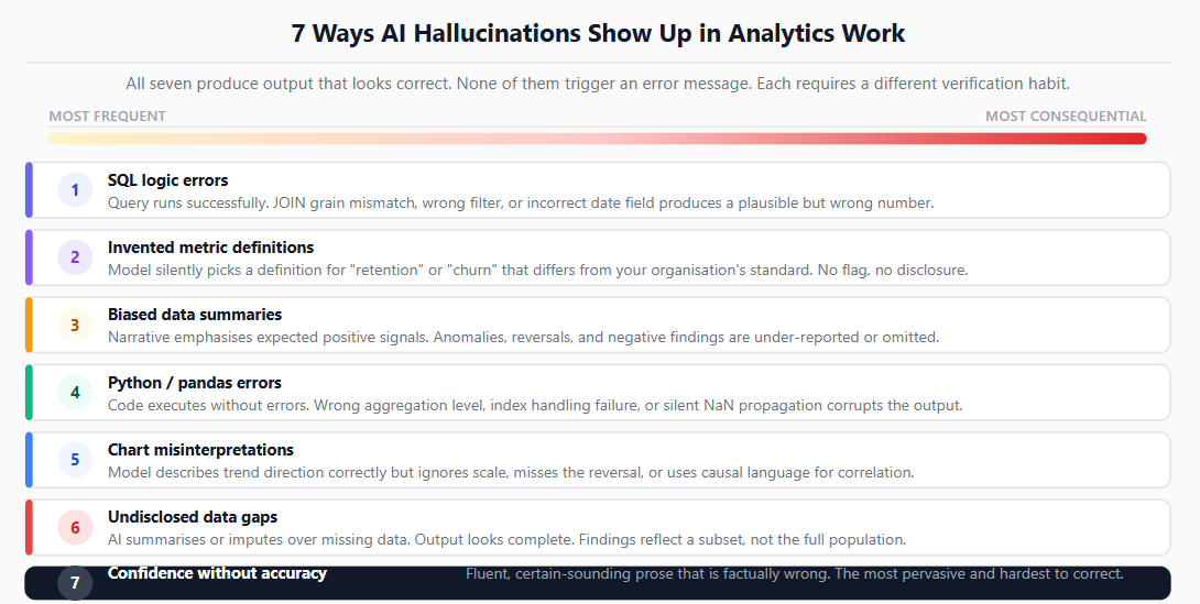
The most frequent hallucination pattern in day-to-day analytics work is AI-generated SQL that runs successfully but answers the wrong question. This is not a syntax error. The query executes, returns rows, and produces a number. The number is wrong because the logic is wrong.
The most common logical errors in AI-generated SQL:
Grain mismatch in JOINs. An AI tool joins an Orders table (one row per order) to an Order Items table (one row per item per order) and then sums a revenue column from the Orders table. Because the join duplicates orders for each item, the revenue total is inflated by the average number of items per order. The query runs. The number is plausible. It is wrong by a factor that depends on your average cart size.
Wrong aggregation scope. The model applies a WHERE clause that filters correctly on one condition but misses a second condition the business logic requires. For example, filtering to status = 'completed' without also filtering out refunded orders, because the schema distinction between completed and net-completed was not explained in the prompt.
Implicit date assumptions. The model assumes that a date filter like WHERE order_date >= '2026-01-01' should use order_date when the correct field for this specific table is created_at, because order_date is the date the order was placed and created_at is the date it was confirmed. Both columns exist. The model picks the more obvious name. The numbers differ.
Invented column names. When a schema is not provided explicitly, some AI models generate column names that seem logical but do not exist in the actual table. The query fails, which is detectable. The subtler version is when the model uses a column name that does exist but means something different from what the model assumed.
The verification habit: Every AI-generated query should be read line by line against the actual schema before it is run against production data. Check the JOIN conditions, the WHERE filters, the GROUP BY logic, and the column names against the data dictionary or a quick DESCRIBE of the relevant tables. This review surfaces the categories of error described above (grain mismatches, missing filter conditions, and wrong column references), which are difficult or impossible to detect from the output alone.
Building strong SQL fundamentals is what makes this verification fast rather than laborious. If you understand joins, aggregation scope, and date logic at the level where you could write the query yourself, you can review an AI-generated version in a fraction of the time it would take you to write it, and you will catch errors that someone without that foundation would miss entirely.
When you ask an AI tool to "calculate retention" or "measure engagement" or "compute the churn rate," the model has to make a choice. What counts as retained? Retained over what time window? Does engagement mean daily active users, sessions per user, or feature adoption? Does churn mean account cancellation, 30-day inactivity, or subscription non-renewal?
The model will make these choices silently and present the output as if the definition were obvious.
This is one of the most consequential hallucination patterns because the error is invisible at the output layer. The metric has a name everyone recognises, a number that looks reasonable, and no indication that the definition used to produce it is different from the definition the stakeholder had in mind.
A concrete example: an analyst asks an AI copilot to "calculate the monthly retention rate for users who signed up in Q1." The model computes the percentage of Q1 users who had any activity in the following month. The stakeholder's definition of retention, embedded in all existing reports, is users who completed a specific key action within 30 days of signup. Both are defensible definitions of retention. They produce numbers that differ by 20 percentage points.
Metric name | Common AI assumption | What your business might actually mean |
|---|---|---|
Retention | Any activity in the next period | Specific key action within a defined window |
Churn | No activity for 30 days | Subscription cancellation event |
Engagement | Sessions or page views | Completion of a core workflow |
Conversion | Any desired action | First purchase, not trial signup |
Active user | Any login | Meaningful feature interaction |
The verification habit: Never accept a metric from an AI tool without asking the model to state its definition explicitly. Add "state your exact definition of [metric] before calculating it" to every prompt that involves a metric computation. Then compare that stated definition against your organisation's documented definition before trusting the number.
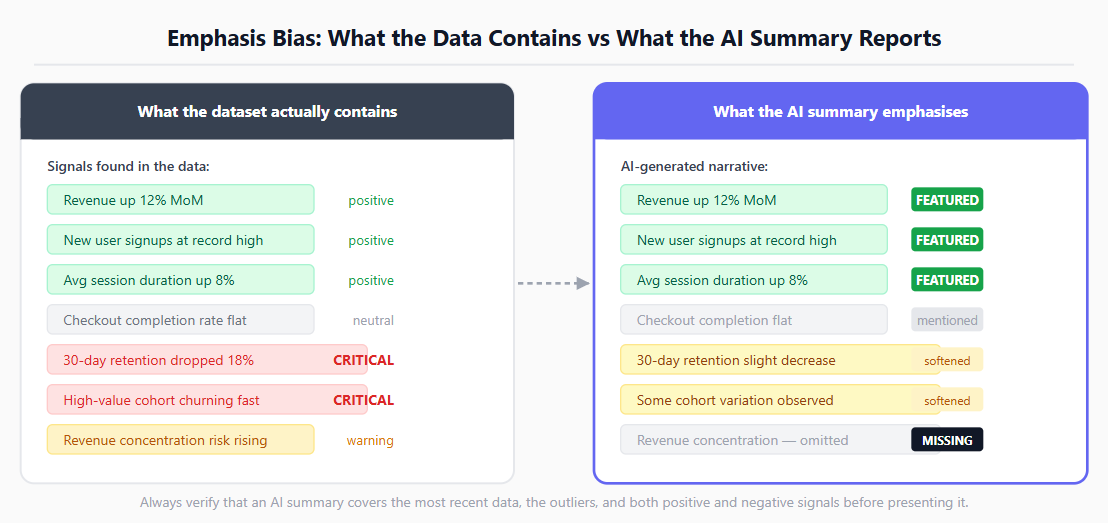
When you feed a dataset to an AI tool and ask it to "summarise the key findings" or "describe what the data shows," the model generates a narrative that is heavily influenced by what it expects the data to show, not only by what the data actually contains.
This manifests in two specific ways.
Emphasis bias. The model finds three positive signals and one negative signal in a dataset and summarises the three positive ones in detail while mentioning the negative one briefly or not at all. The summary is technically accurate but directionally misleading, because the negative signal may be the most important one for the decision being made.
Pattern completion. The model identifies what looks like a trend in the first few rows and describes it as if it holds across the full dataset, without checking whether the trend continues, reverses, or disappears in later data. This is particularly common with time-series data where the most recent period shows a different pattern from the historical one.
The output in both cases reads confidently and coherently. It uses precise language. It cites specific numbers. It does not tell you that it emphasised the parts of the dataset that matched its expectations and de-emphasised the parts that didn't.
The verification habit: Never use an AI-generated data summary as your primary read of a dataset. Use it as a starting point, then verify: does the summary address the most recent data? Does it mention the outliers? Does it cover both the positive and negative signals? Specifically check whatever the summary seems most confident about, because that is where emphasis bias is most likely to produce a misleading picture.
AI tools are highly capable at generating Python code for data analysis tasks. They are also capable of generating Python code that runs without errors, produces an output, and computes the wrong thing. In pandas especially, there are enough ways to express the same operation that a model can produce syntactically valid, logically wrong code consistently.
The most common patterns:
Wrong aggregation after a groupby. The model generates a groupby and then applies .mean() where the correct operation is .sum(), or aggregates at the wrong level. The result is a DataFrame that looks like the right shape with the wrong values.
Index handling errors. After a merge or reset_index operation, the model references a column by name that has been moved to the index, or assumes a column exists that was dropped in a previous step. In some pandas configurations this raises a KeyError. In others, it silently produces a column of NaN values that carry forward into the final output.
Inconsistent date parsing. The model calls pd.to_datetime() without specifying the format parameter. When a column contains mixed date formats, pandas will attempt to infer the format for each value independently. This can produce silently incorrect parses for some rows: a day-first date like 02/03/2026 may be read as February 3rd in one row context and March 2nd in another, depending on the inference logic and surrounding values. Specifying the format explicitly is the only reliable way to prevent this.
Type mismatch on object columns. The model performs arithmetic on a column that is stored as object type. Depending on the pandas version and the actual values in the column, this may raise a TypeError, produce unexpected results after implicit casting, or in some cases propagate NaN silently. The behaviour is not always predictable without knowing the column's actual contents, which the model does not have.
The verification habit: After running any AI-generated Python code, add three checks before accepting the output: print the shape and dtypes of the result DataFrame, spot-check five to ten rows against the source data manually, and verify at least one aggregate against a simpler hand-calculation. Using pandas correctly means understanding what each operation actually does to the data structure, which is what makes these spot-checks fast and reliable rather than guesswork.
Many modern BI tools and AI copilots can generate text descriptions of charts and dashboards. These descriptions are attractive because they save time and produce polished, readable output. They are also one of the highest-risk hallucination surfaces in analytics work, because the model is generating an interpretation of a visual that it is processing statistically rather than reading with the kind of contextual understanding an analyst brings.
The specific failure modes:
Missing the trend reversal. A chart shows a metric growing steadily for twelve months and then declining sharply in the last two months. The model, weighting the full history, describes the metric as "showing steady growth" and notes the recent dip as a minor fluctuation. An analyst looking at the chart would immediately see that the most important story is the reversal, not the overall trend.
Ignoring the scale. A chart showing a 2% change is described as "significant improvement" because the model reads the visual direction but not the scale. Whether 2% is significant depends on context the model does not have: the typical variance in this metric, the business threshold for action, and what a 2% change means for revenue or cost.
Confusing correlation with causation. Two metrics move together in the chart. The model describes one as "driving" the other. This is a fundamental error that an analyst would flag immediately.
The verification habit: Use AI-generated chart descriptions as a draft, not a finding. Read the actual chart yourself before accepting any interpretation. Pay particular attention to the most recent data points, the scale of any changes the model describes as significant, and any causal language the model uses.
This mistake is less about AI error and more about a workflow pattern that produces misleading outputs: using an AI tool to estimate, impute, or describe data that is actually missing, and then presenting the result without flagging that it contains AI-generated fills rather than real observations.
This happens in two common forms.
Explicit imputation without disclosure. An analyst asks an AI tool to "fill in the missing values in this dataset" and the model applies a statistical imputation or, in some cases, generates plausible-looking values based on surrounding data. The result is a complete dataset that contains both real observations and AI-generated estimates. If the downstream analysis doesn't distinguish between the two, and the report doesn't disclose it, decisions are being made on data that partially doesn't exist.
Confident description of sparse data. An analyst asks an AI tool to summarise a dataset that has significant missing values in a key column. The model generates a summary as if the data were complete, because it describes what is there without explicitly accounting for what isn't. A summary of "average revenue per user is $42" from a dataset where 40% of revenue values are NULL is a summary of the non-NULL users only, which may be a very different population from the full user base.
The verification habit: Before feeding any dataset to an AI tool for analysis, check the NULL rate on every key column used in the analysis. If the NULL rate is high enough to materially affect the finding, state that explicitly in the prompt and in the output. What counts as material depends on the analysis: a 10% NULL rate in a revenue column may be acceptable for a rough directional read but not for a precise aggregate used in financial reporting. The report should always distinguish between findings based on complete data and findings based on imputed or estimated data.
Understanding why data quality problems create silent errors in analysis explains why this verification habit matters beyond the AI context: missing data has always been one of the most common sources of wrong answers in analytics, and AI tools make it easier to skip the check that would catch it.
The most pervasive and hardest-to-correct mistake on this list is not a specific technical failure. It is a calibration problem in how analysts interpret AI output.
AI tools are trained to produce fluent, confident, well-structured responses. Uncertainty is not naturally expressed in their output; it has to be explicitly prompted for, and even then the expressions of uncertainty are often boilerplate rather than calibrated to the specific situation. The result is that AI-generated analytical content consistently sounds more certain than it should be.
This matters in analytics because the domain is full of cases where the right answer is "we don't know yet," "the data is too noisy to be conclusive," or "this finding is suggestive but not actionable without further investigation." An AI tool, asked to summarise what a dataset shows, will produce a clear, confident narrative. It will not naturally say "the sample is too small for the pattern to be reliable" unless the analyst specifically prompts for that assessment and understands how to evaluate whether the model's expression of uncertainty is itself accurate.
Confidence in the output is not evidence of accuracy in the output. This is the central mental model shift that separates analysts who use AI tools well from those who use them dangerously.
The practical implication is that every piece of AI-generated analytical content needs the same scrutiny you would apply to a result you calculated yourself and weren't sure about. The fact that the model wrote it in polished, confident prose is irrelevant to whether it is correct.
The verification habit: For any AI-generated finding you plan to use in a report or presentation, ask yourself: "Could I verify this independently without the AI tool?" If yes, do it. If the claim cannot be independently verified, flag it as AI-assisted and note the confidence limitation explicitly. Developing the right instincts about which AI tools are actually worth using for which tasks is part of building this calibration over time.
None of the seven mistakes above are arguments against using AI tools in analytics work. They are arguments for using them with the right mental model.
AI tools in analytics are best understood as very fast, very confident first-draft producers that have no knowledge of your specific schema, your organisation's metric definitions, your data quality profile, or the business context that determines whether a finding is meaningful or misleading.
The analyst's job is not to trust the first draft. It is to verify the first draft efficiently and improve it where necessary. This is a better workflow than writing everything from scratch, because the AI tool handles the structural and syntactic work quickly, leaving the analyst to focus verification effort on the logical and definitional questions that require domain knowledge.
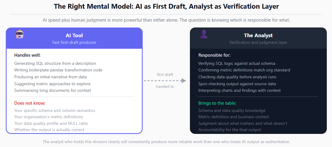
The analysts who will get the most value from AI tools over the next several years are not the ones who trust the tools most. They are the ones who understand what the tools are good at, where they fail, and how to catch the failures efficiently. That combination of AI speed and human judgment is more powerful than either alone.
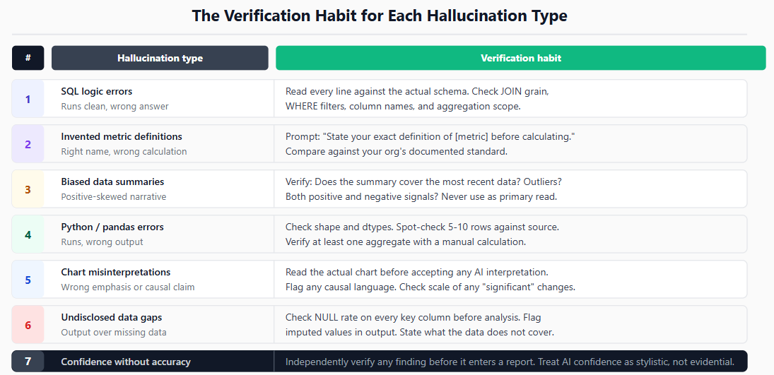
Mistake | What the hallucination looks like | The verification habit |
|---|---|---|
1. SQL logic errors | Query runs, wrong answer | Read every query line-by-line against the schema before running |
2. Invented metric definitions | Right metric name, wrong calculation | Ask the AI to state its definition explicitly before computing |
3. Biased data summaries | Confident narrative that skews positive | Verify the summary covers recent data, outliers, and negative signals |
4. Python/pandas errors | Code runs, wrong output | Check shape, dtypes, spot-check rows, verify one aggregate manually |
5. Chart misinterpretations | Polished description, wrong emphasis | Read the chart yourself before accepting any interpretation |
6. Undisclosed data gaps | Complete-looking output from incomplete data | Check NULL rates before feeding data, flag imputed values in output |
7. Confidence without accuracy | Fluent, certain-sounding text that is wrong | Verify independently; treat AI confidence as stylistic, not evidential |
Schema and definitions
Have you provided the AI tool with the actual schema, not assumed it knows your table structure?
Have you specified the exact metric definition you need, not assumed a general term will produce the right calculation?
Have you confirmed that any column names in the AI-generated output exist in your actual tables?
Data quality
Have you checked the NULL rate on every key column before feeding the dataset to an AI tool?
Is any imputed or AI-estimated data in your output clearly flagged as such?
Have you verified the date range and freshness of the data the AI is working with?
Output verification
Have you read every SQL query line-by-line before running it against production data?
Have you checked Python output shape, dtypes, and at least one manually calculated aggregate?
Have you read the actual chart or dataset before accepting an AI-generated interpretation?
Have you independently verified any finding you plan to include in a report or presentation?
The foundation for catching AI hallucinations in analytics is being strong enough technically that you can verify what the AI produces. The SQL for Data Analysts guide covers the query patterns and logic you need to review AI-generated SQL confidently. For Python-based analysis, the pandas fundamentals guide covers the operations where AI tools most commonly produce wrong output that runs without errors.
For a broader view of how to evaluate which AI tools are genuinely useful for specific analytics tasks versus which ones introduce more risk than they eliminate, the AI tools for data analysts review covers the current landscape with honest assessments of where the tools are and are not ready for unsupervised use.
Quiz
Question 1 of 15
FAQ
FREE COURSES
You'll master funnel analysis (designing funnels, calculating drop-off, segmenting, root-cause diagnosis) and cohort/retention analysis (retention tables, heatmaps, LTV curves, churn-risk signals), all reinforced with hands-on SQL and Python. The course closes with two full portfolio projects built on real datasets: an e-commerce funnel analysis and a SaaS revenue cohort analysis.

This hands-on Pandas course takes you from your first DataFrame to writing efficient, production-ready data analysis pipelines. Learn data cleaning, transformation, aggregation, merging, time series, reshaping, and performance optimization using one realistic e-commerce dataset. Build five complete portfolio projects covering sales, customer cohorts, inventory, revenue trends, and survey analysis. By the end, you'll confidently handle and analyze real-world data for data analyst and data science roles.
A hands-on course that takes you from BI foundations to KPI design, SQL calculation, dashboards, data quality, experiments, and clear communication of insights. Every lesson uses worked examples, exercises, and interview questions. The description is two sentences. If you want it shorter, use: "Learn to design, calculate, analyze, and present KPIs, from BI foundations to dashboards, data quality, and experiments."