The Most Common Reasons Analytics Projects Fail
Why most analytics work never changes a decision, and how to be the analyst who avoids that outcome
8 Minutes Read
Data Analytics Program — Data Analytics — Next cohort Starts Oct 24 · 35% Discount
Enroll NowWhy most analytics work never changes a decision, and how to be the analyst who avoids that outcome
Most analytics projects don't fail because of bad SQL. The query runs. The numbers add up. The dashboard loads. And then nothing happens. No decision is made, no one acts on the output, and six months later the same question gets asked again from scratch.
This is the more common failure mode, and it's much harder to diagnose than a broken pipeline. It happens upstream of the data: in how the project was framed, who was involved, what question was actually being answered, and whether anyone who could act on the output trusted it enough to do so.
Analytics failure isn't usually a technical problem. It's a combination of definitional, organisational, and communication problems that look like technical problems by the time anyone notices. Understanding where things actually go wrong is how analysts avoid repeating the pattern and how they start delivering work that genuinely changes what an organisation does.
This article covers the most consistent failure reasons across analytics work, with the practical habits that prevent each one.
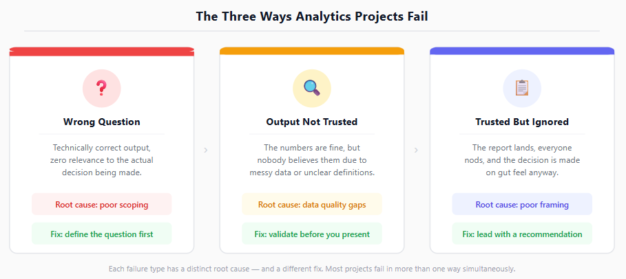
Before getting into individual failure modes, it's worth naming the general shape of the problem. Analytics projects tend to fail in one of three ways:
They answer the wrong question: technically correct output, zero relevance to the decision that actually needed to be made.
They produce the right output but it's not trusted: the numbers are fine, but no one believes them because the data is messy, the definitions are unclear, or the analyst didn't earn credibility with the people who matter.
They produce trusted output but no one acts on it: the report lands, everyone nods, and the decision gets made on gut feel anyway because the insight wasn't framed in a way that made action obvious.
These three failure types map almost perfectly onto the most common individual mistakes listed below. Understanding which failure type you're dealing with is usually the fastest way to diagnose what went wrong.
The single most common reason an analytics project fails is that no one agreed on exactly what question it was trying to answer.
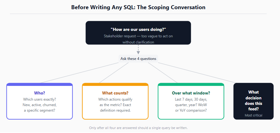
This sounds basic, and it is. Which is why it gets skipped constantly. A stakeholder asks "how are our users doing?" and an analyst starts pulling retention metrics, churn rates, and DAU trends without ever confirming which of those actually maps to the decision being made. Three weeks later the stakeholder looks at the output and says it's not quite what they needed.
The problem compounds at the definition level. "Active user" means something different to the growth team, the product team, and the finance team. "Revenue" might include refunds in one team's model and exclude them in another's. "Conversion" can mean a click, a signup, a purchase, or a first meaningful action depending on who's asking. When the definition isn't locked in at the start, the output is technically correct and practically useless.
Before a single query is written, document the specific business question, the decision it informs, and the exact definition of every metric involved. Then confirm those definitions with the person who will act on the output (not just the person who requested the analysis).
Common vague request | What to clarify before starting |
|---|---|
"How are users engaging?" | Which users? Which actions count as engagement? Over what time window? |
"What's our revenue look like?" | Gross or net? Refunds included? Which product lines? Which date field? |
"Why did signups drop?" | Drop compared to what baseline? Which signup step? Which segment? |
"Is the campaign working?" | What does 'working' mean? What's the success metric? Against what control? |
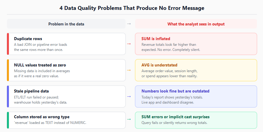
An analyst can write perfect SQL against data that has been silently broken for months. Duplicated rows from a botched ETL run, missing values that were never flagged as missing, a pipeline that stopped updating three days ago: none of these produce an error message. They produce a number that looks completely normal and is completely wrong.
Data quality problems are dangerous precisely because they're invisible at the output layer. The query succeeds. The dashboard populates. The number is wrong.
The most common data quality traps analysts fall into before a project even starts:
Assuming a table is complete. Rows go missing from incomplete pipeline runs, especially near period boundaries like month-end or fiscal quarter close.
Not checking for duplicates before aggregating. A join gone wrong silently duplicates rows; summing revenue across that join inflates every number by the duplication factor.
Treating NULL as zero. A NULL in a revenue column and a zero in a revenue column are different things. Averaging across both gives a wrong result.
Trusting a column's name over its content. A column called is_paid might store integers, strings, or a mix of both depending on when and how it was loaded.
Research consistently shows that data quality issues are among the leading causes of analytics project failure. A Harvard Business Review analysis found that bad data costs organisations an estimated $3 trillion per year in the US alone, and most of that cost is invisible at the point it occurs. Understanding how data gets from source systems into the tables you're querying (the ETL and ELT pipeline) is the foundation of catching these problems early. If you're not already familiar with how that flow works, the databases and data warehouses guide covers the concepts that explain why the data is shaped the way it is before you query it.
A short data quality check before committing to a full analysis is not overhead. It's the difference between producing a correct answer and producing a confident wrong one. At minimum: count rows, check for unexpected NULLs, verify the date range of the latest data, and pull a small sample to inspect raw values before building any calculation on top of them.
Even with a clean question and clean data, an analytics project can fail if the metric chosen doesn't actually measure what the decision-maker needs to act on.
This is the "metric mismatch" failure, and it's more subtle than it sounds. An analyst might measure average session duration when the stakeholder is trying to understand whether users are completing a key action. They might track total signups when the decision is about quality of signups, not volume. They might report week-over-week change when the comparison that actually matters is year-over-year because of seasonality.
A metric is a proxy for something the business cares about. Choosing the wrong proxy produces an answer to a question no one was actually asking.
The check here is to explicitly name the decision the output will feed, then work backward to the metric: what number, if it moved, would cause someone to do something different? That's the metric worth measuring. Everything else is context at best and noise at worst.
Common metric mismatches worth watching for:
Volume metrics when quality matters. More signups isn't better if churn goes up at the same rate. More support tickets isn't worse if satisfaction scores are rising.
Average when distribution matters. Average order value can be stable while high-value orders are disappearing and low-value orders are growing. Both pull in opposite directions and cancel out.
Lagging indicators when leading indicators are available. Revenue is a lagging indicator. Trial activations, feature adoption, or NPS are often leading. Optimising for the lagging indicator is optimising for the past.
Absolute numbers when rates tell a cleaner story. A team that adds 1,000 users this month is doing very differently depending on whether they started with 5,000 or 500,000.
Analytics projects built in isolation (an analyst receives a brief, disappears for two weeks, and surfaces with a complete deck) almost always land badly. The output is technically complete and contextually misaligned, because the context only becomes clear through conversation, not from a one-line request.
The analyst who surfaces a question before starting is almost always more effective than the one who surfaces an answer after finishing. Gartner has consistently reported that poor stakeholder alignment is among the primary reasons analytics initiatives fail to deliver business value. The insight exists, but it never connects to the decision.
Early stakeholder involvement does three things:
It surfaces the actual decision faster. What people ask for and what they're trying to decide are often two different things, and you only learn the real one by asking.
It builds ownership. A stakeholder who helped shape the question is far more likely to act on the answer than one who received the output cold.
It catches scope problems before they cost time. A two-week analysis built on a misunderstood brief is harder to fix than a twenty-minute scoping conversation.
The practical habit is to set a brief alignment meeting or shared written brief before work starts. Not a full requirements document, just enough to confirm: what decision does this feed? What does success look like? Who needs to see the output and who needs to act on it?
A technically correct analysis communicated in the wrong format for the wrong audience is a failed analysis. An executive reading a 12-tab workbook with raw data. A product team handed a statistical significance table without an interpretation. An operations team receiving a presentation when they needed a daily dashboard.
Every analytics output has an audience, and the format should be chosen for that audience's context, not the analyst's convenience. A MIT Sloan Management Review study on data-driven decision-making found that the gap between producing analytical output and actually influencing decisions is almost always a communication and framing problem, not a data problem.
The most common communication failures:
Too much data, not enough insight. Dumping every metric available forces the reader to do the analytical work themselves. The analyst's job is to highlight what matters, not to present everything.
No clear recommendation or implication. "Here's what happened" without "here's what it means and what we should consider doing" leaves the decision-maker without a starting point.
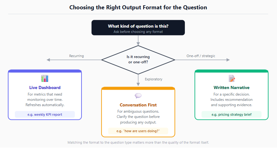
Wrong format for the question. A one-off strategic question deserves a written narrative. A recurring operational question deserves a live dashboard. An exploratory question deserves a conversation, not a formal report.
Buried lead. The most important finding on page 8 of a slide deck will not get read. The most important finding should be the first sentence.
Knowing how to use Python for data analysis and communication matters here. Automated reports, repeatable pipelines, and clean output formatting are all tools that help the right information reach the right person in the right shape. But format choice is a judgment call that comes before any of that.
An analyst who produces a number no one else can reproduce, or can't explain how they got there, has produced output no one will trust (and no one should).
Reproducibility is partly a technical problem (undocumented queries, unnamed spreadsheet tabs, manual steps that aren't recorded) and partly a communication problem (an analysis explained in jargon the audience can't follow). Both versions of the problem have the same outcome: the number sits in a document, gets referenced once, and then gets quietly ignored the next time the question comes up because no one is confident it's right.
If someone asked you "where did this number come from," you should be able to show them the exact query, the exact table, and the exact logic in under two minutes.
The habits that prevent reproducibility failures:
Write SQL that can be re-run, not one-off queries copied into a cell. The SQL for Data Analysts guide covers the query patterns worth making repeatable.
Document definitions in the output itself, not just in your head. What counts as an "active user" in this analysis? Note it.
Version control matters even for analytics work. A query saved with a clear name, in a shared location, with a date and brief description is infinitely more useful than a query in your browser history.
Be able to explain the methodology in plain language. If you can't describe what you measured and how in two sentences without using technical terms, the analysis is not ready to share.
A completed analysis delivered after the decision was already made is not a late analysis. It's a useless one. Analytics projects fail on timing more often than most analysts realise, because the point of the work is to inform a decision, and decisions happen on a schedule that doesn't always wait.
Speed-accuracy tradeoffs are real, but an 80% accurate answer delivered on time beats a 100% accurate answer delivered after the fact.
Two timing failures are common:
Scope creep extends the timeline past the decision window. The project starts focused, then additional questions get added, then edge cases require investigation, and by the time the output arrives the meeting has already happened.
The analyst wasn't in the room when the decision got made. Analytics outputs that travel through several layers of communication before reaching the decision-maker often lose context, nuance, and the ability to answer follow-up questions.
The fix for the first is a clear scope at the start and explicit agreement on what's in scope for this iteration versus what can be addressed in a follow-up. The fix for the second is being closer to the decision: briefing directly, being available for questions, and treating the analysis as a starting point for a conversation rather than a finished deliverable.
As analytics teams adopt AI copilots and natural language querying tools, a new category of failure is appearing: outputs that are generated quickly, look plausible, and are wrong in ways that are difficult to detect without domain knowledge.
AI tools are genuinely useful for accelerating analytics workflows: writing boilerplate SQL, summarising dashboards, and speeding up repetitive tasks. But they are not verification tools, and they do not know when a metric definition is ambiguous, when a data quality problem exists in the underlying table, or when the question being asked is the wrong one.
An AI-generated query that runs successfully is not the same as an AI-generated query that is correct.
The specific risks analysts need to manage when using AI tools for analytics work:
A natural language query tool will choose a metric definition if the underlying semantic layer is ambiguous, and it will not tell you it made a choice.
AI-generated SQL often doesn't account for grain differences between tables, which means a JOIN that looks correct can silently duplicate rows and inflate aggregations.
Summarised outputs from AI copilots compress nuance. "Revenue grew 12% this quarter" from an AI summary may be omitting that the growth was entirely in one segment that's about to churn.
The right mental model for AI tools in analytics is: they speed up the first draft, but the analyst is still responsible for verifying the output, understanding the methodology, and owning the result.
An analytics project that doesn't come with a mechanism to find out whether it was useful is a project that can't improve. Most analytics failures repeat themselves precisely because no one checks whether the output influenced a decision, and no one finds out what would have made it more useful.
The best analysts treat every piece of work as a prototype, not a final product. After an output is delivered:
Did the stakeholder act on it? If not, why not?
Was the framing clear? Was the recommendation obvious?
Did the metric chosen turn out to be the right proxy?
Did any data quality issues emerge after the fact?
These questions don't need a formal retrospective. A brief follow-up message ("was this useful, and is there anything you'd want differently next time?") takes two minutes and compounds significantly over a career.
Without that feedback loop, analysts repeat the same framing patterns, communication choices, and metric selections indefinitely, regardless of whether they're working.
Analytics is not a solo activity, even when it feels like one. The analyst who works alone from brief to delivery, without checking in, without sharing intermediate findings, and without testing their assumptions against someone who knows the business context, is the analyst most likely to arrive at an accurate answer to the wrong question.
Intermediate check-ins do two things: they surface misalignments early, when fixing them is cheap, and they create shared ownership of the output, which makes it far more likely to be acted on.
Share early, share rough, and ask questions before you're sure of the answer. An analyst who says "I'm 60% of the way through this. Here's what I'm seeing so far, does this look right?" is doing something structurally different from one who surfaces a polished final output. The first creates a collaborator. The second creates a recipient.
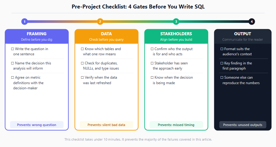
Running through this before beginning any significant analytics work takes under ten minutes and prevents the majority of the failures above.
Framing
Can you write the specific business question in one sentence?
Do you know which decision this analysis is meant to inform?
Have you agreed on the exact definition of every metric involved with the people who will act on the output?
Data
Do you know which tables you're querying and what each row represents?
Have you checked for duplicates, NULLs, and unexpected values in the key columns?
Do you know when the data was last refreshed?
Stakeholders
Have you confirmed who the output is for and who needs to act on it?
Has the stakeholder seen the approach before you've built the full analysis?
Do you know when the decision is being made, so you can hit the right window?
Output
Is the format right for the audience?
Is the most important finding in the first paragraph, not the last slide?
Can someone else reproduce your numbers from your documentation alone?
The failures above span technical and non-technical skills. On the technical side, the foundation is being genuinely fluent with SQL and data. The SQL for Data Analysts guide is the most direct starting point for building or sharpening those skills, and understanding how databases and data warehouses actually work is what lets you catch data quality problems before they reach your output.
On the broader career side, becoming a data analyst is not just about learning tools. It's about developing the judgment to frame the right question, identify the right metric, and communicate the right output to the right audience. The technical layer is necessary but not sufficient; the failures above are proof that the non-technical layer is where the real work happens.
Quiz
Question 1 of 15
FAQ
FREE COURSES
A statistics course built for working Data Analysts, not a general statistics degree. Every lesson passes one test: would a working analyst actually use this on the job. Four modules take you from descriptive statistics and probability through hypothesis testing to regression, all taught on one continuous fictional retailer's data so techniques build on data you already recognize. Closes with two full end-to-end portfolio projects, each ending in a written business recommendation. No unnecessary mathematical depth, no career filler, every number in every lesson verified against real data before it's written down.
Learn to design data models that power accurate, fast, and trusted analytics. Starting from grain, keys, and relationships, you will build star schemas, track history with slowly changing dimensions, and implement tested dbt projects on cloud warehouses. The course ends with two hands-on portfolio projects. Basic SQL is all you need to start.
A 12-module, hands-on course that teaches product analytics using one real, consistent dataset from start to finish, SQL, funnels, retention, A/B testing, segmentation, churn modeling, and stakeholder communication. Every number is computed and verified, not invented. Ends with two full portfolio projects you can show off.