Data Visualization with Python
Learn to create clear, professional data visualizations in Python using Pandas, Matplotlib, Seaborn, Plotly, Streamlit, and Dash with practical projects and real-world business scenarios.

Rutvik Acharya
Principal Data Scientist
Atlassian
Loading modules...
What You'll Learn
Prepare and transform data for visualization
Choose the right chart for different analytical questions
Build professional visualizations with Matplotlib and Seaborn
Apply design, accessibility, and storytelling principles
Who Should Attend
Aspiring Data Analysts
Business Analysts
Data Science Beginners
BI Professionals
CERTIFICATION
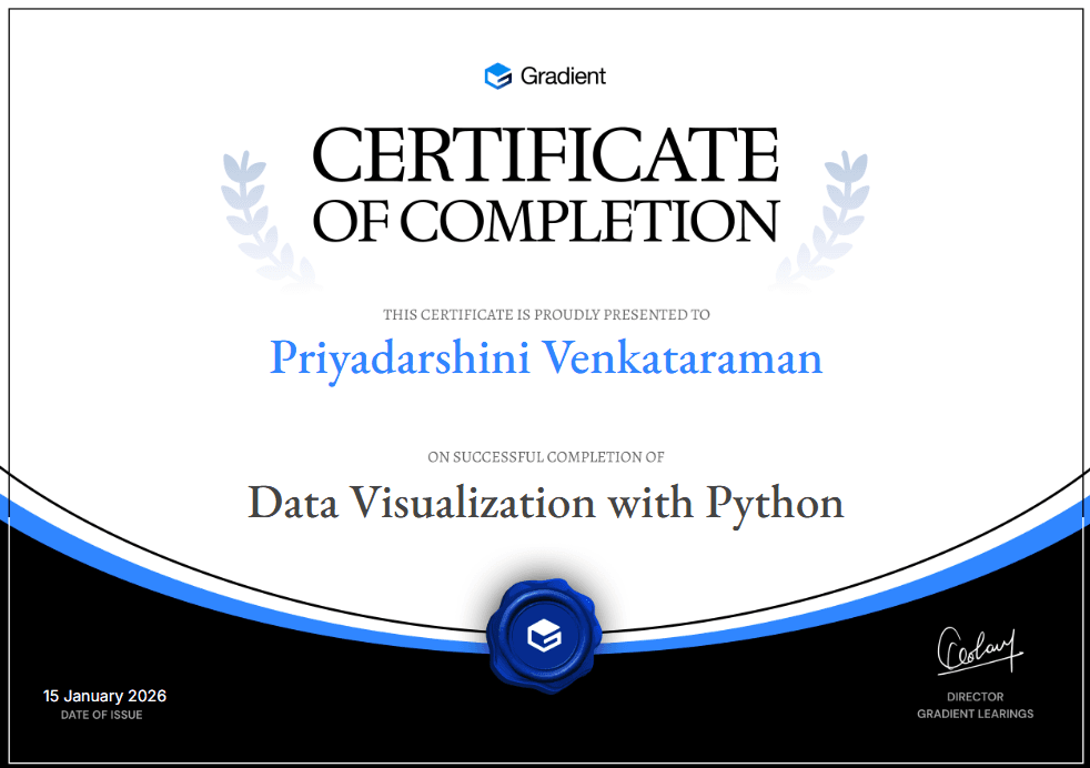
Certificate of Completion

10
20 Hours
50 lessons
50 Challenges
Language: English

Ready for the next step?
Data Analytics Program
Master Python, Power BI, Tableau, SQL and Excel, with AI built into every dashboard and decision.
Check it outFAQ
FREQUENTLY ASKED QUESTIONS
This course is designed for aspiring data analysts, business analysts, Python learners, BI professionals, students, and working professionals who want to build practical data visualization skills.
Basic familiarity with Python is helpful, but the course introduces the visualization workflow progressively and includes the Pandas skills needed for the projects.
You will work with Pandas, Matplotlib, Seaborn, and Plotly, along with Streamlit and Dash for building interactive dashboards and applications.
Yes. The course focuses on matching visualization techniques to analytical questions such as comparison, trends, distributions, relationships, composition, geography, and hierarchy.
Yes. You will learn how to build interactive dashboards and data applications using Streamlit and Dash, including filters, widgets, callbacks, multipage applications, and deployment concepts.
Yes. You will learn how to reshape, clean, aggregate, group, and prepare data with Pandas before creating visualizations.
Yes. You will learn visual hierarchy, color and accessibility, clutter reduction, storytelling structure, chart design principles, and common visualization mistakes.
Yes. Advanced topics include animation, network and graph visualization, 3D visualization, Matplotlib's low-level API, and performance strategies for large datasets.
Yes. The course uses realistic business scenarios throughout the curriculum and includes portfolio-focused projects that combine data preparation, analysis, visualization, storytelling, and business recommendations.
You will be able to prepare data for visualization, build professional static and interactive charts, create dashboards, communicate analytical findings effectively, and develop portfolio-ready visualization work using Python.
Scroll Up
GET FREE CAREER COUNSELING