How to Build a Product Metrics Tree: A Practical Guide
A metrics tree only earns its name if every branch is something one team can actually move, and most trees fail that test before they fail anything else
5 Minutes Read

Data Analytics Program — Data Analytics — Next cohort Starts Oct 24 · 35% Discount
Enroll NowA metrics tree only earns its name if every branch is something one team can actually move, and most trees fail that test before they fail anything else
Most metrics trees fail for the same reason. Someone draws a top metric, adds a few boxes underneath it that sound related, and calls it done. Six months later nobody can say which box moved last quarter, why, or which team was responsible. The tree exists as a slide, not as a working tool, because it was built backwards: shapes first, ownership never.
A metrics tree that works does one specific job. It takes a single number the whole company cares about and decomposes it, level by level, until the bottom row is made of things one team can actually go and change this week. Everything in between exists to connect those two ends honestly. If a box in the middle can't trace up to the top metric and down to an owned action, it isn't part of the tree, it's decoration.
The running example throughout this guide is Marlow, a project management SaaS tool used by small and mid-size teams. Marlow's situation is a common one: usage is healthy, the product has real fans, but growth has stalled and nobody in the leadership meeting can agree on which of six teams should own fixing it. Building a real metrics tree is how Marlow gets out of that meeting with an actual plan.
The top of the tree is a single number that captures the value your product delivers to customers, not a number that merely correlates with revenue. Amplitude, whose product analytics platform popularized this approach at scale, defines it as a metric that aligns to customer value, represents your product strategy, and functions as a leading indicator of success rather than a lagging one like monthly revenue.
Two properties matter more than any other when picking this metric.
It has to reflect realized value, not activity. Amplitude is direct about the failure mode here: "Daily Active Users" or "Registered Users" don't make good North Star metrics, because they say nothing about what your customers value about your product. A user can be "active" by opening the app and closing it again, and a metric that can't distinguish that from genuine value is not a North Star, it's a vanity count.
It has to be a leading indicator. Revenue tells you what already happened. A North Star Metric should move before revenue does, giving the team enough runway to act. Amplitude's own framing puts it plainly: the further upstream of revenue you can get your metric while still capturing real value, the more future impact you can drive by moving it.
For Marlow, the obvious first guess is "monthly active users." It fails both tests: a user can be active without their team getting real value, and it is a fairly direct proxy for revenue rather than a leading indicator of it. Marlow's actual North Star, after working through what a genuinely engaged team looks like, becomes weekly teams with three or more completed tasks. That number captures something specific: a team that is not just logged in but actually using the product to get work done, at a threshold high enough to filter out the accounts that signed up and never really adopted it.
Before decomposing the North Star, it helps to know what kind of product Marlow is, because the shape of a good tree differs by category. Amplitude's research groups products into three broad engagement models: the attention game, where the question is how much time customers spend in the product; the transaction game, where the question is how many transactions happen; and the productivity game, where the question is how efficiently someone gets a task done. Companies playing the same game can still land on radically different North Stars, since each one reflects a different strategy, and a product built around getting work done, like Marlow, is squarely in the productivity game rather than the attention game. That distinction should shape everything below it: a productivity-game tree should reward task completion and speed, not raw time spent in the app.
The North Star Metric on its own is not actionable. Nobody can walk into a sprint planning meeting and "increase weekly teams with three or more completed tasks" directly. It has to be broken into a small number of inputs, the handful of factors that most directly drive it and that some part of the organization can influence.
Amplitude's guidance is to keep this to three to five factors, and a useful starting heuristic is the breadth, depth, frequency, and efficiency pattern: how many people are doing the thing, how much of the thing they're doing, how often, and how well. For Marlow, three inputs cover the North Star cleanly:
Breadth: new teams creating a first project
Depth: tasks completed per active team
Retention: teams still active after week six
Each of these is still too broad to hand to a single team, but together they are a genuine, non-overlapping explanation of what moves the North Star. That non-overlap matters more than it might seem. Barbara Minto, who developed the MECE principle during her time at McKinsey, built it around exactly this requirement: that a good breakdown of a problem is mutually exclusive and collectively exhaustive, meaning the categories don't double-count the same underlying behavior and don't leave a gap between them either. A metrics tree is a MECE breakdown applied to a number instead of a business problem, and the discipline transfers directly: if two of your input metrics would both move when the same underlying behavior changes, they aren't separate inputs, they're one input counted twice.
This is the step almost every tree skips, and it is the one that decides whether the tree is a working tool or a poster.
Each input metric needs to become one or more metrics specific enough that a single team can look at their number, know it's theirs, and know roughly what to do about it. For Marlow:
Breadth breaks into signup-to-first-project conversion rate, owned by the onboarding team, and teams invited by an existing user, owned by the growth team.
Depth breaks into templates used per new project and average project size in tasks, both owned by the core product team working on the project-creation experience.
Retention breaks into six-week team survival rate, owned by the customer success team, and reactivation rate after a dormant month, owned by a small lifecycle marketing function.
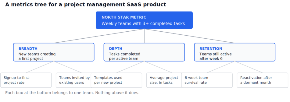
Notice what happened at the bottom row. Every box names a metric, and every metric has exactly one team whose name goes next to it. That is the actual test of whether a tree is finished: if you can't write one team's name next to a bottom-row box, that box needs to be broken down further or it doesn't belong in the tree yet.
A tree that looks structurally correct can still be wrong, in one of three specific ways.
Check the logic runs downhill, not just uphill. It's easy to convince yourself a bottom metric matters because it sounds related to the top one. Test it in the other direction: if the onboarding team doubled signup-to-first-project conversion tomorrow, would weekly teams with three-plus completed tasks visibly move? If the answer is "probably not much," the connection is weaker than the tree implies, and it needs either a different metric or an intermediate step that's currently missing.
Check for metrics that move together for reasons the tree doesn't explain. If templates used per new project and average project size always rise and fall together regardless of what either team does, they may both be downstream of a third factor, like overall account seniority, that the tree hasn't surfaced. Two branches moving in lockstep for unexplained reasons is usually a sign the tree's structure is hiding a variable rather than revealing one.
Check for a behavioral signal underneath every metric, not just a number. Kerry Rodden, the Google UX researcher who developed the HEART framework and the Goals-Signals-Metrics process behind it, describes the discipline as starting from a qualitative goal, identifying an observable behavioral signal that indicates progress toward it, and only then defining the quantifiable metric that captures that signal. Applied to a metrics tree, this means every box should be traceable back to an actual behavior you watched a real team do, not a number that happened to be sitting in the database and looked plausible.
Marlow's team ran this check and found a problem: "templates used per new project" and "average project size" moved together almost perfectly for three straight months. Digging in, both turned out to be driven by a single underlying factor, whether the team's admin had completed a specific setup step. The tree was restructured to put that setup completion rate in as its own metric under breadth instead, since it was really an onboarding factor wearing a depth costume.
Putting a vanity metric at the top. Total registered users or total page views measure activity, not value delivered, and a tree built on top of one will optimize for the wrong thing at every level below it.
Skipping straight from the North Star to team-level metrics. Without the input layer in between, you lose the ability to see which broad lever, breadth, depth, or retention, is actually the problem, and every conversation reverts to guessing.
Letting two branches measure the same underlying behavior. This is the MECE violation, and it shows up as effort being duplicated by two teams who both think they own the same lever, or as a change looking like it moved two metrics when it only really moved one.
Stopping one level too early. If a "team-owned" metric still spans three teams' work, it isn't team-owned yet. Push the decomposition one more level down.
Building the tree once and never revisiting it. A tree reflects a specific theory of what drives value. As the product and strategy change, the theory needs re-testing, not just the numbers.
Confusing the tree with a dashboard. A dashboard shows current values. A tree shows structure and ownership. Conflating the two produces a dashboard with a false sense of causal explanation built into its layout.
Once the tree exists, the natural next question is how to put its top level in front of the people who need to see it moving day to day, and how to design a KPI dashboard executives will actually use covers exactly that translation from a structural artifact to a page someone opens every morning.
The validation step above depends on genuinely understanding what "significant" movement looks like in a metric versus noise, and statistics for data analysts covers the variance and sampling concepts that keep a team from reorganizing the tree in response to what turns out to be random monthly wobble.
Finally, once specific bottom-row metrics need to be tested rather than just tracked, for instance checking whether a new onboarding flow genuinely lifts signup-to-first-project conversion, A/B testing for data analysts covers how to run that test properly rather than eyeballing a chart and hoping.
Quiz
Question 1 of 15
FAQ
FREE COURSES
A 12-module, hands-on course that teaches product analytics using one real, consistent dataset from start to finish, SQL, funnels, retention, A/B testing, segmentation, churn modeling, and stakeholder communication. Every number is computed and verified, not invented. Ends with two full portfolio projects you can show off.
A complete, hands-on introduction to marketing analytics for anyone starting out in the field. Covers the full journey from foundational concepts to job-ready skills: core marketing metrics (CTR, CAC, LTV, ROAS), customer segmentation and cohort analysis, A/B testing and experimentation, multi-touch attribution, SQL and spreadsheet analysis, dashboard design, and forecasting. Every lesson uses a consistent running case study - Northloom, a direct-to-consumer outdoor apparel brand - so concepts build on each other with realistic, connected examples rather than one-off exercises. Includes original diagrams for every lesson and two full end-to-end portfolio projects with real downloadable datasets and worked solutions: an e-commerce campaign performance and segmentation analysis, and a multi-channel attribution and budget reallocation project.
A complete, practitioner-built path into customer analytics, covering the full beginner-to-advanced journey used at real companies. You'll learn the core metrics every customer analyst relies on (CAC, CLV, retention, churn, NRR), how to segment customers with RFM and behavioral analysis, how to run cohort and funnel analysis to diagnose what's actually driving results, how to read Voice-of-Customer data like NPS and CSAT, the basics of A/B testing and experimentation, and simple predictive techniques like churn risk scoring, all using two running example businesses (a subscription app and an e-commerce retailer) so every concept builds on the last.