How to Analyse a Sales Funnel: Conversion Rates, Drop-Offs and Bottlenecks
Defining the steps, computing the right rates, and telling a real bottleneck from a large number
6 Minutes Read
Data Analytics Program — Data Analytics — Next cohort Starts Oct 24 · 35% Discount
Enroll NowDefining the steps, computing the right rates, and telling a real bottleneck from a large number
A funnel chart is one of the easiest visuals to produce and one of the easiest to misread. The bars always narrow, the biggest gap is always visible, and somebody in the room always proposes fixing whichever step has the scariest looking number. None of that is analysis.
The work is upstream of the chart. It sits in three decisions that are usually made implicitly: which population enters the funnel, what time window a user has to complete it, and whether the steps must occur in order. Change any one of those and every conversion rate in your report changes with it.
This article covers those definitions, the three different rates that get conflated as "conversion rate", how to build both a loose and a strict funnel in SQL, how to identify which bottleneck is actually worth fixing, and how segmentation and step timing change the answer.
The running example is an ecommerce checkout funnel for a single month. All figures are illustrative, constructed to make specific patterns visible, and none of them are benchmarks.
A funnel is not a property of your data. It is a model you impose on an event stream, and the model has parameters you have to set.
Three parameters determine every number that follows.
The unit and the entry population. Are you counting sessions, users, or accounts? A session funnel and a user funnel on the same event table give different conversion rates, because a user who browses on Monday and buys on Thursday completes the user funnel and fails two session funnels. Neither is wrong. Reporting one while the stakeholder assumes the other is.
The completion window. A user who adds to cart today and orders in nine days counts as converted only if your window is at least nine days. Longer windows raise conversion rates and slow down reporting, since recent cohorts remain incomplete. Pick a window that reflects the actual purchase cycle, state it on the chart, and keep it fixed across comparisons.
The ordering rule. Must the steps happen in sequence, or is it enough that each event occurred somewhere in the window? This is the strict versus loose distinction, covered in detail below. It changes the numbers materially and it changes what the numbers mean.
The Wikipedia entry on the conversion funnel is a reasonable reference for the general model, but the specific parameters above are yours to choose, and they belong in the documentation next to the metric rather than in an analyst's head. If your organisation runs a metrics layer, this is exactly the kind of definition worth centralising, which is the argument the dbt semantic layer documentation makes for metric definitions generally.
Step conversion, cumulative conversion, and drop-off count answer three different questions. Most funnel arguments are two people using the same phrase for two of them.
Here is the running example for one month of sessions.
Stage | Sessions | Step conversion | Cumulative conversion | Lost at this step |
|---|---|---|---|---|
Session start | 100,000 | | 100.0% | |
Product view | 45,000 | 45.0% | 45.0% | 55,000 |
Add to cart | 18,000 | 40.0% | 18.0% | 27,000 |
Checkout start | 9,000 | 50.0% | 9.0% | 9,000 |
Payment details | 7,200 | 80.0% | 7.2% | 1,800 |
Order complete | 6,480 | 90.0% | 6.5% | 720 |
Step conversion is the stage divided by the stage immediately before it. It is the diagnostic metric, because it isolates one transition and is unaffected by everything upstream.
Cumulative conversion is the stage divided by the entry population. It is the reporting metric, because it is what the business cares about, but it is useless for diagnosis: every stage after a bad step inherits that step's damage and looks broken too.
Drop-off count is the raw number of units lost at the transition. It is the prioritisation metric, because a poor rate on a small population and a decent rate on a large population are very different commercial problems.
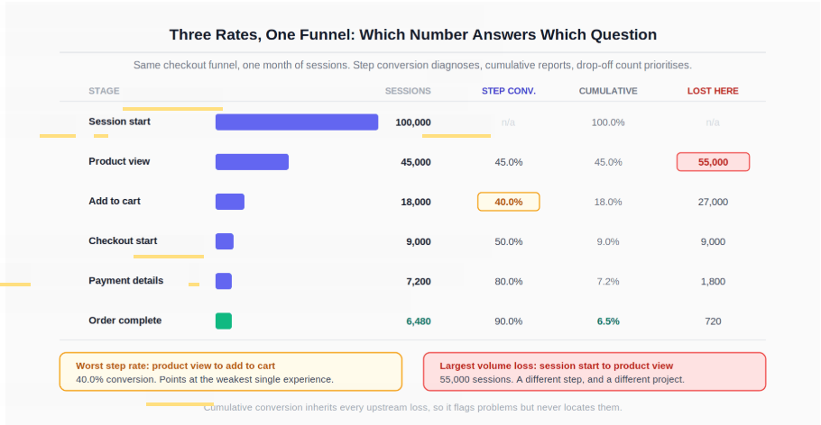
Notice what the table already reveals. The worst step conversion is product view to add to cart at 40.0 percent. The largest absolute loss is session start to product view, where 55,000 sessions disappear. Those are two different steps, and they imply two different projects.
Most funnel logic reduces to collapsing an event stream to one row per unit with the first timestamp of each step. That intermediate table is worth materialising, because both funnel variants and the timing analysis all build on it.
-- Step 1: one row per session, first timestamp of each step.
-- Portable across PostgreSQL, BigQuery and MySQL 8.
WITH step_times AS (
    SELECT
        session_id,
        MIN(CASE WHEN event_name = 'session_start'  THEN event_ts END) AS t_start,
        MIN(CASE WHEN event_name = 'product_view'   THEN event_ts END) AS t_view,
        MIN(CASE WHEN event_name = 'add_to_cart'    THEN event_ts END) AS t_cart,
        MIN(CASE WHEN event_name = 'checkout_start' THEN event_ts END) AS t_checkout,
        MIN(CASE WHEN event_name = 'payment_info'   THEN event_ts END) AS t_payment,
        MIN(CASE WHEN event_name = 'order_complete' THEN event_ts END) AS t_order
    FROM events
    WHERE event_ts >= DATE '2026-07-01'
      AND event_ts <  DATE '2026-08-01'
    GROUP BY session_id
)
The loose funnel asks only whether each event occurred inside the window:
-- Loose funnel: did the step happen at all?
SELECT
    count(*)                                                    AS sessions,
    sum(CASE WHEN t_view     IS NOT NULL THEN 1 ELSE 0 END)     AS viewed,
    sum(CASE WHEN t_cart     IS NOT NULL THEN 1 ELSE 0 END)     AS carted,
    sum(CASE WHEN t_checkout IS NOT NULL THEN 1 ELSE 0 END)     AS checked_out,
    sum(CASE WHEN t_payment  IS NOT NULL THEN 1 ELSE 0 END)     AS entered_payment,
    sum(CASE WHEN t_order    IS NOT NULL THEN 1 ELSE 0 END)     AS ordered
FROM step_times;
The strict funnel requires each step to occur after the one before it. The condition at every stage has to restate the entire chain up to that point, not just the single preceding comparison:
-- Strict funnel: each stage requires the whole sequence up to it.
-- NULL comparisons evaluate to NULL, so those rows fall through to ELSE 0.
SELECT
    count(*) AS sessions,

    sum(CASE WHEN t_view > t_start
             THEN 1 ELSE 0 END) AS viewed,

    sum(CASE WHEN t_view > t_start
              AND t_cart > t_view
             THEN 1 ELSE 0 END) AS carted,

    sum(CASE WHEN t_view     > t_start
              AND t_cart     > t_view
              AND t_checkout > t_cart
             THEN 1 ELSE 0 END) AS checked_out,

    sum(CASE WHEN t_view     > t_start
              AND t_cart     > t_view
              AND t_checkout > t_cart
              AND t_payment  > t_checkout
             THEN 1 ELSE 0 END) AS entered_payment,

    sum(CASE WHEN t_view     > t_start
              AND t_cart     > t_view
              AND t_checkout > t_cart
              AND t_payment  > t_checkout
              AND t_order    > t_payment
             THEN 1 ELSE 0 END) AS ordered
FROM step_times;
Checking only the adjacent pair at each stage does not produce a strict funnel. A condition such as t_cart > t_view on its own counts a session at the cart step even when that session failed the view step, because the two comparisons are evaluated independently. The result is a funnel that can widen partway down, which is both impossible as a user journey and a value that will be read as an instrumentation bug. Repeating the full chain guarantees the counts decrease monotonically, since each stage's condition is strictly narrower than the previous one.
The repetition is verbose. If the funnel has many stages, the maintainable alternative is to compute one step_reached integer per session in a single CASE expression evaluated from the deepest stage backwards, then count sessions at or beyond each level. Both approaches produce identical numbers; pick whichever your team will read correctly six months from now.
The strict funnel is more precise for the defined sequence. The loose funnel measures step exposure rather than sequence. Neither is the correct one in general. If you are diagnosing a checkout flow that users are supposed to traverse in order, strict matches the process you are trying to fix. If you are measuring whether a marketing journey touched certain surfaces at all, loose matches the question. What you must not do is compute one and describe the other.
Two engine notes worth carrying. Timestamp arithmetic and interval literals differ across engines, so a window constraint such as "within 7 days of cart" is written differently in PostgreSQL, BigQuery, and MySQL, and will not port unchanged. And if the underlying data is a partitioned event table in a warehouse, the date filter needs to sit on the partition column or the query will scan far more than it needs to, a point covered in the BigQuery documentation on how event tables are stored and queried.
For the deeper query patterns behind this (window functions for ordering events, careful joins on event streams, and deduplication before aggregation), the essential SQL skills and query guide for data analysts covers the ground this section assumes.
A drop-off number tells you how many left. It does not tell you what they did. The useful follow-up ranks what stalled sessions did instead, but it has a trap in it that is worth stating before the query.
"The next event was not checkout" and "the session dropped off" are different populations. A user who adds to cart, views two more products, and then starts checkout has a next event of product_view while converting perfectly well. Ranking the immediate successor of every add_to_cart event mixes those users in with genuine abandonments, and it double counts any session that added to cart more than once. The fix is to define the stalled population first, from the funnel logic, and only then look at behaviour.
-- Step 1: sessions that reached add_to_cart under the strict funnel's own
-- definition, and never reached checkout_start afterwards.
-- The chain here must match the chain used to count the cart stage.
WITH stalled AS (
    SELECT session_id, t_cart
    FROM step_times
    WHERE t_view > t_start
      AND t_cart > t_view
      AND (t_checkout IS NULL OR t_checkout <= t_cart)
),
-- Step 2: the first event each stalled session produced after the cart.
-- LEFT JOIN keeps sessions whose last action was the cart itself.
-- event_id is a tiebreaker for events sharing a timestamp.
following AS (
    SELECT
        s.session_id,
        COALESCE(e.event_name, '(no further events)') AS next_event,
        ROW_NUMBER() OVER (
            PARTITION BY s.session_id
            ORDER BY e.event_ts, e.event_id
        ) AS rn
    FROM stalled s
    LEFT JOIN events e
           ON e.session_id = s.session_id
          AND e.event_ts   > s.t_cart
)
SELECT next_event, count(*) AS sessions
FROM following
WHERE rn = 1
GROUP BY next_event
ORDER BY sessions DESC;
This returns one row per stalled session, so the counts sum to the drop-off figure in the funnel table rather than to some larger number of event pairs. That reconciliation only holds if the two definitions agree: the WHERE clause above repeats the strict funnel's chain up to the cart stage, so the population is exactly the sessions counted at carted and not at checked_out. If your funnel is the loose variant, use the loose condition here instead. Mixing the two produces a diagnostic breakdown that does not add up to the number it is supposed to explain, which is a hard error to spot because both queries run fine. The PostgreSQL window functions documentation covers ROW_NUMBER, LEAD, and the partition and ordering semantics these queries depend on.
One modelling choice is worth making deliberately. Anchoring on t_cart, the first cart event, answers "what happened after this session first added to cart". Anchoring on the last cart event before abandonment usually answers the more actionable question for multi-item carts, where several adds are normal behaviour rather than a signal.
The output tends to separate into patterns that point at different teams. Sessions returning to browsing or category pages suggest an intent, pricing, or shipping-cost problem. Sessions repeating the same step suggest a technical failure such as a validation error, a double-firing event, or a page that reloads on submit, though for cart events you should confirm the repeat is not just a second item being added. Sessions with no further events tell you nothing on their own and need a user-level or cross-device follow-up, since the journey may simply continue elsewhere.
The step with the worst rate, the step with the largest loss, and the step worth the most money are frequently three different steps.
In the running example, the worst rate is product view to add to cart at 40.0 percent, and the largest volume loss is session start to product view at 55,000 sessions. Neither of those facts tells you where to spend engineering time. For that you need the value of an improvement, and the arithmetic here is more interesting than it looks.
Overall conversion is the product of the step rates: 0.45 × 0.40 × 0.50 × 0.80 × 0.90 = 0.0648, or 6,480 orders from 100,000 sessions.
Now improve one step by 10 percent relative to its own current rate, holding every other step rate unchanged. Total orders become 6,480 × 1.10 = 7,128, a gain of 648 orders. With the other rates held constant, that result is identical no matter which step you improve, because overall conversion is a product and multiplication is commutative.
The table below assumes exactly that: one rate moves, the rest stay where they are.
Improvement scenario (other step rates unchanged) | New step rate | Total orders | Gain |
|---|---|---|---|
Baseline | | 6,480 | |
Product view up 10% relative | 49.5% | 7,128 | +648 |
Add to cart up 10% relative | 44.0% | 7,128 | +648 |
Checkout start up 10% relative | 55.0% | 7,128 | +648 |
Payment details up 10% relative | 88.0% | 7,128 | +648 |
Order complete up 10% relative | 99.0% | 7,128 | +648 |
That assumption is doing real work, and it rarely holds exactly. Pushing more users past a step changes the composition of who arrives at the next one, and the marginal users you newly convert are often less committed than the ones already advancing, so downstream rates can soften as an upstream step improves. Treat +648 as a planning ceiling rather than a forecast, and measure the realised effect at the bottom of the funnel rather than assuming the upstream gain propagates intact.
The practical consequence: position in the funnel does not determine the value of a relative improvement. Prioritisation therefore comes from feasibility and cost, not from which bar looks worst on the chart. A step already converting at 90 percent has little headroom left, so a 10 percent relative lift there may be unachievable, while the same lift on a step converting at 40 percent may be one form redesign away.
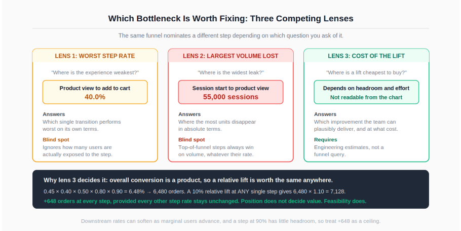
The prioritisation question to bring to the room is therefore not "where is the biggest drop", which the chart already answers. It is "where can we buy a given relative lift most cheaply, and is that lift plausible given the current rate". That reframing is what turns a funnel report into a roadmap input.
Setting up the underlying stage-by-stage measurement is covered in more depth in the guide to finding where customers drop off in a funnel, which pairs naturally with the prioritisation logic here.
An overall funnel can deteriorate while every segment inside it improves. This is not a data error, and it happens whenever the traffic mix shifts.
Two consecutive months, same total sessions:
Month | Device | Sessions | Order rate | Orders |
|---|---|---|---|---|
July | Desktop | 60,000 | 9.0% | 5,400 |
July | Mobile | 40,000 | 3.0% | 1,200 |
July | Total | 100,000 | 6.6% | 6,600 |
August | Desktop | 30,000 | 9.5% | 2,850 |
August | Mobile | 70,000 | 3.5% | 2,450 |
August | Total | 100,000 | 5.3% | 5,300 |
Desktop improved. Mobile improved. Overall conversion fell by 1.3 points. The arithmetic is fully explained by the mix shift: a larger share of sessions landed in the segment with the lower base rate, which drags the weighted average down even when neither segment got worse. Why the mix shifted is a separate question the funnel cannot answer. A paid campaign is a plausible hypothesis, and it is checkable against channel-level session counts for the same two months, but it is a hypothesis rather than a finding until you look. What the numbers do support on their own is narrower and still useful: reporting the aggregate alone here would raise a false alarm, and the team could spend a sprint fixing a checkout that improved in every segment.
The segments worth splitting by default are the ones that structurally differ in conversion behaviour rather than the ones that are convenient: device, acquisition channel, new versus returning, and geography or currency where checkout mechanics differ. Run the step conversion table inside each, and check whether the direction of any change is consistent with the aggregate before you report the aggregate.
When you present segmented funnels, resist stacking every segment onto one chart. A small multiples layout, one identical funnel per segment on a shared scale, makes divergence readable in a way that a single crowded chart does not, and the principles behind that choice are covered in the guide to data visualisation for analysts.
Two steps can convert at the same rate and mean completely different things, depending on how long the transition takes. A checkout step where the median transition is a few seconds and one where it is several minutes are different user experiences even at identical conversion.
-- Median seconds from add_to_cart to checkout_start, PostgreSQL syntax.
-- BigQuery uses APPROX_QUANTILES; MySQL 8 has no direct percentile aggregate.
SELECT
    percentile_cont(0.5) WITHIN GROUP (
        ORDER BY EXTRACT(EPOCH FROM (t_checkout - t_cart))
    ) AS median_seconds_to_checkout
FROM step_times
WHERE t_checkout > t_cart;
Report the median and an upper percentile rather than the mean, since these distributions are heavily skewed by sessions that resume hours later. Two patterns are worth watching for. A step whose conversion is stable while its time to complete grows is usually degrading before the rate reflects it. And a step with a long tail of very slow completions is often two distinct populations sharing one metric, typically users completing in one sitting and users returning later, which is an argument for splitting the funnel rather than averaging across both.
A funnel analysis is observational. It shows where users stop, not why they stopped, and certainly not what would happen if you changed the step. Keep the wording matched to that.
What the funnel shows | Wording that fits | Wording that overclaims |
|---|---|---|
A step with low conversion | "40 percent of product viewers add to cart" | "The product page is broken" |
A drop that coincides with a release | "Conversion fell in the week following the release" | "The release caused the drop" |
A segment converting worse | "Mobile converts below desktop at this step" | "Mobile users have less intent" |
A fix followed by improvement | "Conversion rose after the change shipped" | "The change lifted conversion by X" |
The last row is the one that matters most commercially, because it is the claim that gets used to justify the next quarter's roadmap. A before and after comparison on a funnel step shares the window with everything else that shipped, plus seasonality and traffic mix. If the number is going to be used to make a decision, the honest version pairs the observed movement with a proposal to measure it properly through a holdout on the next rollout.
Where the finding is unwelcome (a flagship feature that did not move the funnel, or a campaign that shifted mix and depressed the headline rate), the framing patterns in how to present difficult findings to senior leaders apply directly. Lead with the number, name the alternative explanation you cannot eliminate, and bring the cheapest test that would settle it.
The queries above assume comfort with window functions, event-stream deduplication, and multi-step CTEs, all of which are covered in the essential SQL skills and query guide for data analysts.
For the stage-definition and instrumentation side of funnel work, the deeper treatment in finding where customers drop off in a funnel covers what this article compressed into the definitions section.
For presenting segmented funnels so that divergence is actually visible, the layout and encoding principles in the data visualisation guide are directly applicable.
If the funnel report needs to live as a refreshable dashboard rather than a one-off query, the walkthrough in Power BI for beginners covers building the stage measures and slicers that segmentation requires.
Quiz
Question 1 of 15
FAQ
FREE COURSES
You'll master funnel analysis (designing funnels, calculating drop-off, segmenting, root-cause diagnosis) and cohort/retention analysis (retention tables, heatmaps, LTV curves, churn-risk signals), all reinforced with hands-on SQL and Python. The course closes with two full portfolio projects built on real datasets: an e-commerce funnel analysis and a SaaS revenue cohort analysis.
A complete, practitioner-built path into customer analytics, covering the full beginner-to-advanced journey used at real companies. You'll learn the core metrics every customer analyst relies on (CAC, CLV, retention, churn, NRR), how to segment customers with RFM and behavioral analysis, how to run cohort and funnel analysis to diagnose what's actually driving results, how to read Voice-of-Customer data like NPS and CSAT, the basics of A/B testing and experimentation, and simple predictive techniques like churn risk scoring, all using two running example businesses (a subscription app and an e-commerce retailer) so every concept builds on the last.
A 12-module, hands-on course that teaches product analytics using one real, consistent dataset from start to finish, SQL, funnels, retention, A/B testing, segmentation, churn modeling, and stakeholder communication. Every number is computed and verified, not invented. Ends with two full portfolio projects you can show off.