Exploratory Data Analysis for Data Analysts

EDA sits between cleaned data and formal statistical testing, and this course treats it as its own real skill rather than a warm-up step. Five modules cover the EDA mindset, fast univariate and bivariate scanning, multivariate and time-based exploration, anomaly spotting, and turning an exploration session into a prioritized findings summary. Built on a full year of realistic daily business data, including genuine seasonality and two deliberately planted data quality anomalies that a later lesson finds and resolves. Closes with a cold first-look investigation on an unfamiliar dataset and a full performance deep-dive project.

author

Rutvik Acharya

Principal Data Scientist

Atlassian

Loading modules...

What You'll Learn

Run a structured first look on any new dataset in minutes, not hours

Scan variables and relationships fast to know where to focus deeper analysis

Spot hidden confounders, shape differences between groups, and real anomalies by eye

Turn a messy exploration session into a prioritized, decision-ready findings summary

Who Should Attend

Data Analysts who jump straight to charts without a repeatable exploration process

Anyone who has missed an obvious pattern or data issue that a proper first look would have caught

Analysts who want to build faster intuition before reaching for formal statistical tests

Teams wanting a shared, consistent approach to exploring new datasets

CERTIFICATION

Certificate of Completion
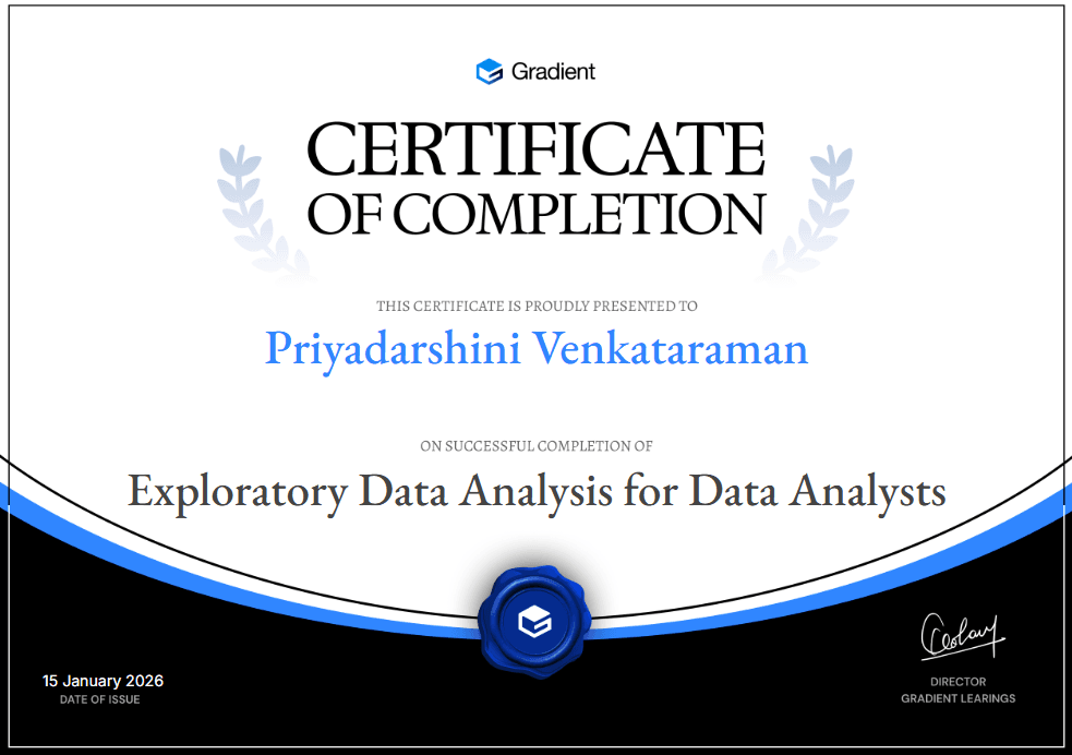
Certificate of Participation
Course
5 Modules
4 Hours
13 Lessons
13 Challenges
Language: English

FAQ

FREQUENTLY ASKED QUESTIONS

The dataset's grain (what one row represents), its scope, each column's real data type, which variables matter most, and a realistic range for the key numbers — all before a single chart gets built, so later mistakes get caught early.
With a real side-by-side example: the same 4% difference in a metric, shown honestly on a zero-based axis and shown misleadingly on a truncated one that makes it look like a 150% jump — using identical underlying numbers.
A store's revenue figure that's wildly out of line with its neighbors gets traced, step by step, from a suspicious summary statistic down to one specific row — a data entry error, confirmed and explained, not just flagged.
Yes — through a real case where pooling data across store types shows a strong relationship that doesn't actually hold for any individual store type once you split the data apart, a genuine example of a hidden confounder appearing in an ordinary-looking correlation.
At the level an analyst actually needs day to day: spotting trend and seasonality by eye, and specifically checking whether a metric that looks healthy at the aggregate level might be hiding a problem in a specific subgroup or time window.
It teaches you to check the full shape, not just the average — two groups can have the same mean and completely different spread, or different means and the same underlying shape, and the course shows a real case of each.
Through a structured findings summary format that ranks discoveries by business impact rather than the order you found them in, since the most useful finding is rarely the first thing you notice.
The first is a cold investigation of a completely new dataset, testing the full process from a blank start. The second revisits a familiar dataset with a new, specific business question — a deep dive rather than a first look, ending in a staffing recommendation.
Yes — it draws a clear line between a chart built to explore (fast, disposable, for you) and a chart built to monitor (a dashboard, for repeated use by others), and how to tell which stage you're actually in.
By staying at the "does this look right" level rather than the formal test level — this course teaches you to notice a pattern is worth investigating; the Statistics course teaches you how to test it rigorously once you have.
Scroll Up
GET FREE CAREER COUNSELING