Time Series Analysis for Data Analysts: Trends, Seasonality and Forecasting
Getting the calendar right, separating trend from seasonality, and testing a forecast before you defend it
5 Minutes Read
Getting the calendar right, separating trend from seasonality, and testing a forecast before you defend it
Time series work fails earlier than most analysts expect. Not at the model, which usually behaves. At the calendar: a series with silent gaps, a final period that is still filling, a year-over-year comparison that lines up Tuesdays against Saturdays, or a timestamp bucketed in UTC while the business runs on local time. Every one of those produces a chart that looks fine and a number that is wrong.
The modelling itself is the easier half. A seasonal naive baseline takes one line and is frequently competitive with something far more elaborate, which is exactly why it belongs in the comparison.
This article covers the data preparation that determines whether anything downstream is valid, how to separate trend from seasonality and read each correctly, how to build baselines before models, and how to evaluate a forecast without accidentally letting it see the future.
The running example is three years of daily orders for a subscription ecommerce business, with weekly seasonality, a softer annual cycle, and growth. All figures are illustrative rather than benchmarks.
Most time series errors are not modelling errors. They are date handling errors that survive into the model because nothing crashes.
Four checks belong at the start of every time series task.
Gaps. A daily series stored as one row per day with orders is not the same as a daily series stored as one row per day that had orders. Days with zero activity usually do not appear in the source table at all, and every rolling calculation downstream will quietly close over that hole. Build a date spine and left join to it, so zero days exist as zeros rather than as absences.
Grain and aggregation boundaries. Weekly buckets need a defined start day, and changing it shifts every value. Monthly buckets have unequal lengths, so a 28 day February will look like a decline against a 31 day January even when the daily rate is flat. Either normalise to a daily rate for comparison, or say explicitly that you are comparing calendar totals.
The incomplete final period. The current week or month is partial, and plotting it alongside complete periods manufactures a cliff at the right edge of every chart. Either exclude the incomplete period, or mark it clearly and never let it drive a trend statement.
Timezone and daylight saving. Bucketing UTC timestamps into local calendar days shifts activity across the day boundary, and the size of that shift changes twice a year under daylight saving. Convert to the business timezone before truncating to a date. The Python datetime documentation covers the distinction between naive and aware datetimes, which is the specific thing that goes wrong when a pipeline mixes both.
In pandas, the gap problem becomes visible in one line:
import pandas as pd

s = (orders
     .assign(order_date=lambda d: pd.to_datetime(d["order_date"]))
     .set_index("order_date")["orders"]
     .sort_index())

# asfreq exposes missing days as NaN instead of silently skipping them.
daily = s.asfreq("D")
print(daily.isna().sum(), "missing days")

# Decide explicitly: a true zero-activity day is 0, a broken pipeline day is not.
daily = daily.fillna(0)
That last distinction matters. A missing day caused by no orders and a missing day caused by a failed ingestion job both appear as NaN, and filling both with zero turns an outage into a real business decline. Check the source system before you fill.
A time series is easier to reason about as three separate components than as one line, because each one answers a different business question and each one has a different failure mode.
Decomposition splits the observed series into a trend, a repeating seasonal component, and a remainder. The trend answers "which direction is the business moving". The seasonal component answers "what does a normal week look like". The remainder is where genuine events live: promotions, outages, and one-off spikes that neither of the other components explains.
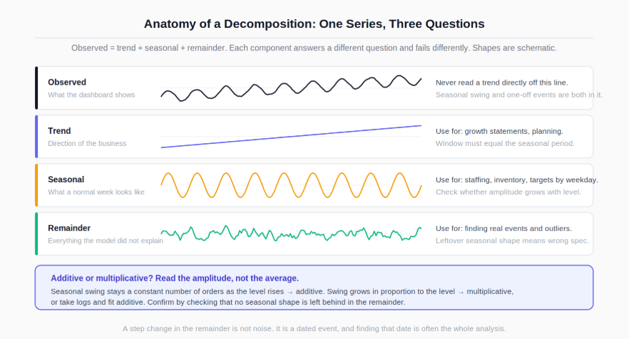
The choice between additive and multiplicative decomposition is not cosmetic. In an additive model the seasonal swing is a fixed number of orders regardless of level. In a multiplicative model it is a fixed percentage, so the swing grows as the business grows. Look at the amplitude of the seasonal peaks over time: if the peaks widen as the level rises, the series is multiplicative, and either fit a multiplicative decomposition or take logs and fit an additive one. Getting this backwards produces a remainder with visible seasonal structure still in it, which is the diagnostic to check.
Read the remainder rather than discarding it. A remainder that looks like noise means the model has captured the structure. A remainder with a step change in it means something happened on a specific date, and finding that date is often the entire analysis.
The moving average is the workhorse here, and its one rule is easy to get wrong.
The window has to match the seasonal period, or the trend line inherits the seasonality it was supposed to remove. For a daily series with weekly seasonality, that means a 7 day window. A 5 day or 10 day window leaves weekday structure in the output and produces a "trend" that wobbles with the weekend.
Two further properties are worth knowing. A trailing moving average lags the underlying level by roughly half the window, so a 7 day trailing average responds about three days late, which matters when someone asks whether a decline started before or after a launch. And for even numbered periods (a 12 month cycle, for example) a simple centred average does not align to whole periods, which is why implementations use a doubled moving average for those cases. The NIST/SEMATECH e-Handbook of Statistical Methods covers the smoothing definitions and their properties in detail.
In SQL, the frame clause carries a trap:
-- PostgreSQL. ROWS counts rows, not days.
-- On a gapped series this silently averages over a longer real interval.
SELECT
    order_date,
    orders,
    avg(orders) OVER (
        ORDER BY order_date
        ROWS BETWEEN 6 PRECEDING AND CURRENT ROW
    ) AS ma7_rows_unsafe,

    -- RANGE with an interval is defined on the date values themselves,
    -- so gaps stay gaps. Supported in PostgreSQL and MySQL 8;
    -- BigQuery RANGE frames take numeric offsets, not intervals.
    avg(orders) OVER (
        ORDER BY order_date
        RANGE BETWEEN INTERVAL '6 days' PRECEDING AND CURRENT ROW
    ) AS ma7_range
FROM daily_orders
ORDER BY order_date;
If the series has been gap filled against a date spine the two agree. If it has not, ROWS BETWEEN 6 PRECEDING reaches back across missing days and averages a window that is seven rows but more than seven days wide. The PostgreSQL window functions documentation sets out the frame semantics that distinguish the two, and the broader query patterns behind this sit in the essential SQL skills and query guide for data analysts.
pandas draws the same distinction through the window argument type:
# Integer window: 7 observations, whatever dates they fall on.
daily.rolling(7).mean()

# Offset window: 7 calendar days, requires a DatetimeIndex.
daily.rolling("7D").mean()

# Centred, for describing history rather than tracking the present.
daily.rolling(7, center=True).mean()
Use the trailing version for monitoring, where you only have the past, and the centred version for describing a completed period, where the lag would misplace a turning point. The pandas documentation covers the rolling and resampling API these examples rely on, and the surrounding workflow skills are in the guide to Python skills every data analyst needs.
Seasonality is repetition at a known period. Calendar effects are the messier cousin: they are not periodic in a clean way, and they distort comparisons that assume they are.
A year-over-year comparison on a daily series with weekly seasonality should usually offset by 364 days, not 365. Three hundred and sixty five days back is a different weekday, so a Tuesday gets compared against a Monday and the weekday effect contaminates the growth number. Three hundred and sixty four days is exactly 52 weeks and preserves the weekday.
-- Weekday-aligned year-over-year on a gap-filled daily series.
-- PostgreSQL interval syntax; BigQuery uses DATE_SUB(order_date, INTERVAL 364 DAY).
SELECT
    d.order_date,
    d.orders,
    p.orders AS orders_52w_ago,
    CASE WHEN p.orders > 0
         THEN round(100.0 * (d.orders - p.orders) / p.orders, 1)
    END AS yoy_pct
FROM daily_orders d
LEFT JOIN daily_orders p
       ON p.order_date = d.order_date - INTERVAL '364 days'
ORDER BY d.order_date;
The other calendar effects worth handling explicitly:
Effect | What it does to the number | Standard handling |
|---|---|---|
Month length | February looks weak, March looks strong | Compare daily rates, or count trading days |
Weekday mix | Months with five Saturdays inflate retail totals | Normalise by weekday composition |
Moving holidays | Easter and Diwali shift between periods | Align on the holiday, not the calendar date |
Leap year | One extra day in the annual total | Note it, or use a 364 day offset |
None of these are exotic. They are the reason a monthly report can show a decline in a month where the business performed identically, and the reason someone senior will ask about it.
When you plot a seasonal series, avoid stacking multiple years on one continuous axis and expecting a reader to see the pattern. A seasonal subseries layout, where each weekday or month gets its own small panel across years, makes the seasonal shape and its drift visible in a way a single long line does not. The encoding principles behind that choice are in the guide to data visualisation for analysts.
A forecast is only meaningful relative to what a trivial method would have produced. Report the baseline alongside the model or the accuracy number says nothing.
Three baselines cover most business series, and all three are one line of code.
Baseline | Prediction for period t | Appropriate when |
|---|---|---|
Naive | The last observed value | Series is close to a random walk, short horizons |
Seasonal naive | The value from one full cycle ago | Strong, stable seasonality (weekly, annual) |
Drift | Last value plus the average historical change | Steady trend with weak seasonality |
For a daily series with weekly seasonality, seasonal naive means "next Tuesday equals last Tuesday". It is often hard to beat by much, and that is the useful information: if an elaborate model beats seasonal naive by a small margin, the added maintenance cost is a real business question rather than a formality.
Beyond baselines, the practical ladder for an analyst is exponential smoothing methods that handle level, trend, and seasonality explicitly, then regression with calendar features (weekday, month, holiday flags, promotion flags) when you need to attribute movement to drivers, then the ARIMA family when the autocorrelation structure genuinely warrants it. Two decisions matter more than which family you pick.
Forecast at the level you will act on. Aggregated series are smoother and easier to forecast than their components, so a total that forecasts well can decompose into per-region forecasts that are individually poor. If the decision is made per region, evaluate per region.
Match the horizon to the question. A model tuned to predict tomorrow and a model tuned to predict next quarter are different exercises with different error profiles. Errors grow with horizon, so quoting a single accuracy figure without stating the horizon is not interpretable.
A random train and test split on time series data leaks the future into training and produces accuracy figures that cannot be reproduced in production.
Randomly holding out 20 percent of days means the model trains on Wednesday and Friday and is tested on the Thursday in between, surrounded by information it will never have when it runs for real. The resulting error is optimistic, sometimes dramatically so. The correct approach preserves time order.
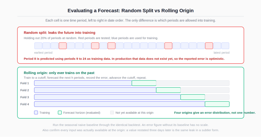
Rolling origin evaluation (also called walk forward, or time series cross validation) trains on everything up to a cutoff, forecasts the next h periods, records the error, then advances the cutoff and repeats. You end up with an error distribution across many origins rather than a single number from one arbitrary split, which also tells you how stable the model is.
# Rolling-origin backtest skeleton. h is the horizon you actually need.
h = 14
initial = 365 * 2          # minimum history before the first forecast
step = 7                   # advance the origin one week at a time

errors = []
for cutoff in range(initial, len(daily) - h, step):
    train = daily.iloc[:cutoff]
    test  = daily.iloc[cutoff:cutoff + h]
    preds = forecast(train, horizon=h)     # any method, including a baseline
    errors.append((test - preds).abs().mean())

print("MAE across origins:", pd.Series(errors).describe())
On error metrics, the choices carry real consequences.
MAE is in the units of the series and is easy to explain, but it cannot be compared across series of different scale. RMSE penalises large misses more heavily, which is appropriate when a big error costs disproportionately more (stockouts, capacity planning) and inappropriate when it does not. MAPE is undefined when actuals are zero and unstable when they are near zero, which rules it out for sparse or intermittent series, and it penalises over-forecasting more heavily than under-forecasting by construction. MASE compares against a seasonal naive benchmark and is therefore scale free and directly interpretable: below one means better than seasonal naive, above one means worse.
Whatever you choose, report it against the baseline computed under the identical backtest. An MAE quoted alone is a number without a scale.
A point forecast is the least useful part of a forecast. It is a single number from a distribution, and it will be wrong.
Report an interval and state what it means. A prediction interval widens with horizon because uncertainty compounds, and that widening is information the business needs when deciding how much buffer to hold. A forecast presented as a single line invites planning that treats it as a commitment.
Three qualifications belong next to every forecast you publish:
The horizon and the vintage. What period it covers and what data cutoff produced it. A forecast without a cutoff date cannot be evaluated later.
The assumption of continuity. Statistical forecasts assume the process that generated history continues. A pricing change, a channel launch, or a competitor exit invalidates that, and the model cannot know it happened. Name the known upcoming interventions rather than letting the model absorb them silently.
The backtest result. The error the method produced at this horizon on held out history, alongside the baseline's error.
When the forecast contradicts a plan that leadership has already committed to, the framing patterns in how to present difficult findings to senior leaders apply directly: lead with the number, state the interval, name the assumption that would have to break for the plan to be right, and bring the check that would settle it.
The resampling, rolling, and offset mechanics above assume comfort with a DatetimeIndex and the pandas time series API, which the introduction to pandas for analysts covers from the ground up.
For the wider Python toolkit these workflows sit inside, including the environment and library setup that time series work needs, the guide to Python skills every data analyst needs is the natural next step.
For the SQL side, window frames, date spines, and self joins on offset dates are all covered in the essential SQL skills and query guide for data analysts.
And for presenting seasonal series and forecast intervals so that readers see uncertainty rather than a single confident line, the data visualisation guide covers the relevant encoding choices.
Quiz
Question 1 of 15
FAQ