North Star Metric vs KPI: How to Choose the Right Metrics for Your Business
Screening a candidate metric, decomposing it into owned inputs, and pairing it with guardrails
5 Minutes Read
Screening a candidate metric, decomposing it into owned inputs, and pairing it with guardrails
The argument usually starts as a definitional one and stays there. Someone says the north star should be revenue. Someone else says revenue is a lagging indicator. A third person points out that the company already tracks forty KPIs and nobody looks at them. Nothing gets decided, and the dashboard grows by two tiles.
The distinction is not academic, and it is not about which number is most important. A north star metric is a single leading measure of the value customers receive, chosen so that moving it reliably moves long-term revenue. A KPI is any indicator a team is accountable for. One is a coordination device for a whole company. The other is a management tool for a function. Confusing them produces either a north star nobody can influence or a set of KPIs pulling in different directions.
This article covers how the two differ in practice, how to screen a candidate north star before committing to it, how to decompose it into inputs that individual teams actually own, what guardrails are for, and how to write a metric definition that survives contact with three teams.
The running example is a B2B collaboration SaaS product. Figures are illustrative and constructed so the arithmetic is checkable.
Most metric confusion dissolves once you separate four categories that get lumped together as "KPIs".
Type | Purpose | Time horizon | How many |
|---|---|---|---|
North star | Aligns the whole company on delivered value | Leading, weekly or monthly | Exactly one |
Input metric | Decomposes the north star into movable parts | Leading, weekly | One per major driver |
KPI | Holds a team accountable for its area | Mixed | A handful per team |
Guardrail | Detects damage caused by pursuing the north star | Lagging or leading | A small fixed set |
Two clarifications that resolve most disputes.
Revenue is usually a poor north star and an excellent KPI. It is the outcome you want, but it is lagging, it moves for reasons no single team controls, and a product team cannot act on it this week. That does not demote it. It stays on the executive dashboard as the outcome the north star is supposed to predict.
Having one north star does not mean having one metric. The north star is the alignment device. Teams still need their own KPIs, and the company still needs guardrails. What "one metric that matters" is arguing against is having five competing top-level goals, not against measuring anything else.
A candidate north star has to clear five tests. Most popular candidates fail at least two, and the failures are predictable.
1. Does it reflect value the customer receives? Not value you extracted, value they got. Registered users measures your success at collecting signups; it says nothing about whether anyone got anything.
2. Is it leading rather than lagging? It should move before revenue does, so it functions as a steering wheel rather than a rear-view mirror.
3. Can teams actually move it within a quarter? A metric influenced mainly by macroeconomic conditions or a two-year sales cycle cannot coordinate weekly work.
4. Is it hard to game, or paired with guardrails that catch gaming? Any metric under pressure will be optimised, including in ways nobody intended.
5. Is it one number a new joiner can understand? If explaining it takes a paragraph, it will not survive as a shared reference.
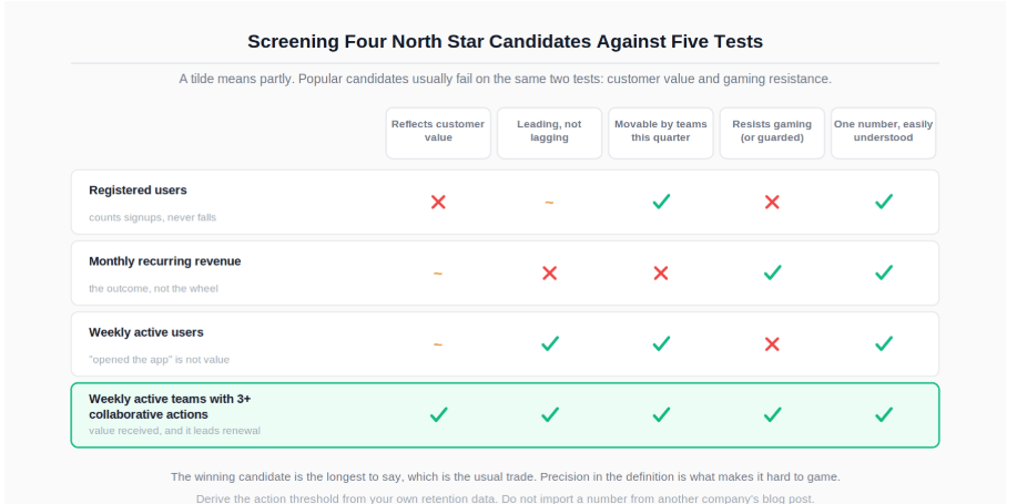
Applying that to four candidates for the collaboration product:
Registered users fails on customer value and on gaming resistance. It rises when marketing runs a giveaway and never falls, which makes it a ratchet rather than a signal.
Monthly recurring revenue fails on leading and on team influence. It is the right outcome and the wrong steering instrument.
Weekly active users is closer, but "active" usually means "opened the app", which is not value received, and it is trivially inflated by notification volume.
Weekly active teams completing at least three collaborative actions passes all five, at the cost of being longer to say. It captures the product's actual value (teams working together, not individuals logging in), it leads revenue because collaborating teams renew, teams can move it, the collaborative-action threshold makes notification spam ineffective, and a new joiner understands it immediately.
The threshold in that definition is not arbitrary and should not be invented. Derive it from your own data by finding the usage level above which retention meaningfully separates, then state that you derived it and revisit it annually.
A north star that no team owns is a poster. The decomposition into input metrics is what makes it operational.
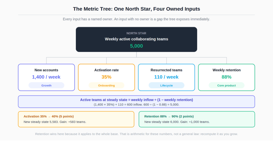
The north star here is the count of weekly active collaborating teams. That count is a stock, and stocks are governed by flows:
Active teams (steady state) = weekly inflow ÷ (1 - weekly retention rate)With the running example's numbers:
Input | Value | Owner |
|---|---|---|
New accounts per week | 1,400 | Growth |
Activation rate (reach 3 collaborative actions in week 1) | 35% | Onboarding |
Newly activated teams per week | 490 | Onboarding |
Resurrected dormant teams per week | 110 | Lifecycle |
Total weekly inflow | 600 | |
Weekly retention rate | 88% | Core product |
Active teams at steady state | 5,000 | |
Check it: 600 ÷ (1 − 0.88) = 5,000.
Now the question that decides next quarter's roadmap. Which input is worth improving?
Change | New steady state | Gain |
|---|---|---|
Baseline | 5,000 | |
Activation 35% to 40% (a 5 point gain) | 5,583 | +583 |
Retention 88% to 90% (a 2 point gain) | 6,000 | +1,000 |
Two points of retention beat five points of activation, because retention applies to the entire base while activation applies only to this week's new accounts. That is not a general law, it is arithmetic that depends on the current base size relative to inflow, and it will change as the company grows. The point is that the tree lets you compute it rather than argue about it.
The activation term is a funnel, and improving it means finding which step of onboarding loses teams before the third collaborative action, which is the analysis covered in the guide to finding where customers drop off in a funnel.
Once the tree exists, KPI selection stops being a brainstorm and becomes an assignment. Each team takes the input it owns as its primary KPI, plus a small number of secondary measures that explain movement in it.
Team | Primary KPI (from the tree) | Secondary KPIs |
|---|---|---|
Growth | New accounts per week | Cost per account, share of accounts from target segments |
Onboarding | Week-1 activation rate | Time to first collaborative action, step-level onboarding completion |
Core product | Weekly retention rate | Feature adoption among retained teams, session depth |
Lifecycle | Resurrected teams per week | Re-engagement campaign response, dormancy duration before return |
Two properties make this work. Every KPI traces upward to the north star, so no team can succeed on its own number while damaging the company's. And every KPI is influenceable by the team that holds it, which is the difference between accountability and blame.
The count matters too. A team with a dozen KPIs has none, because attention is the scarce resource and a dashboard with everything on it gets read as decoration. Keep the primary KPI visually dominant and the secondaries subordinate to it, which is a layout decision as much as a selection one; the relevant encoding principles are in the guide to data visualisation for analysts, and the mechanics of building the tracking views themselves are covered in Power BI for beginners alongside the Power BI documentation on KPI visuals and refresh.
Any metric that determines what teams are rewarded for will be optimised, including through routes nobody intended. Guardrails exist to detect that, and they should be chosen at the same time as the north star, not after the first incident.
For the collaboration product, the obvious gaming routes and their guardrails:
Gaming route | What it looks like in the north star | Guardrail |
|---|---|---|
Notification volume drives activity | Active teams rise | Notification opt-out rate, unsubscribe rate |
Counting trivial actions as collaborative | Active teams rise | Eight-week retention of newly activated teams |
Buying low-quality signups | Inflow rises | Contribution margin per account, activation rate by channel |
Onboarding pushes teams through the threshold artificially | Activation rate rises | Week-4 activity among week-1 activated teams |
The pattern is consistent: every guardrail is a metric that would deteriorate if the north star were being moved the wrong way. That is what makes it a guardrail rather than just another KPI.
Guardrails need thresholds, and the honest way to set one is from the metric's own historical variation rather than from a round number. Compute the measure across many past periods, look at the spread, and set the alert outside the range that normal operation produces. The NIST/SEMATECH e-Handbook of Statistical Methods is a reliable reference for how that variability is characterised.
When a guardrail fires and the north star looks good, the resulting conversation is uncomfortable, because someone's quarter is about to be reinterpreted. Leading with the guardrail number and the specific mechanism, rather than with an accusation of gaming, is the same skill as presenting difficult findings to senior leaders.
A metric that three teams compute differently is worse than no metric, because it produces confident disagreement rather than uncertainty. Every metric on the tree needs a written specification with six parts.
Numerator and denominator. For the activation rate: teams reaching three collaborative actions, over teams that created an account. Not sessions, not users, teams.
Population and exclusions. Internal test accounts out, trial accounts in or out (state which), accounts from a specific region excluded if a data feed is unreliable there.
Window. Week 1 means the seven days from account creation, not the calendar week the account was created in. This single ambiguity produces more metric disagreements than any other.
Grain and unit. One row per team per week, and the metric is a count of teams rather than of actions.
Owner and cadence. Who is accountable for the number and who is accountable for the definition, which are frequently different people, and how often it refreshes.
Aggregation rule. Rate metrics must be computed as a ratio of sums rather than as an average of ratios, or weekly and quarterly roll-ups will silently disagree with the daily figures.
-- Correct: sum the components, then divide.
SELECT
    date_trunc('week', signup_ts)                      AS cohort_week,   -- PostgreSQL
    count(*)                                           AS accounts,
    count(*) FILTER (WHERE activated_wk1)              AS activated,
    round(100.0 * count(*) FILTER (WHERE activated_wk1)
          / NULLIF(count(*), 0), 1)                    AS activation_pct
FROM team_accounts
WHERE is_internal = false
GROUP BY 1
ORDER BY 1;
-- FILTER is PostgreSQL; use count(CASE WHEN ... THEN 1 END) in other engines.
-- Wrong, and it will not error: avg(activation_rate_per_day)
That aggregation behaviour follows from how the counting aggregates handle conditions and nulls, documented in the PostgreSQL aggregate function reference. Where the organisation runs a modelling layer, these definitions belong there rather than in individual dashboards, which is the case the dbt semantic layer documentation makes for centralising metric logic.
Changing it is expensive, because every target, dashboard, and historical comparison is anchored to it. Three situations justify the cost.
The business model changed. A company that moves from self-serve to enterprise sales has a different value delivery mechanism, and a metric built for the old one will steer the new business wrong.
The metric stopped predicting the outcome. This is the empirical test and it is worth running annually: does the north star still correlate with revenue and retention over the following two or three quarters? If the relationship has decayed, the metric has stopped doing its job regardless of how well understood it is.
It has been thoroughly gamed and cannot be repaired. Sometimes a guardrail reveals that the metric's definition is the problem rather than the behaviour, and patching the definition repeatedly is worse than replacing it.
What does not justify a change: a new executive preferring a different number, or the current metric looking bad. Changing the metric because it is unflattering is the clearest possible signal that measurement is not being used to make decisions, which is one of the recurring patterns behind why analytics projects fail.
When you do change it, run both metrics in parallel for at least a quarter, and publish the mapping between them so historical comparisons remain interpretable.
For improving the activation term in the tree, which is fundamentally a drop-off problem, see finding where customers drop off in a funnel.
For building the tracking views that make a metric tree visible to teams rather than living in a spreadsheet, the walkthrough in Power BI for beginners covers the measures and layouts involved.
For presenting a metric layout where the primary KPI stays dominant and the secondaries stay subordinate, the data visualisation guide covers the encoding choices.
And for the organisational conditions that determine whether a metric framework changes behaviour or becomes wall decoration, why analytics projects fail is worth reading alongside this.
Quiz
Question 1 of 15
FAQ