Data Analyst Case Study: From Raw Data to Business Recommendation
A worked churn investigation, including the hypothesis that turned out to be wrong
5 Minutes Read

A worked churn investigation, including the hypothesis that turned out to be wrong
The brief arrives as a message on Monday morning: "Churn is up. Can you look into why and come back with a fix?"
That sentence contains no metric definition, no time period, no segment, no decision, and no deadline. Answering it as written produces a deck full of charts that nobody acts on. The work of the next two weeks is mostly conversion: converting a vague concern into an answerable question, converting three messy tables into a trustworthy dataset, converting a pattern into a sized opportunity, and converting that into a recommendation someone can approve.
This article walks the whole arc for one investigation, including the step where the obvious hypothesis was tested and rejected. The business is a subscription meal-kit company. Every figure is illustrative and constructed so the arithmetic is checkable.
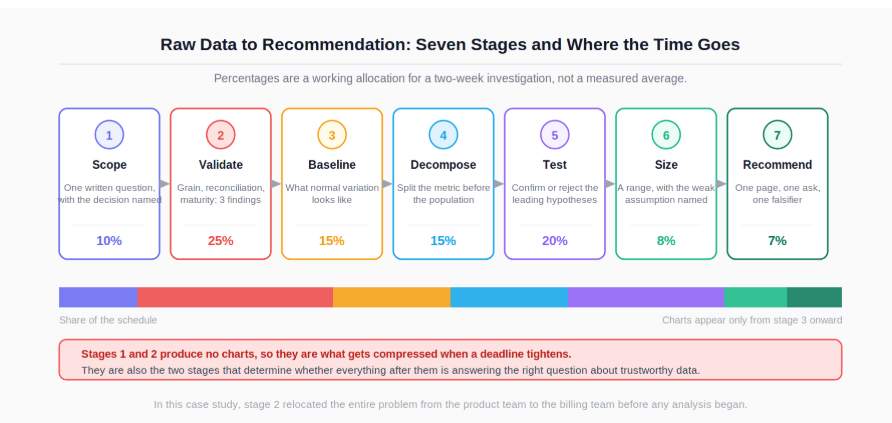
The distribution matters more than the list. Scoping and validation consume a large share of the schedule and produce no charts, which is why they get compressed when a deadline tightens, and why compressing them is what produces confidently wrong answers.
Before touching data, establish four things: what decision this feeds, who makes it, when they need it, and what the metric actually means.
Fifteen minutes of conversation replaced the original brief with this:
For subscribers acquired in the last twelve months, has the month-2 cancellation rate risen, is the rise concentrated in identifiable segments, and what is the largest driver we could act on this quarter?
Every clause in that sentence is doing work. "Month-2 cancellation rate" fixes the metric, since the team had been comparing a monthly churn rate against a cohort retention curve and disagreeing without noticing. "Last twelve months" fixes the window. "Act on this quarter" excludes findings that would require a year of engineering, which changes what is worth investigating.
The decision is a roadmap one: the retention squad has capacity for one project next quarter, and the head of subscriptions picks it in three weeks. That deadline sets the depth of everything downstream. Writing the question down and sending it back for confirmation also protects you later, when the answer is unwelcome and the question quietly shifts.
Three tables arrived.
Table | Stated grain | Relevant columns |
|---|---|---|
| One row per subscriber |
|
| One row per delivery |
|
| One row per cancellation |
|
The validation pass produced three findings, and two of them changed the analysis before it started.
Finding 1: deliveries does not hold its stated grain.
-- Does one row per delivery actually hold?
SELECT delivery_id, count(*) AS n
FROM deliveries
GROUP BY delivery_id
HAVING count(*) > 1
ORDER BY n DESC
LIMIT 10;
Redelivered orders write a second row with the same delivery_id and a later status. Joining subscribers to deliveries without deduplicating would have inflated every per-subscriber delivery count, and inflated it most for exactly the subscribers who had delivery problems, which is the population the investigation was about. That is the worst possible place for a duplication bug, because it manufactures the correlation you are looking for.
Finding 2: the cancellations table is only half of churn.
-- Reconcile: subscribers who left, versus rows in the cancellations table.
SELECT
    count(*) FILTER (WHERE s.status = 'churned')                  AS churned_subscribers,
    count(DISTINCT c.subscriber_id)                               AS rows_in_cancellations
FROM subscribers s
LEFT JOIN cancellations c ON c.subscriber_id = s.subscriber_id;
-- FILTER is PostgreSQL syntax; use count(CASE WHEN ... THEN 1 END) elsewhere.
The counts did not match. The cancellations table records only voluntary cancellations, where someone clicked cancel. Subscribers lost to failed payments transition to churned in subscribers with no cancellation row at all. The headline "churn" number the team had been watching was summing two populations with completely different causes and completely different fixes. This one reconciliation reshaped the whole investigation.
Finding 3: the most recent cohorts are incomplete. A subscriber who joined five weeks ago cannot yet have a month-2 outcome. Including partial cohorts makes the most recent points on any retention chart drop artificially, and the "spike" that prompted the brief was partly this artefact. Cohorts younger than the measurement window were excluded, and that exclusion was stated on every chart.
The mechanics behind these checks (grain testing, anti-joins, conditional aggregation) are covered in the essential SQL skills and query guide for data analysts, and the count(*) versus count(column) behaviour that makes the reconciliation query work is documented in the PostgreSQL aggregate function reference.
"Churn is up" is a comparison, and until you know what normal variation looks like, you cannot tell whether this month is unusual or merely different.
The cohort table came first, built once and reused for everything downstream:
-- Month-2 cancellation rate by signup cohort.
-- PostgreSQL: date_trunc / INTERVAL. BigQuery uses DATE_TRUNC(ts, MONTH) and DATE_ADD.
WITH cohorts AS (
    SELECT
        subscriber_id,
        date_trunc('month', signup_ts) AS cohort_month,
        signup_ts,
        status
    FROM subscribers
    WHERE signup_ts >= DATE '2025-08-01'
      AND signup_ts <  DATE '2026-08-01'          -- exclude immature cohorts
),
outcomes AS (
    SELECT
        c.cohort_month,
        c.subscriber_id,
        CASE WHEN x.churn_ts IS NOT NULL
              AND x.churn_ts < c.signup_ts + INTERVAL '60 days'
             THEN 1 ELSE 0 END AS churned_by_month_2
    FROM cohorts c
    LEFT JOIN churn_events x ON x.subscriber_id = c.subscriber_id
)
SELECT
    cohort_month,
    count(*)                                                     AS cohort_size,
    sum(churned_by_month_2)                                      AS churned,
    round(100.0 * sum(churned_by_month_2) / count(*), 1)         AS month_2_churn_pct
FROM outcomes
GROUP BY cohort_month
ORDER BY cohort_month;
The result, for the five most recent mature cohorts:
Cohort | Size | Month-2 churn |
|---|---|---|
January | 5,900 | 11.0% |
February | 6,100 | 11.4% |
March | 6,000 | 11.2% |
April | 6,200 | 13.9% |
May | 6,050 | 14.1% |
Three months sitting between 11.0 and 11.4 establish the normal band. April and May are outside it by roughly three points, which is several times the month-to-month movement seen before. That comparison against the metric's own historical variation is what makes "up" a defensible word, and the NIST/SEMATECH e-Handbook of Statistical Methods is a reliable reference for how such variability is characterised.
Most analysts jump straight to segmenting by region, plan, and channel. The faster move here was the split that Finding 2 had already suggested: decompose the metric into its two components before decomposing the population.
Cohort | Voluntary | Involuntary (payment failure) | Total |
|---|---|---|---|
January | 10.6% | 0.4% | 11.0% |
May | 11.0% | 3.1% | 14.1% |
Change | +0.4 pts | +2.7 pts | +3.1 pts |
Voluntary cancellation barely moved. Involuntary churn went up nearly eightfold, and accounts for 2.7 of the 3.1 point rise.
This reframes the entire brief. The team had assumed a product or service problem, because that is what "churn" implies. The number was mostly a billing infrastructure problem, which sits with a different team, has a different fix, and would not have been found by any amount of segmenting by region and plan.
Segmenting the population afterwards confirmed rather than redirected: the involuntary rise appeared across regions and plans, which is itself informative, because a driver concentrated in one region would point at a local payment method and a driver spread across all of them points at something central.
The delivery data was the reason the analysis was commissioned. Operations had reported an increase in late deliveries in the spring, and the working theory was that late deliveries were driving cancellations.
The correlation was there. Subscribers with a late delivery in their first eight weeks churned at a visibly higher rate than those without. Two checks stopped that from becoming the finding.
The timing did not line up. Late deliveries began rising in February. The churn increase begins in April. A driver that has been elevated for two months before the outcome moves is not a good explanation for a step change in April.
The correlation did not survive the decomposition. Splitting the late-delivery comparison into voluntary and involuntary churn showed the late-delivery association concentrated in voluntary cancellations, which is the component that barely moved. Late deliveries do plausibly annoy people into cancelling, and that effect appears to have been present all along at roughly the same size. It is not what changed.
So the delivery hypothesis was reported as: real, unchanged, and not the cause of this movement. Reporting the rejected hypothesis explicitly matters, because someone in the room already believes it, and an analysis that ignores their theory rather than testing it does not change their mind. This is also where the causal discipline pays off: an association that survives one cut and disappears under another was never a driver, it was a passenger.
The grouping mechanics for these repeated splits are covered in the pandas groupby user guide if you are running them in Python rather than SQL, and window functions are the tool for the first-late-delivery and first-failure timestamps these comparisons depend on, as documented in the PostgreSQL window functions reference.
A finding without a size is a discussion. A finding with a size is a decision.
The arithmetic, with every assumption stated:
Monthly new cohort: roughly 6,000 subscribers
Involuntary month-2 churn at baseline: 0.4%, or about 24 subscribers per cohort
Involuntary month-2 churn now: 3.1%, or about 186 subscribers per cohort
Excess loss: about 162 subscribers per monthly cohort
Average monthly contribution per subscriber: 22
Average remaining tenure for a retained month-2 subscriber: 4.5 months
Value of one recovered subscriber: 22 × 4.5, or about 99
If a payment retry and card-update fix recovers between a quarter and half of the excess, that is 40 to 81 subscribers per monthly cohort, worth roughly 4,000 to 8,000 in contribution per cohort, or roughly 48,000 to 96,000 annualised.
The recovery rate is the weakest number in that chain, and it is stated as a range rather than a point precisely because it is an assumption rather than a measurement. Everything above it comes from the data. That single assumption is also what a four-week test would replace with a measured value, which is why the recommendation includes the test rather than just the fix.
Presenting a range with the load-bearing assumption named is more persuasive than a single confident figure, not less, because the first question any competent executive asks is which number the estimate depends on most.
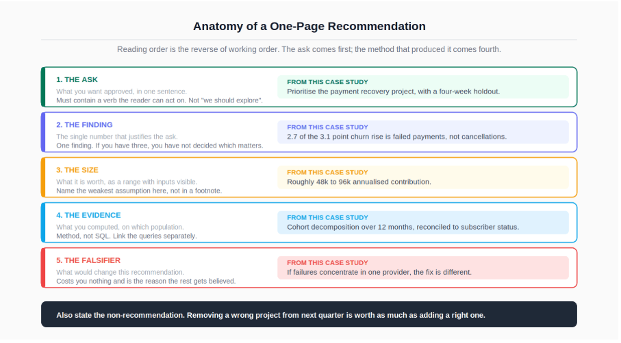
The recommendation that went to the head of subscriptions:
The ask. Prioritise the payment recovery project for next quarter, and run it with a holdout for the first four weeks so the recovery rate is measured rather than assumed.
The finding. The month-2 churn increase is roughly 2.7 of 3.1 points attributable to failed payments rather than to cancellations. Voluntary churn is effectively flat.
The size. Roughly 48,000 to 96,000 in annualised contribution, dependent on a recovery rate assumption the holdout would resolve within a month.
The evidence. Cohort decomposition across twelve months, with the two components reconciled against subscriber status rather than taken from the cancellations table alone.
What would change the recommendation. If the payment failures turn out to be concentrated in a single provider or card type, the fix is a provider-level change rather than a retry flow, and the estimate does not transfer. That check takes a day and should run before engineering scopes the work.
The article also carried one explicit non-recommendation: do not prioritise the delivery-lateness project this quarter on churn grounds. It may be worth doing for other reasons, but the data does not support it as the cause of this movement. Saying that plainly is uncomfortable, because operations had already begun scoping it, and the framing patterns in how to present difficult findings to senior leaders apply directly: lead with the number, name what you tested, and bring the cheaper alternative.
Findings that never reach a decision are the standard failure mode of analytics work, and the organisational reasons behind that are covered in why analytics projects fail. Most of them trace back to stage 1: an analysis commissioned without a decision attached has nowhere to land.
A completed investigation like this is also the strongest material you have for an interview, because it contains the three things interviewers actually probe for: a definition you had to fix, a hypothesis you rejected, and a number you sized with stated assumptions. Walking through the decomposition that relocated the problem from the product team to the billing team demonstrates more than any tool list.
Structure the retelling the same way as the write-up, with the recommendation first and the method last, and keep the rejected delivery hypothesis in the story rather than trimming it. The approach to that narrative is covered in the guide to explaining a data analyst project in an interview.
For the query patterns underneath every stage here, including grain checks, cohort construction, and conditional aggregation, the essential SQL skills and query guide for data analysts is the direct prerequisite.
For turning this kind of investigation into an interview narrative, the guide to explaining a data analyst project in an interview covers the retelling structure.
For delivering the part of the finding that contradicts what a team has already started building, see how to present difficult findings to senior leaders.
And for the organisational patterns that determine whether a recommendation like this changes anything, why analytics projects fail is worth reading alongside this.
Quiz
Question 1 of 15
FAQ