Correlation vs Causation in Data Analytics: Examples Every Analyst Should Know
How to tell what your data can support, what it cannot, and how to word the difference in front of stakeholders
4 Minutes Read
How to tell what your data can support, what it cannot, and how to word the difference in front of stakeholders
Most analysts can recite "correlation is not causation" and then, two slides later, write "enabling automation increases retention by 37 points." The gap is not knowledge. It is that the correlational finding arrives already formatted as an insight, the causal claim is what the room actually wants, and nothing in the query output flags the moment you crossed from one to the other.
This article is about that crossing point. It covers what a correlation coefficient actually asserts, the four rival explanations you have to eliminate before a causal claim holds, how Simpson's paradox reverses conclusions inside ordinary segment data, what each study design licenses you to say, and how to word a finding so it survives contact with a sceptical stakeholder.
The running example is a B2B SaaS product. An analyst pulls renewal rates and finds that accounts which used the workflow automation feature in their first 30 days renew far more often than accounts which did not. Every figure in that example is illustrative, constructed to make a pattern visible, and none of it should be quoted as a benchmark.
A Pearson correlation is a statement about the linear co-movement of two variables in one sample. It is not a statement about mechanism, direction, or what happens if you intervene.
That distinction matters more than it sounds. When you compute corr(feature_usage, renewed), you get a number describing how tightly two columns move together in the rows you happened to pull. It says nothing about which variable moved first, whether a third variable moved both, or whether the pattern would survive if you changed one of them on purpose.
Three properties of the coefficient trip analysts up regularly.
It only sees linear structure. A relationship that rises and then falls can produce a coefficient near zero while being strongly related. The NIST/SEMATECH e-Handbook of Statistical Methods is a reliable reference for how these measures are defined and where they break down. Plot the relationship before you trust the number.
It is sensitive to the range you sampled. If your query filters to accounts above a certain contract value, the correlation inside that slice can differ in magnitude, and sometimes in sign, from the correlation across all accounts.
It is not a business quantity. A coefficient of 0.4 does not translate into revenue, lift, or a decision. Effect sizes on the outcome scale (percentage point differences in renewal, for example) are what stakeholders can act on, and they carry exactly the same causal caveats.
Computing it is cheap, which is part of the problem. In PostgreSQL, corr() is a built in aggregate:
-- PostgreSQL syntax: corr() is a built-in aggregate here.
-- MySQL has no corr() aggregate; compute it manually or in the analysis layer.
SELECT
    corr(first_30d_automation_runs, renewed::int) AS r_usage_renewal,
    count(*)                                      AS n_accounts
FROM account_facts
WHERE cohort_month = DATE '2026-01-01';
The PostgreSQL aggregate function reference documents corr() alongside regression aggregates such as regr_slope(). Nothing in the result set reminds you what the number cannot support. That reminder has to come from your process.
Before "X causes Y" is defensible, four competing explanations for the same pattern have to be eliminated. Each one produces identical correlations, so no amount of additional correlational analysis distinguishes between them.
1. Confounding. A third variable drives both. In the running example, account size plausibly drives both automation adoption and renewal: larger accounts have implementation teams who configure automation, and larger accounts renew more because switching costs are higher. The feature may be contributing nothing.
2. Reverse causation. The outcome drives the input. Accounts already committed to the product, and therefore already likely to renew, are the ones willing to invest effort in configuring automation. Intent came first, usage second.
3. Selection or collider bias. The way rows entered your dataset created the association. If your table contains only accounts that completed onboarding, and both automation setup and early commitment influence completing onboarding, you have conditioned on a downstream variable and induced a relationship that does not exist in the full population.
4. Coincidence. With enough metrics on a dashboard, some pairs will correlate strongly by chance. This is the least interesting explanation and the easiest to reduce: pre-register the hypothesis, or hold out a second cohort and check whether the pattern reappears.
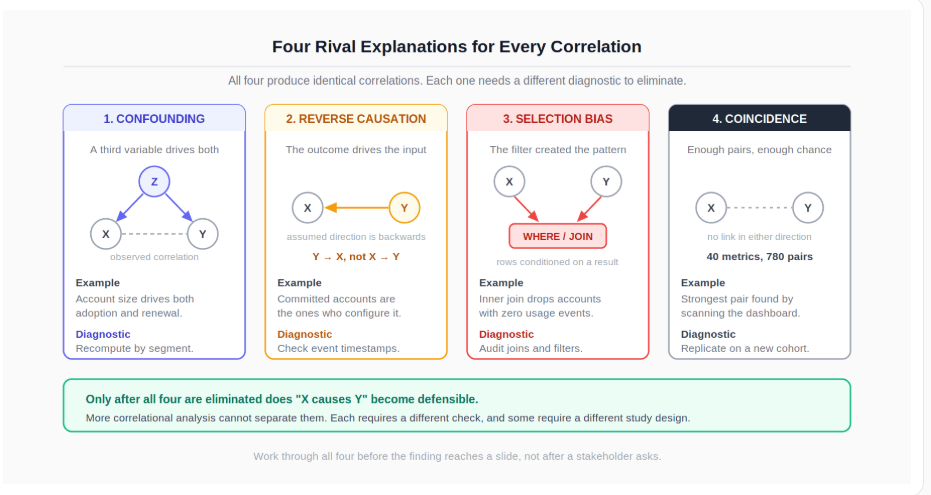
The practical value of the four is that each one suggests a different diagnostic. Confounding suggests segmenting or adjusting. Reverse causation suggests checking timestamps and event ordering. Selection bias suggests auditing the joins and filters that built the table. Coincidence suggests replication in a fresh cohort. Working through them costs a few hours and frequently kills a finding before it reaches a slide, which is a considerably better outcome than it dying in the meeting.
Take the finding at face value first. Suppose the query returns this:
Group | Accounts | Renewed | Renewal rate |
|---|---|---|---|
Used automation in first 30 days | 1,240 | 967 | 78.0% |
Did not use automation | 3,610 | 1,480 | 41.0% |
A 37 point gap is large enough that someone will propose forcing every new account through automation setup. Before that happens, run the four diagnostics against it.
Timestamp ordering. Check whether automation usage precedes the renewal signal, and whether it also precedes other commitment signals such as adding seats or connecting a data source. If accounts add seats before they touch automation, usage is trailing a decision rather than causing one.
Segmentation on the obvious confounder. Recompute renewal rates within contract value bands, plan tier, and industry. If the gap collapses inside every band, account size was doing the work.
Join audit. Confirm the denominator. If account_facts was built with an inner join to a usage events table, accounts with zero events may have been dropped entirely, which means the "did not use" group is not the population its label implies.
Replication. Rerun on a different cohort month. A real relationship should reappear. A coincidence usually does not.
Segmentation is the step that most often reverses the conclusion outright, and it deserves its own treatment.
A relationship measured in aggregate can point the opposite way from the same relationship measured inside every segment. This is not a rounding artefact. Both results are arithmetically correct.
Different question, same product. The team rolled out a redesigned onboarding flow, and the aggregate numbers say the new flow converts worse:
Segment | Old flow trials | Old conversion | New flow trials | New conversion |
|---|---|---|---|---|
SMB | 800 | 28.0% | 200 | 30.0% |
Enterprise | 200 | 10.0% | 800 | 12.0% |
Total | 1,000 | 24.4% | 1,000 | 15.6% |
The new flow converts better in SMB and better in Enterprise, yet worse overall. The reason is mix: the rollout sent most Enterprise trials to the new flow, and Enterprise converts at a lower base rate regardless of which flow it sees. Segment composition, not flow quality, is driving the aggregate.
The reversal is easy to miss because the aggregate query is the one you write first:
-- Aggregate view: hides the composition shift.
SELECT flow_version,
       count(*)            AS trials,
       avg(converted::int) AS conversion_rate
FROM trials
GROUP BY flow_version;

-- Segment view: run this before believing the aggregate.
-- PostgreSQL syntax; the ::int cast differs across engines
-- (MySQL would use CAST(converted AS SIGNED), for example).
SELECT segment,
       flow_version,
       count(*)            AS trials,
       avg(converted::int) AS conversion_rate
FROM trials
GROUP BY segment, flow_version
ORDER BY segment, flow_version;
The pandas equivalent is a single change to the grouping keys, which is a good argument for making segment level recomputation a reflex rather than a follow up:
import pandas as pd

overall = (trials
           .groupby("flow_version")["converted"]
           .agg(trials="size", rate="mean"))

by_segment = (trials
              .groupby(["segment", "flow_version"])["converted"]
              .agg(trials="size", rate="mean"))

# Does the sign of the difference flip between the two?
print(overall, by_segment, sep="\n\n")
The pandas groupby user guide covers the split, apply, combine mechanics behind this. If most of your segment analysis still happens in spreadsheets, moving it into code is what makes regrouping cheap enough to do every time, and the walkthrough of pandas basics for data analysts is a reasonable starting point.
Two things are worth internalising about Simpson's paradox. First, it is not rare in analytics work, because rollouts, campaigns, and feature launches almost never distribute evenly across segments. Second, segmenting does not automatically hand you the right answer either. Which level to trust depends on whether the segmenting variable is a confounder (segment on it) or a step on the causal path between input and outcome (segmenting subtracts the effect you are trying to measure). That judgement comes from knowing the business process, not from the data.
Funnel work is where this bites hardest, since stage to stage conversion is nearly always compared across traffic sources with very different mixes. The mechanics of finding where customers drop off in a funnel are worth pairing with this section.
The strength of the claim you can make is set by the design that produced the data, not by the size of the sample or the tightness of the correlation.
A very large observational dataset with a very strong association still supports only an associational claim. Volume does not change the design.
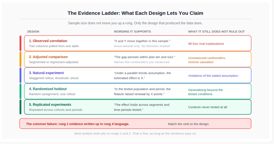
Read the ladder as a constraint rather than a target. Most analyst work legitimately lives on the lower rungs, and that is fine as long as the wording matches. The failure mode is producing rung one evidence and writing a rung four sentence.
A note on predictive models, since this comes up whenever someone points at a feature importance chart. A model trained to predict churn learns associations that are genuinely useful for ranking accounts by risk. It does not learn what happens if you intervene on a feature. The scikit-learn documentation describes these estimators as supervised learners fitted to observed data, and feature importance is a statement about the model, not about the world. "Automation usage is the top predictor of renewal" and "automation usage increases renewal" are different sentences with different evidentiary requirements.
You will rarely get a clean randomised experiment for every question. You can almost always get something better than nothing. Rank the options by cost.
Holdout on the next rollout. If the feature or campaign is shipping anyway, withhold it from a random slice. This is the cheapest randomised evidence available, and the marginal cost is usually one conversation with the team running the rollout.
Staggered rollout by region, cohort, or account list. If a full holdout is unacceptable, sequence the rollout and compare units before and after their own switch date. That supports a difference in differences comparison under a stated assumption about parallel trends.
Natural experiment already sitting in your data. Look for an arbitrary threshold or an external shock: a pricing rule that applied only above a contract value cutoff, an outage that suppressed a feature in one region, a policy that changed on a specific date. These are quasi-experimental and depend on assumptions you must state.
Observational comparison with explicit adjustment. Match or adjust on the confounders you can measure, and name the ones you cannot. This is the weakest of the four and should be labelled as such.
Whichever you pick, write down in advance what result would change your mind. A hypothesis that no possible outcome could falsify is not an analysis, it is a preference. Committing to the falsifying result in advance also protects you later, when the number comes back inconvenient and someone suggests slicing until it improves.
The organisational version of this problem is well documented: analyses that cannot survive scrutiny tend to get quietly abandoned after the decision has already been made, which is one of the recurring patterns behind why analytics projects fail.
Most overclaiming happens in the verb, not in the analysis. The query was correct, the segmentation was careful, and then "is associated with" became "drives" during the slide edit because the stronger verb read better.
Keep an explicit mapping between what you did and what you are entitled to write:
What you actually have | Wording that fits | Wording that overclaims |
|---|---|---|
Raw correlation in observational data | "Accounts using automation renew at a higher rate" | "Automation increases renewal" |
Association that persists after segment adjustment | "The gap persists within contract value and plan tier" | "We have controlled for the confounders" |
Difference in differences on a staggered rollout | "Under a parallel trends assumption, the estimated effect is X" | "The rollout caused a lift of X" |
Randomised holdout | "In the tested population and period, the feature raised renewal by X points" | "The feature raises renewal by X points" |
Feature importance from a churn model | "Usage is the strongest predictor of renewal in this model" | "Usage is the biggest driver of renewal" |
Two habits keep the right hand column out of your work.
State the rival explanation you could not eliminate, in one sentence, in the body of the finding. Not in an appendix. Something like: "We cannot separate automation usage from account size, because larger accounts adopt it almost universally." That reads as competence rather than weakness, and it pre-empts the question a senior stakeholder will otherwise ask in front of everyone.
Give the decision maker the action that is robust to your uncertainty. If you cannot say whether automation causes renewal, you can still say that a holdout would resolve it within one rollout cycle, and that is an actionable recommendation. Framing an inconclusive result as a concrete next step draws on the same skill as presenting bad news from analysis to senior leaders without losing credibility in the room.
Recurring mistakes worth naming:
Treating a strong coefficient as evidence of mechanism when it only describes co-movement
Reporting an aggregate result without checking whether the segment level results agree
Segmenting on a variable that sits on the causal path, then reporting the shrunken effect as the true one
Reading feature importance from a predictive model as a causal ranking
Testing many metric pairs, reporting the strong one, and not mentioning the other twenty
Building the analysis table with joins that silently drop the comparison group
Switching from "associated with" to "drives" between the analysis and the slide
Run this before a correlational finding leaves your machine:
I have plotted the relationship, not only computed a coefficient
I know which variable is measured first in time, from timestamps rather than assumption
I have recomputed the result inside the segments most likely to confound it
I have audited the joins and filters that produced the comparison groups
I have checked whether the pattern reappears in a second cohort or period
I have named at least one rival explanation I cannot eliminate
I have written the verb that matches the design, and read the sentence back
I have proposed the cheapest test that could settle the question
The reasoning above is only as good as the query underneath it. Segment level recomputation, window functions for ordering events in time, and careful joins are where most causal errors are actually introduced, and the essential SQL skills and query guide for data analysts covers that ground directly.
For conversion work specifically, where composition effects across traffic sources are a constant, the treatment of funnel drop-off analysis shows how these comparisons are structured stage by stage.
For the analysis workflow itself, moving segment comparisons into code makes it cheap to regroup and recheck, which is the practical case made in the introduction to pandas for analysts.
For the communication side, the framing patterns in how to present difficult findings to senior leaders apply directly to reporting an inconclusive causal result.
And for the organisational context in which overclaimed findings tend to go wrong, the patterns behind analytics projects that fail to land are worth reading alongside this.
Quiz
Question 1 of 15
FAQ