Cohort Analysis Explained: How to Measure Customer Retention and Behaviour
Building the retention triangle, reading it in three directions, and choosing a retention definition on purpose
6 Minutes Read

Building the retention triangle, reading it in three directions, and choosing a retention definition on purpose
A single retention number tells you almost nothing. "Sixty-eight percent of customers are retained" hides whether that figure is the average of a healthy recent cohort and a collapsing old one, whether retention has been declining for six months, and whether the decline is a product problem or an acquisition problem. Those are different projects with different owners, and the aggregate cannot distinguish between them.
Cohort analysis fixes that by refusing to average across time. You group customers by when they arrived, track each group separately, and read the resulting grid in three directions. Each direction answers a different question, and most of the value comes from knowing which direction you are reading.
This article covers what actually counts as a cohort, how to build the retention triangle in SQL and pandas, how to read it, how the choice of retention definition changes the numbers, and how the same structure extends to revenue and behaviour.
The running example is an ecommerce store with monthly acquisition cohorts. All figures are illustrative and constructed so the arithmetic is checkable.
A cohort is a group defined by a shared starting event and tracked forward from that event. A group defined by a fixed attribute is a segment, and the two answer different questions.
The distinction matters because segments and cohorts get confused constantly, and the confusion produces charts that cannot show what people think they show.
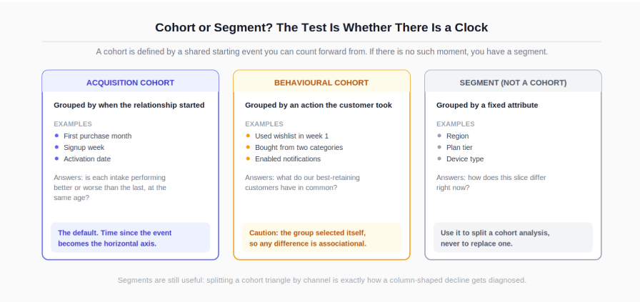
Acquisition cohorts group by when the relationship started: first purchase month, signup week, activation date. Time since that event becomes the horizontal axis, so every cohort is compared at the same age rather than on the same calendar date. This is the default and the one most people mean by "cohort analysis".
Behavioural cohorts group by an action taken: customers who used the wishlist in their first week, customers who bought from two categories. These are useful for generating hypotheses about what drives retention, but they carry a permanent interpretation caution. The group selected itself, so a difference between behavioural cohorts is associational. Customers who used the wishlist may retain better because the wishlist helps, or because customers who were already committed are the ones who bother to use it.
Segments group by an attribute that is not a starting event: region, plan tier, device. Segments are for splitting a cohort analysis, not for replacing it. "Retention by region" without a cohort dimension still averages across acquisition periods and hides the same trend.
The practical rule: if your grouping variable does not define a moment from which you can count forward, you have a segment.
The output of an acquisition cohort analysis is a triangle: cohorts down the rows, periods since acquisition across the columns, and a progressively shorter row for each newer cohort because it has had less time to age.
Here is the running example, with data through June:
Cohort | Customers | M0 | M1 | M2 | M3 | M4 | M5 |
|---|---|---|---|---|---|---|---|
January | 5,000 | 100% | 42% | 31% | 26% | 23% | 22% |
February | 5,400 | 100% | 41% | 30% | 25% | 21% | |
March | 5,800 | 100% | 43% | 32% | 27% | | |
April | 6,200 | 100% | 36% | 25% | | | |
May | 6,600 | 100% | 35% | | | | |
June | 7,000 | 100% | | | | | |
Three structural points about that grid.
Period 0 is always 100% by construction. It is the denominator. A period 0 that is not 100% means the cohort definition and the activity definition disagree, which is worth fixing before reading anything else.
Empty cells are not zeros. The blank in February's M5 means June has not happened for that cohort yet, not that nobody returned. Filling those with zero, which several charting tools do by default, drags every average downward and creates an artificial cliff at the triangle's edge.
The bottom-left cells are the least reliable. Recent cohorts have the fewest observed periods, and a cohort measured at M1 only is one data point, not a trend.
The SQL follows the same shape. Build the cohort assignment first, then the activity, then the period index:
-- PostgreSQL. BigQuery uses DATE_TRUNC(ts, MONTH) and DATE_DIFF(a, b, MONTH).
WITH first_order AS (
    SELECT
        customer_id,
        min(order_ts)                          AS first_order_ts,
        date_trunc('month', min(order_ts))     AS cohort_month
    FROM orders
    GROUP BY customer_id
),
activity AS (
    SELECT DISTINCT
        f.customer_id,
        f.cohort_month,
        date_trunc('month', o.order_ts)        AS activity_month
    FROM first_order f
    JOIN orders o USING (customer_id)
),
indexed AS (
    SELECT
        cohort_month,
        customer_id,
        (extract(year  FROM activity_month) - extract(year  FROM cohort_month)) * 12
      + (extract(month FROM activity_month) - extract(month FROM cohort_month))
                                               AS period_index
    FROM activity
)
SELECT
    cohort_month,
    period_index,
    count(DISTINCT customer_id)                AS active_customers
FROM indexed
GROUP BY cohort_month, period_index
ORDER BY cohort_month, period_index;
The DISTINCT in the activity CTE matters: a customer who ordered four times in March must count once in that month's cell, and forgetting it produces retention rates above 100%. Counting behaviour like this, including how count(DISTINCT ...) differs from count(*), is documented in the PostgreSQL aggregate function reference, and the min(order_ts) per customer is the kind of first-event problem window functions also solve, as covered in the PostgreSQL window functions documentation.
Converting counts to rates requires dividing each row by its own period 0 value, which is a join back to the cohort size rather than a global denominator. In pandas the same shape is a pivot and a row-wise division:
counts = (indexed
          .groupby(["cohort_month", "period_index"])["customer_id"]
          .nunique()
          .unstack(fill_value=0))

cohort_size = counts[0]
retention = counts.divide(cohort_size, axis=0) * 100

# Mask cells that cannot exist yet, so charts do not read them as zero.
import numpy as np
periods_available = (len(counts) - 1) - np.arange(len(counts))
mask = np.arange(counts.shape[1]) > periods_available[:, None]
retention = retention.mask(mask)
The grouping and reshaping mechanics are covered in the pandas groupby user guide, and the wider pandas workflow in the introduction to pandas for analysts.
The triangle is not a heatmap to admire. It has three reading directions, and each one answers a question the other two cannot.
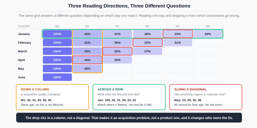
Down a column: is acquisition quality changing? Column M1 in the example runs 42, 41, 43, 36, 35. The first three months sit in a narrow band. April and May sit six to eight points below it. Every cohort is being compared at the same age, so this is not a lifecycle effect. Something about the customers acquired from April onward is different, or something about their first month was.
Across a row: what does the lifecycle look like? January reads 100, 42, 31, 26, 23, 22. The steep drop from M0 to M1 followed by progressive flattening is the standard shape, and the interesting question is where it flattens rather than how far it falls.
Along a diagonal: did something happen in calendar time? Cells on the same diagonal share a calendar month. For May, that is January's M4 (23), February's M3 (25), March's M2 (32) and April's M1 (36). Compare each against the same period in earlier cohorts: January M3 was 26 against February's M3 of 25, and January M2 was 31 against March's M2 of 32. Nothing on the May diagonal is out of line.
That last check is what turns the finding into a conclusion. The drop is confined to a column, not a diagonal, so it is an acquisition problem rather than a site or product event. A pricing change, an outage, or a checkout bug would have depressed the whole May diagonal at once, hitting old and new cohorts together. This one hit only the customers who arrived in April and May.
Splitting those cohorts by acquisition channel closed it out. April's cohort of 6,200 was 4,200 from established channels retaining at the usual 42%, giving 1,764, plus 2,000 from a channel launched that month retaining at 23%, giving 460. Together that is 2,224 of 6,200, or 35.9%, which matches the 36% in the table once rounded. The blended number was never a product signal at all; it was a mix shift.
Plotting the rows as curves makes the lifecycle question easier than reading a grid, and three shapes cover most cases.
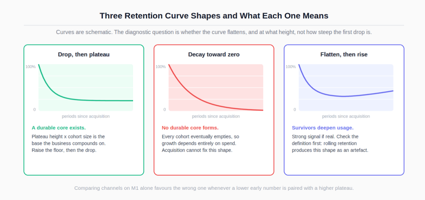
Drop then plateau. Steep early loss, then the curve flattens at a stable floor. The plateau is the important part: it says a durable core exists, and the height of the floor multiplied by cohort size is the base the business compounds on. Improvement work splits into raising the plateau (which compounds) and reducing the early drop (which is usually an onboarding problem).
Continuous decay toward zero. No flattening. Every cohort eventually empties, which means growth depends entirely on acquisition and the business is running to stand still. This is the shape that indicates the product has not found a repeatable use case, and no amount of acquisition spending fixes it.
Flatten then rise. The curve bottoms out and turns upward, which happens when surviving customers deepen their usage or when a purchase cycle is long enough that later periods capture repeat buyers. Genuine upward movement is a strong signal, but check the definition first, since a rolling retention definition produces an upward-looking curve as an artefact.
Read the plateau, not the M1 number, when comparing businesses or channels. A channel with a lower M1 and a higher plateau delivers more customers in the long run than one with the reverse, and reporting only M1 systematically favours the wrong one.
Curve comparisons are also where chart design earns its place: small multiples with a shared y-axis make cohort-to-cohort divergence visible in a way a single overplotted chart does not, which is covered in the guide to data visualisation for analysts.
"Retention" is not one metric. Classic, rolling, and range retention give different answers from identical data, and none of them is wrong.
Classic (bounded) retention asks whether the customer was active in exactly period N. It is the strictest definition, produces the lowest numbers, and is the right choice for products with an expected regular usage rhythm.
Rolling (unbounded) retention asks whether the customer was active in period N or any period after it. It answers "have they left for good", and by construction it produces higher numbers and a curve that can never fall as fast. It cannot be computed for recent periods without waiting, since you need future data to know whether someone returned.
Range (bracket) retention asks whether the customer was active at any point within a window, such as days 7 to 13. It suits products with irregular usage, where demanding activity on one specific day is unreasonably strict.
Take a customer active on day 1, day 3, and day 30. At day 7: classic says not retained, range over days 7 to 13 says not retained, rolling says retained, because they returned on day 30. One customer, one dataset, three answers.
Two more definitional choices carry the same weight.
Calendar months versus relative months. A customer who first purchases on 28 January has three days left in their calendar-month M0. Using calendar buckets, their M1 is February; using 30-day buckets, their M1 starts on 27 February. Calendar buckets are easier to build and align with reporting; relative buckets are fairer to customers acquired late in a period. Month-length differences and the leap-year edge case are the kind of thing the Python datetime documentation is worth checking before implementing relative periods by hand.
What counts as active. Logged in, opened, purchased, and used a core feature produce very different curves for the same product. Pick the one closest to value received, write it down, and keep it fixed.
The same triangle works for anything measurable per cohort per period.
Revenue cohorts replace the customer count with revenue per original cohort member. Note that cumulative revenue curves rise and flatten rather than falling, so they read the opposite way to retention curves and are the natural basis for a payback comparison against acquisition cost.
Behaviour cohorts track feature adoption or order frequency by cohort age, which answers whether newer customers are adopting a feature faster than older ones did at the same age. That is a question about onboarding effectiveness that a snapshot of current adoption cannot answer at all.
Cohort size context. A retention percentage from a small cohort moves substantially on chance, and a single cell in a sparse triangle should not drive a decision. Compare a cell against the variation the same cell shows across several previous cohorts before treating it as a change; the NIST/SEMATECH e-Handbook of Statistical Methods covers how that variability is characterised.
Where the early drop is the problem, the diagnosis is a funnel question rather than a cohort one, since you need to know which onboarding step loses people before their second purchase. That analysis is covered in the guide to finding where customers drop off in a funnel.
Recurring mistakes worth naming:
Filling immature cells with zero instead of leaving them blank, which manufactures a cliff at the edge of the triangle
Reading a column as a lifecycle trend or a row as an acquisition trend, which inverts the conclusion
Concluding a decline is a product problem without checking the diagonal for a calendar event
Omitting DISTINCT on the activity join, producing retention above 100% for repeat purchasers
Comparing M1 across channels while ignoring where each channel's curve plateaus
Switching between classic and rolling retention between reports without saying so
Treating a behavioural cohort difference as causal when the group selected itself
Averaging retention across all cohorts, which is the aggregate the analysis exists to avoid
Run this before a cohort analysis leaves your machine:
Period 0 is 100% for every cohort
Immature cells are blank, not zero, and the maturity edge is visible on the chart
The activity count is distinct per customer per period
The retention definition (classic, rolling, or range) is stated on the output
The period convention (calendar or relative) is stated on the output
"Active" is defined in terms of value received, and written down
I have read the triangle down, across, and diagonally before concluding
Cohort sizes are shown next to the percentages
Any suspected change has been checked against a channel or segment split
For the query patterns underneath the triangle, including first-event assignment, distinct counting, and multi-step CTEs, the essential SQL skills and query guide for data analysts is the direct prerequisite.
For building and reshaping the cohort matrix in code, where masking and row-wise division are one line each, see the introduction to pandas for analysts.
For diagnosing the early drop that dominates most retention curves, the stage-by-stage approach in finding where customers drop off in a funnel is the natural companion.
For presenting cohort curves and triangles so that the maturity edge and cohort sizes stay visible, the data visualisation guide covers the encoding choices.
And when the finding is that a recently launched acquisition channel is producing weak cohorts, delivering that well is covered in how to present difficult findings to senior leaders.
Quiz
Question 1 of 15
FAQ